If you are looking for website design in Vernal, Utah, you may need more than someone who can simply build a good-looking website.
Vernal businesses compete for customers online every day.
Contractors.
Oilfield service companies.
Restaurants.
Retail businesses.
Professional services.
Home service companies.
Tourism and recreation businesses.
When a potential customer needs something, one of the first things they often do is search online.
The question is simple:
Will they find your business—or someone else’s?
At Northpoint Web, we provide website design, ongoing website management, proactive search engine optimization, managed content, and AI integration options for businesses in Vernal and throughout the Uinta Basin.
A Vernal Business Website Should Be Built for Vernal Customers
One of the problems with national website companies is that they often approach every local business the same way.
Choose a template.
Add a logo.
Write a few paragraphs.
Publish the website.
But Vernal is not a generic market.
Businesses here serve a unique combination of local residents, oilfield companies, contractors, rural communities, tourists, and customers from throughout northeastern Utah.
The website for a Vernal business should reflect the people that company actually serves.
Where do your customers come from?
What services are they searching for?
Do you only serve Vernal?
Do you work throughout Uintah County?
Do customers come from Roosevelt or Duchesne?
Do you serve businesses connected to the energy industry?
Does tourism affect your business?
These questions matter when planning a website and local SEO strategy.
Why Local SEO Matters for Vernal, Utah Businesses
Imagine someone searches Google for a service you provide.
They may search:
“contractor Vernal Utah”
“plumber near Vernal”
“excavation company Uintah County”
“website designer Vernal Utah”
“best roofing company Vernal”
Your business may provide exactly what that customer needs.
But if your website does not clearly explain your services and location, search engines may have difficulty understanding when your company is relevant.
That means we can continue paying attention to the website after launch.
We can update content.
Add services.
Build new landing pages.
Evaluate search opportunities.
Create articles.
Improve calls to action.
And help the website change as the business changes.
Proactive SEO Instead of Waiting for the Business Owner
Most Vernal business owners have enough to do.
They should not have to spend Saturday night researching Google keywords.
We believe the website company should help look for online opportunities.
At Northpoint Web, our proactive SEO approach can include evaluating services that are poorly represented on a website, identifying customer questions that deserve content, reviewing local search opportunities, and improving existing pages.
If a business expands into a new service, the website may need a new page.
If customers repeatedly ask the same question, that question may make a useful article.
If a company wants more work in a specific part of the Uinta Basin, the website strategy may need to change.
The business owner should not always have to call the website company first.
Managed and Automatic Blog Content for Vernal Businesses
Many website companies tell small businesses to start a blog.
Then they leave the business owner to write it.
That rarely works.
A Vernal contractor probably has better things to do than write an article after working all day.
The same is true for most business owners.
Northpoint Web can help plan, create, manage, and publish website content based on actual business services and search opportunities.
In some situations, automatic blog publishing can help maintain a consistent content schedule.
But we do not believe in publishing meaningless AI articles simply to fill a website.
Content should have a reason to exist.
It should answer a customer question.
Explain a service.
Address a local issue.
Or help potential customers understand the business.
AI Integration for Vernal Small Businesses
Artificial intelligence is creating new opportunities for small businesses.
The challenge is knowing what is actually useful.
A Vernal business may benefit from an AI website assistant that helps visitors find the correct service.
A contractor may use a smarter inquiry process to collect project details.
A service company may want to better organize incoming customer questions.
A business may need help creating and managing ongoing website content.
Northpoint Web can evaluate practical AI integration options for Vernal businesses.
We start with the business problem.
Then we consider whether AI or automation can help solve it.
Technology should make the business easier to operate.
It should not create another complicated system for the owner to manage.
There are excellent website designers throughout the country.
But local presence can provide an advantage.
We know where Vernal is.
That may sound like a low standard, but it matters more than people think.
We understand the relationship between Vernal, Roosevelt, Duchesne, and the surrounding Uinta Basin communities.
We understand that local businesses may serve customers across a wide geographic area.
We understand the importance of the oil and gas industry to the Basin.
We understand rural Utah.
We understand that local reputation still matters.
Northpoint Web combines professional website development with a local understanding of the Uinta Basin.
Looking for a Web Designer in Vernal, Utah?
If you are comparing website design companies in Vernal, Utah, consider what you want after the website launches.
Do you simply want a new website?
Or do you want someone helping manage your online presence?
Northpoint Web provides website design, ongoing website management, proactive SEO, local search optimization, managed blog content, automatic publishing options, and practical AI integration for Vernal and Uinta Basin businesses.
Our goal is simple.
We want your website to become a managed part of your business—not another online project everyone forgets about.
A lot of contractor websites in the Uinta Basin fail in the same way. A landowner, plant manager, or superintendent pulls the site up on a phone between calls, tries to confirm services, can't find a direct contact path, and leaves. A driver looking for work taps into the careers page, gets sent to a clunky PDF, and never finishes. The business may be solid. The website just gets in the way.
That's the core issue with website user experience design. It isn't about making a site look trendy. It's about making the site easy to use when someone is in a hurry, on a weak signal, covered in dust, or comparing you to two competitors in the same afternoon.
For industrial companies, that difference shows up in quote requests, phone calls, applicant quality, and whether a customer trusts you enough to reach out at all. A website should work like a dependable field hand. It should answer common questions, direct people to the right next step, and keep doing that after hours, on weekends, and while your crew is in the field.
If your current site feels more like an online brochure than a business tool, that's usually a UX problem. A strong small business web design approach fixes that by making the website clearer, faster, and easier to act on.
Introduction From Digital Brochure to 24/7 Workhorse
Most contractor websites were built with good intentions. Put up the logo, list a few services, add some photos, and call it done. That worked when a website was mostly there so people could say, “Yep, they have one.”
That's not how people use websites now. They use them to make decisions. They check if you handle hydro excavation or roustabout work. They look for service areas. They want a fast way to request a bid, ask about equipment, or apply for a job without playing hide-and-seek.
A website with weak user experience design acts like a locked job trailer. The tools may be inside, but nobody can get to them quickly. A strong UX setup turns that same site into a working asset. It guides a visitor to the right action, reduces dead ends, and gives people confidence that your company is organized before they ever speak to you.
Practical rule: If a visitor can't figure out what you do, where you work, and how to contact you within a short visit, your website is creating friction.
For contractor and oilfield service businesses, UX has to serve real business tasks:
Lead generation: Make it obvious how to request a quote or call now.
Hiring: Remove obstacles for drivers, operators, welders, and laborers who want to apply.
Credibility: Show that your company is legitimate, active, and capable.
Clarity: Help customers understand services without making them decode industry jargon.
Good UX isn't fluff. It's field logic applied to a website. Put the right tool within reach. Label it clearly. Remove extra steps. Keep the path clean.
That's what turns a digital brochure into a 24/7 workhorse.
What Website User Experience Actually Means for Your Business
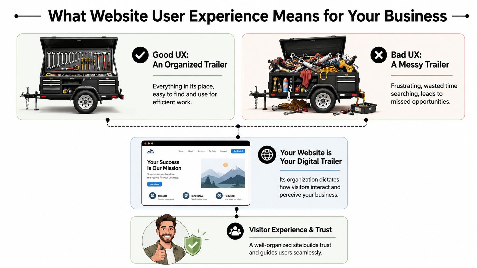
Contractors usually understand UX once you stop talking like a designer and start talking like a foreman. Think about a tool trailer. If every wrench, fitting, and cutoff wheel has a place, the crew moves faster. If everything is piled in the corner, people waste time, get irritated, and sometimes use the wrong thing.
Your website works the same way.
The tool trailer test
A visitor shows up with a job to do. They aren't there to admire your website. They want to know one of a few things fast.
Maybe they need a vac truck. Maybe they need welding support. Maybe they want to know if you work in Duchesne County, Uintah County, or beyond. Maybe they're a CDL driver looking for a better employer.
If the menu is confusing, the pages are scattered, or the contact options are buried, the site feels like a messy trailer. People don't say, “This site has poor information architecture.” They say, “I can't find anything,” and they leave.
That's why website user experience design matters. It organizes your digital space around what the visitor needs to accomplish, not around how your company happens to be structured internally.
Three pillars that matter
Most of UX for a contractor website comes down to three simple tests.
Short forms, click-to-call, readable text, mobile-friendly layouts
Trust
Does this company look legitimate and capable?
Professional design, current photos, clear service area, consistent branding
The first pillar is navigation and layout. A strong site doesn't make people dig through vague labels like “Solutions” or “Resources” when what they need is “Services,” “Careers,” or “Request a Quote.”
The second is ease of use. A form that asks for too much too early kills momentum. A phone number that isn't clickable on mobile wastes an easy opportunity. Tiny text, weak contrast, and crowded pages make the site harder to use than it needs to be.
The third is trust. People judge your operation partly by how your website feels. If it looks outdated, broken, or unfinished, they start wondering what else is disorganized.
A polished website doesn't replace good field performance. It does help a buyer believe you'll deliver it.
The practical takeaway is simple. Review your site the way a stranger would. Don't ask whether it has all the information. Ask whether the right person can find and use that information without effort.
If the answer is no, that's a UX problem, not just a design problem.
How Good UX Drives Leads Recruitment and Credibility
A contractor doesn't invest in a website for compliments. The site needs to produce phone calls, quote requests, and applicants. That's where UX stops being abstract and starts looking like a business decision.
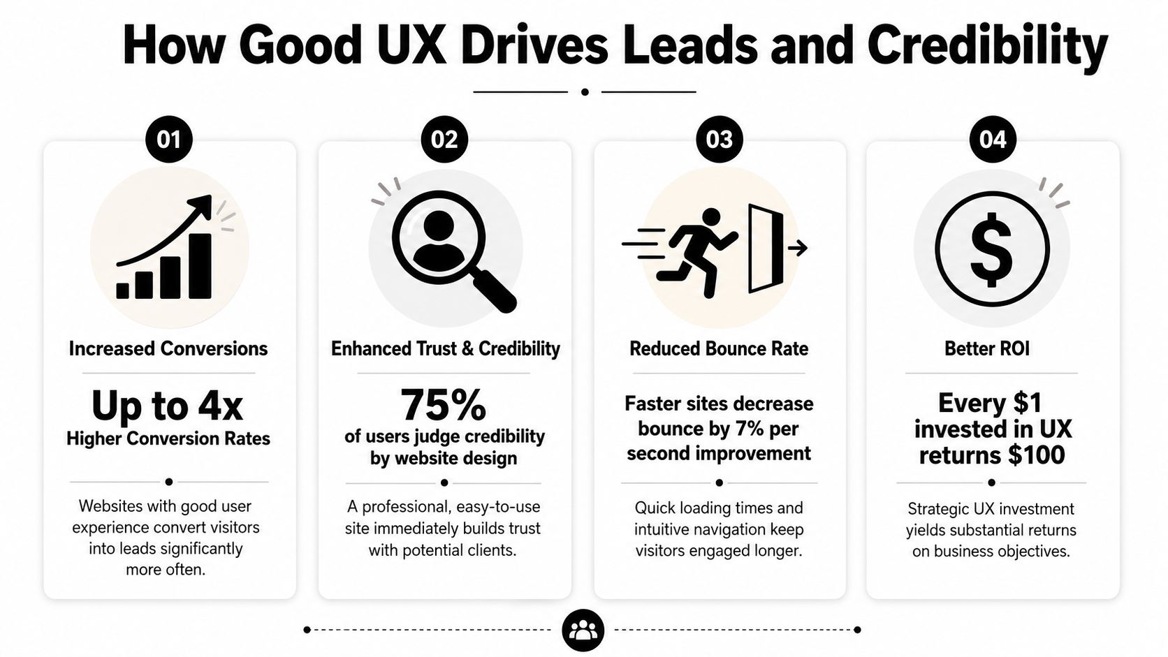
The upside can be substantial. According to DesignRush's roundup of UX statistics, every dollar invested in UX can generate up to $100 in return, which is often described as about 9,900% ROI. The same source also notes that frictionless UX design can increase conversion rates by as much as 400%. For a contractor or oilfield service company, that means the structure of the site can directly affect how many visitors become leads or applicants.
More leads with less friction
A good contractor website doesn't just say “contact us.” It clears a path.
If someone lands on your service page, they should see what you do, where you work, and what to do next. On many underperforming sites, the visitor has to hunt for all three. That's where leads disappear. Not because demand is weak, but because the path is clumsy.
A few things usually work well:
Visible calls to action: “Request a Quote” in the main menu works better than hiding the contact path in the footer.
Short forms: Ask only for what you need to start the conversation.
Service-specific pages: A page about excavation should lead naturally to an excavation estimate request.
Trust cues near the form: Reviews, safety credentials, and service area details reduce hesitation.
If you want a simple way to present credibility elements cleanly, a trust badge generator tool can help package reviews or proof points into something more usable than random screenshots.
For companies focused on lead flow, this is the same logic behind a better website conversion rate strategy. Reduce friction, and more of the traffic you already have turns into real opportunities.
Better recruiting starts with usability
Recruiting is where a lot of contractor sites inadvertently lose good people. The company says it's hiring, but the process sends applicants through a maze. Sometimes it's a PDF. Sometimes it's a desktop-only form. Sometimes the careers page is buried under “About.”
That setup filters out the wrong people. Not the unqualified ones. The busy ones.
A welder on break or a driver between loads won't jump through hoops to express interest. They'll move on to the company with the easier process. Good UX supports hiring by making the careers path obvious, mobile-friendly, and short enough to finish in a real-world setting.
If applying for a job feels like office paperwork, field talent won't finish it.
Credibility gets decided fast
Many local businesses underestimate how much website quality affects perception. A smaller company can look dependable and established online. A capable company can also look disorganized if the site is slow, sparse, or outdated.
Credibility comes from details people notice without thinking about them:
Current project photos
Readable service descriptions
Consistent branding
Clear company contact details
A site that feels maintained rather than abandoned
For industrial buyers, that first impression matters because the consequences are more significant. They're not ordering a T-shirt. They're evaluating whether you seem reliable enough to handle a serious job.
Good UX tells them yes before the first phone call.
Practical UX Upgrades for Your Contractor Website
Most contractor websites don't need a fancy reinvention first. They need practical cleanup. Fix the places where users get stuck, and the site usually starts pulling more weight right away.
One useful way to think about it is task completion. CareerFoundry's overview of UX design notes that well-structured site hierarchies and optimized task flows can improve task completion rates by 20–40%. On a contractor site, that often means more visitors finishing a quote request or job application instead of dropping off halfway through.
Fix the high-friction spots first
Start with the pages tied directly to money and hiring. Don't begin with your history page or a logo refresh.
Make the phone number tap-to-call: On mobile, this should work from the header on every page.
Put “Request a Quote” in the main navigation: Not buried under a submenu.
Create a real careers page: Don't force users to download a document to apply.
Show service areas clearly: If you serve Vernal, Roosevelt, Duchesne, and surrounding areas, say so plainly.
Use plain labels: “Hydrovac Services” beats vague menu text like “Capabilities.”
A lot of this is easier to manage when the site is built on a flexible platform. A well-structured WordPress website for business makes it easier to update service pages, hiring content, and forms without rebuilding the whole site every time something changes.
Build around the jobs people need done
Internal org charts make terrible website navigation. Customers don't care which department owns a service. They care whether you can solve the problem they have today.
That means pages should map to user tasks, such as:
Visitor need
Best page or feature
Get pricing or availability
Quote form with a clear next step
Check service fit
Individual service pages with examples
Confirm service area
Service area page or map
Apply for work
Mobile-friendly careers page
Verify credibility
Projects, certifications, reviews, equipment info
When this is done well, the site feels obvious. That's a compliment. Obvious is good. Obvious gets the job done.
Here's a practical walkthrough that shows the difference between cluttered interfaces and cleaner decision paths:
Use video and visuals to remove doubt
Contractor websites often lean too hard on text or, just as often, on giant photo galleries with no context. The better approach is to use visuals as proof.
Show trucks, crews, fabrication work, equipment, site conditions, and finished results. Add short captions so the visitor knows what they're seeing. A photo of a rig-up yard means more when it's tied to a service, project type, or capability.
A few upgrades usually pay off quickly:
Replace generic stock images with real field photos.
Use headings that answer questions people have.
Keep forms short and place them near relevant content.
Add FAQs for common concerns like service area, turnaround, or equipment types.
Trim dead pages that don't help a visitor take action.
The best contractor websites feel less like advertisements and more like a well-run office counter. Clear signs, direct answers, and no wasted motion.
That's the standard to aim for.
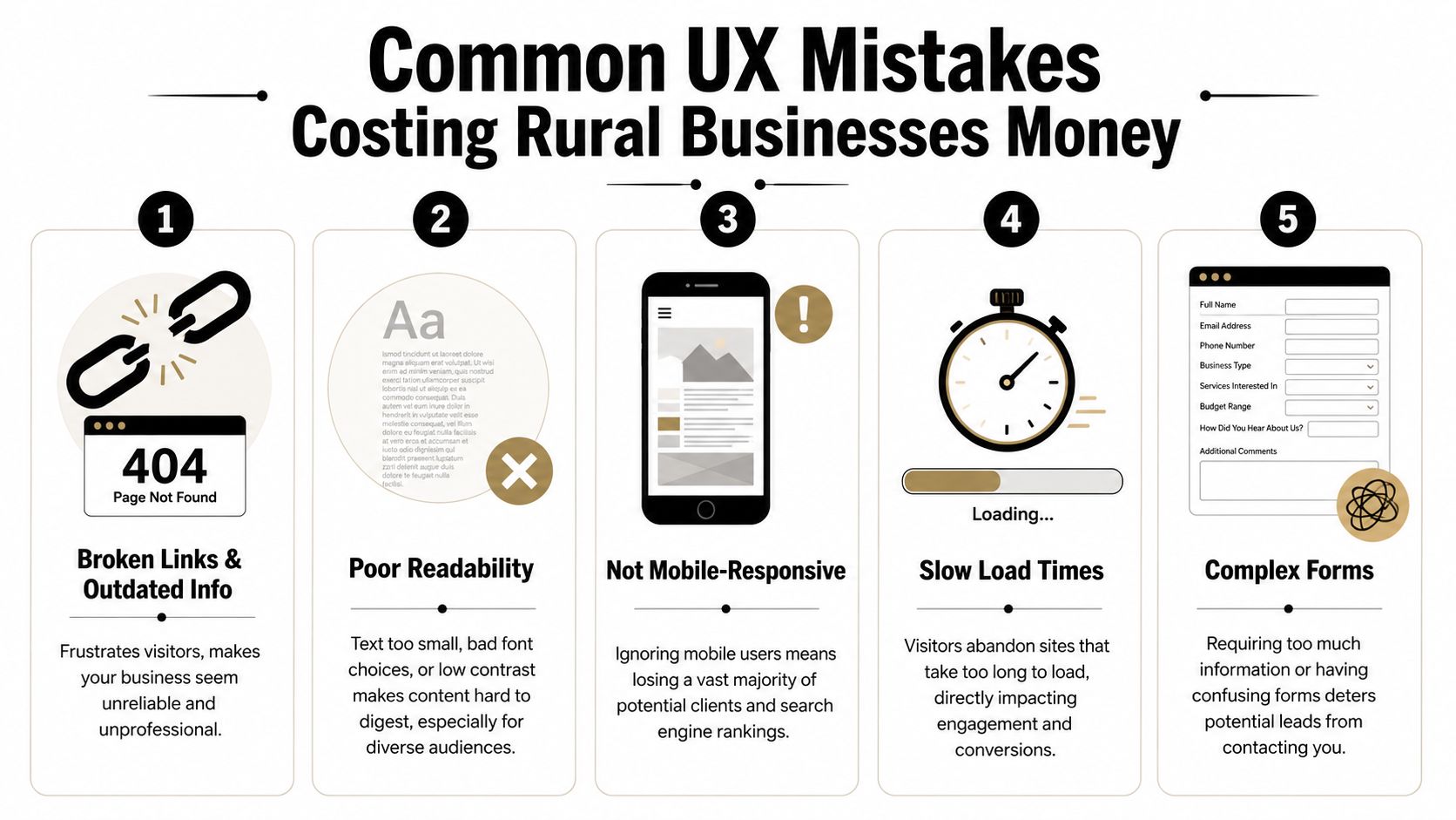
Common UX Mistakes Costing Rural Businesses Money
Some website problems are annoying. Others directly cost you leads and applicants. Rural businesses often deal with both at the same time.
The hard truth is that many local contractor sites still make basic mistakes that turn away good traffic. Not because the owners don't care, but because the site was built once, then left alone while the business kept evolving.
The expensive mistakes I see most often
The first is hidden contact information. If a user has to scroll, search, or switch pages just to find a phone number, the site is slowing down a ready-to-buy visitor.
The second is oversized image files. Contractors want to show off jobs, which makes sense. But if those photos are uploaded straight from a phone or camera with no compression, the site gets heavy fast. On a weak mobile connection, that hurts.
The third is document-first thinking. If your service details, job application, or equipment list live inside downloadable files instead of usable web pages, you're adding friction for no reason.
The fourth is unclear language. Local businesses sometimes write for insiders only. That works if the reader already knows your world. It fails when a property owner, office manager, or project coordinator needs plain-English confirmation that you do the work they need.
A quick diagnostic list helps:
Buried contact paths: Visitors shouldn't have to hunt for a call or quote option.
Outdated information: Old crew photos, expired job posts, and stale service pages make the business look inactive.
Tiny text and weak contrast: Hard-to-read sites lose people fast.
Forms that ask too much: Long forms feel like work, especially on mobile.
Broken mobile layouts: If the site pinches, overlaps, or cuts off content, users won't fight through it.
Why rural conditions make bad UX worse
Rural users don't always browse on ideal connections. They may be on the road, on-site, or using older devices. That changes what “good enough” means.
According to the Wikipedia overview of user experience design, sites that exceed Google's Core Web Vitals thresholds for speed and stability can see conversion rates 10–30% higher than slower, poorly optimized sites. For Uinta Basin businesses, that matters because many visitors are using mobile devices in less-than-perfect network conditions.
Challenging environments expose weak websites. A slow-loading gallery, shifting layout, or heavy script might be tolerable on office fiber. It becomes a problem in the field.
Slow websites don't just test patience. They make the company look less professional than it is.
If your website only works well under perfect conditions, it isn't working well.
Your Prioritized UX Action Plan
Most owners don't need another vague reminder to “improve the website.” They need a sequence. What should get fixed first, what can wait, and what deserves a bigger rethink later.
The best UX plans start with friction removal, then move into structure, then into refinement. That keeps the work practical and tied to business results instead of endless tinkering.
This week
Handle the obvious issues first. These are the fixes that stop immediate leakage.
Test your site on your own phone: Not in the office, but the way a customer would use it.
Check every main contact path: Phone number, quote form, contact page, and careers page should all work cleanly.
Move key actions higher: Put quote requests and job opportunities where they're visible without hunting.
Remove dead weight: Broken pages, outdated PDFs, and old announcements should go.
Review readability: If the text is hard to read, increase contrast and size.
A good companion for this step is a structured WCAG AAA checklist. Even if you don't pursue every accessibility standard at once, it gives you a practical way to catch readability and usability issues that affect real visitors.
The next 90 days
Once the urgent problems are fixed, clean up the foundation.
Build clearer service pages. Simplify the main menu. Create a dedicated careers section. Add real project photos with context. Make sure each important page points to one next action instead of several competing ones.
This is also the right time to rethink navigation depth. Critical pages should be easy to reach. Visitors shouldn't need to bounce through multiple layers just to find employment info, equipment details, or service-area coverage.
You'll usually get the best results by focusing on these business paths:
Priority
What to improve
Why it matters
High
Quote flow
Direct impact on leads
High
Careers flow
Direct impact on recruiting
Medium
Service page clarity
Helps qualify the right inquiries
Medium
Mobile usability
Supports field and rural users
Ongoing
Photo and content updates
Keeps credibility current
Longer-term improvements
After the basics are solid, you can add more advanced UX improvements. That might include better FAQ content, tighter local SEO alignment, stronger review presentation, or smarter automation around lead intake.
It may also include AI-assisted interactions. Used carefully, they can help answer common questions or guide users to the right page. But the experience has to stay clear and trustworthy. The Moqups article on hidden work in UX/UI design notes that as AI-driven interactions become more common, UX has to preserve transparency and trust. For a service business, that means users should understand what the tool is doing and still have a clear path to a real human when needed.
Don't bolt on an AI chat widget just because everyone else is doing it. If it blocks the contact form, gives muddy answers, or feels like a gimmick, it hurts more than it helps.
The long-term goal is simple. Build a site that works under real conditions, supports the way your customers and applicants behave, and keeps earning its place in the business.
If your website isn't bringing in enough leads, helping you recruit, or reflecting the quality of your company, Northpoint Web can help. We build practical websites for contractors, oilfield service companies, trucking businesses, and other growing companies in the Uinta Basin that need their site to do more than sit online.
A DIY website can cost under $50 per month, while a professional site from a freelancer or agency usually lands somewhere from $3,000 to over $10,000. That spread is normal. Website price depends entirely on how you build it and what you need it to do.
If you're a contractor in Vernal, a trucking company in Roosevelt, or an oilfield service outfit in Duchesne, you've probably already seen this. One quote looks cheap enough to ignore. Another looks like someone priced you a new piece of equipment. Both might be honest. They just aren't talking about the same thing.
A website is a lot like a truck. A basic pickup gets you down the road. A fully outfitted work truck with toolboxes, racks, upgraded suspension, and a diesel motor costs a whole lot more because it does a whole lot more. Same with websites. A simple online brochure is one thing. A site that brings in leads, filters bad prospects, and helps you recruit CDL drivers or operators is a different asset entirely.
That distinction matters more in rural Utah than most generic website articles admit. Around the Uinta Basin, labor is tight, trust matters, and buyers often check your website before they call. If your site can't help you win jobs or attract workers, the cheap option can turn into the expensive one fast.
How Much Does a Small Business Website Really Cost
A contractor in the Uinta Basin can get one quote for $800 and another for $8,000, and both can be honest numbers. They are pricing different tools for different jobs. A cheap site is like a basic trailer you pull to the job. A growth-focused site is more like a service truck stocked to keep work moving and bring in the next call.
That gap confuses a lot of owners. It should not. Website cost depends on what the site is expected to produce for the business.
A simple site can be inexpensive. A site built to bring in quote requests, show up in search, answer common questions, and help recruit operators or CDL drivers costs more because it does more work. If you want a clear picture of what goes into a serious build, review what's really included in a $7,500 website build.
The easiest way to understand pricing is to compare it to another marketing service owners already know. If you've ever looked at a real estate photo pricing guide, you know the price changes based on the job. A few basic listing photos cost less than a full package with drone shots, twilight images, and marketing extras. Website pricing works the same way. A home page and contact page are one level. Lead forms, hiring pages, local SEO setup, and custom service content are another.
What you're really buying
For a small business in rural Utah, a website usually needs to earn its keep in a few specific ways:
Build trust so a prospect picks up the phone instead of calling the next company
Generate leads from Google searches, map listings, and referrals
Help recruiting when skilled labor is hard to find and harder to keep
Save office time by answering basic questions before someone calls
That last point gets ignored in generic website guides. Around here, labor is tight. If you're an excavation company, HVAC shop, diesel outfit, or oilfield service business, your site is not just a brochure. It can help you win work and fill open positions. Those two outcomes matter more than having fancy design features nobody asked for.
Here is the rule I give local owners. If the website only needs to show you exist, keep it lean. If it needs to help grow revenue or attract good people, pay for a professional build that is set up to do that job well.
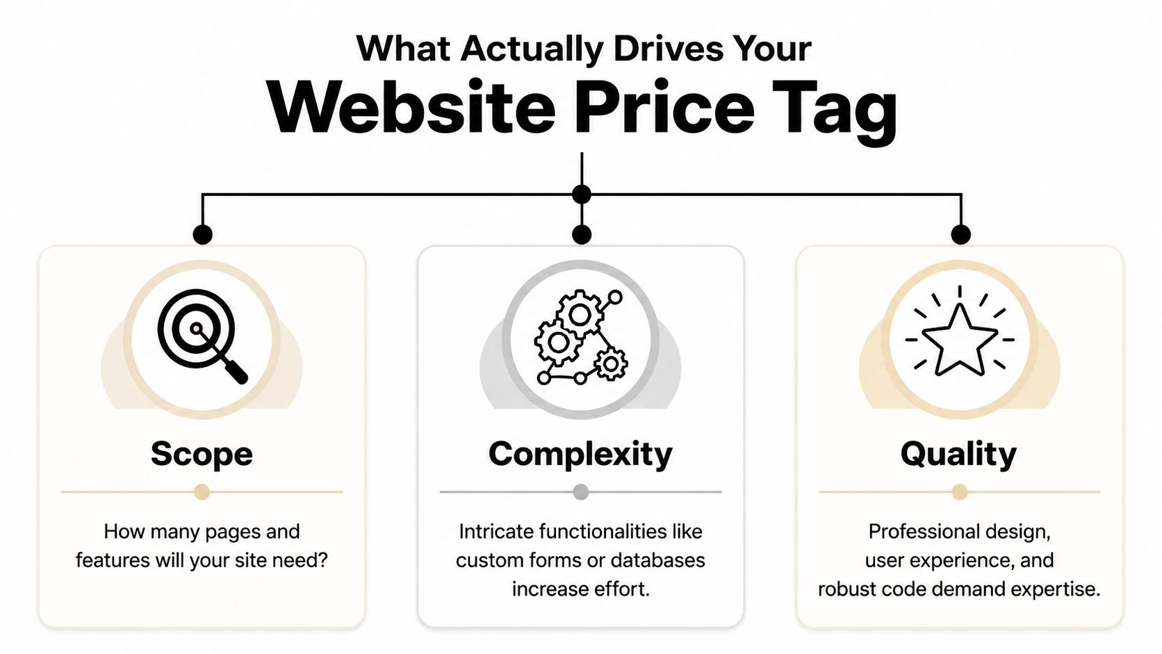
What Actually Drives Your Website Price Tag
The number of pages matters, but it usually isn't the main driver. Functionality complexity is where price starts to move.
Industry guidance shows a basic DIY WordPress build can start near $100 to $400 upfront with $10 to $75 per month in hosting and tools, while a custom small-business site commonly rises to $2,000 to $8,000 with a freelancer or $10,000 to $35,000+ with an agency when it includes custom design, SEO setup, integrations, or e-commerce features, as outlined in Elementor's website cost guide.
Imagine building a workshop. Square footage affects cost, sure. But the wiring, concrete work, specialty tools, and finishes are what really separate a basic shed from a building that supports serious work.
Scope is the size of the job
Scope is the footprint.
If you need a home page, about page, service pages, gallery, contact page, and maybe a careers page, that takes more planning and content than a one-page site. More pages usually mean more writing, more layout work, and more decisions.
But don't get stuck counting pages like they're the whole story. A seven-page site can still be simple. Another seven-page site can be a headache if every page has custom sections, forms, filters, or special content needs.
Complexity is where cost jumps
This is the big one.
Add a quote request system that routes leads by service type. Add hiring forms for CDL drivers. Add booking, CRM integration, e-commerce, shipping logic, or custom location pages. Every feature adds setup, testing, and future maintenance.
A lot of business owners don't see that part at first. They compare a cheap site to a growth-focused site and think the only difference is design. It isn't. The difference is what happens behind the scenes. If you want a plain-English breakdown of that middle tier, this explanation of what's really included in a $7,500 website build is worth reading.
Here's a simple way to judge complexity:
Low complexity means brochure pages, basic contact forms, standard templates
Medium complexity means lead funnels, service-area pages, stronger SEO setup, better forms
High complexity means custom applications, recruiting workflows, online payments, portals, or deep integrations
The video below gives a solid overview of how these moving parts affect budget.
Quality decides whether the site works or just exists
Two shops can both say they build websites. That doesn't mean they build the same thing.
Quality shows up in the writing, layout, mobile performance, photo selection, calls to action, code quality, and how easy the site is to update later. It also shows up in the strategy. A decent builder can make a website look acceptable. A strategist builds it so a contractor gets better calls and fewer tire-kickers.
A cheap site often lowers launch cost, not ownership cost. If it breaks, looks dated, or fails to convert, you pay for it later.
That's why small business website cost should be judged like any other capital expense. Don't ask only what it costs to buy. Ask what it costs to own, use, and rely on.
Choosing Your Path DIY vs Freelancer vs Agency
A website builder, a freelancer, and an agency can all put a site online. That does not mean they solve the same business problem.
For a contractor in Roosevelt or an oilfield service company in Vernal, the question is simple. Do you need a site that just proves you exist, or a site that helps you win bids, get quote requests, and recruit people who can pass a drug test and show up on Monday? Website pricing works the same way as buying equipment. A basic tool is cheaper. The right tool earns its keep.
When DIY makes sense
DIY works for a new business that needs a clean placeholder fast.
If you are just getting started, a platform like Wix or Squarespace can handle the basics. You can list services, show your phone number, add a form, and stop losing work to competitors who at least have something online.
That said, DIY usually tops out early.
Once you need better service-area pages, stronger local search visibility, hiring pages, or clearer calls to action, the cracks show. You end up wrestling with templates instead of running your business. For a serious contractor, that is like trying to trench with a shovel because the shovel was cheaper than a machine.
When a freelancer is the practical middle ground
A good freelancer is often the right fit for a small business that has outgrown DIY but does not need a full outside team.
This route can work well for local service companies with a defined scope and decent source material. If you already know your services, have solid photos, and can give feedback quickly, a freelancer can build a strong site without a lot of overhead.
The tradeoff is depth and capacity. One person may be handling design, copy, SEO setup, edits, and support. If that person is good, great. If that person disappears during hunting season, gets booked out, or is weak in one area, your project slows down or comes out uneven.
When an agency is the right tool
Agency work fits businesses that expect the website to produce results, not just sit there.
If the site needs to support lead generation, recruiting, content planning, search structure, maintenance, and ongoing improvement, an agency is usually the better choice. That matters in the Uinta Basin, where many companies are fighting two battles at once. They need more qualified inquiries, and they need more skilled labor. Generic website advice misses that. Around here, the hiring side often matters just as much as the sales side.
If you are still sorting out platform options before choosing a provider, this guide to small business website platforms will help you compare the tradeoffs.
Website Build Options Compared
Factor
DIY (Wix, Squarespace)
Freelancer
Agency (Northpoint Web)
Upfront cost
Lowest
Middle
Higher
Monthly cost
Predictable subscription
Varies by hosting and support setup
Usually paired with ongoing support
Best for
Basic credibility
Solid custom site with moderate needs
Lead generation, recruiting, long-term growth
Owner involvement
High
Medium
Medium, but more guided
Flexibility
Limited
Good
Highest
Support after launch
Usually self-managed
Depends on the freelancer
Usually structured
Recruiting and SEO readiness
Basic
Possible if scoped well
Better fit for businesses that need strategy and execution
If your website needs to help hire operators, drivers, techs, or office staff, DIY is usually the wrong choice. It lowers launch cost, but it often costs more in missed calls, weak applicants, and rebuilds later.
My recommendation is straightforward. Use DIY if cash is tight and you need to get online this month. Hire a freelancer if the project is clear and your needs are moderate. Hire an agency if the website affects revenue, staffing, or both. A $50 tool should not be carrying a $500,000 part of your business.
Real Website Costs for Uinta Basin Businesses
Generic website advice usually stops at pages and design. Around here, that misses the point. For a lot of Uinta Basin businesses, the website isn't just a brochure. It's part sales tool, part recruiting tool, part credibility check.
A local business owner doesn't just need "a website." He needs a site that helps him solve the problem right in front of him.
Excavation contractor in Duchesne
This owner needs more than a gallery of dirt work and pipe installs.
He needs project photos, service pages, trust signals, a clean quote request form, and a recruiting page that doesn't look like an afterthought. If he needs operators, laborers, or CDL drivers, the hiring side can't be buried in a generic careers tab with one sentence and a bad application form.
Recent analysis focused on rural energy markets says a standard $5,000 brochure site often fails to attract qualified tradespeople because it lacks recruiting features such as job-board integrations and employee testimonial structures. The same analysis says recruitment costs for skilled trades in rural U.S. energy sectors exceed $4,000 per hire, and the added recruiting premium for the right website functionality is typically 15% to 25% of the total build cost in these markets, according to this Uinta Basin-focused website cost discussion.
That should change how you budget. If one good hire matters, the site needs to support hiring from day one.
Oilfield service company in Roosevelt
This company usually cares about trust, capability, and professionalism.
The site should show service lines clearly, explain the company's operating standards, make it easy for buyers to understand what crews and equipment are available, and give larger clients confidence that they're dealing with a legitimate operation. Safety, responsiveness, and clean presentation matter here because procurement teams and field managers are judging your company before they ever call.
For this kind of business, the website earns its keep by helping win better conversations. It also supports recruiting when the labor market tightens. A weak site makes a serious company look smaller than it is.
This one is different. The main question isn't hiring. It's control.
A rental owner may want a site that shows the property well, answers guest questions, builds trust, and encourages direct booking inquiries instead of depending entirely on third-party platforms. That pushes the budget toward better photography, polished layout, stronger mobile experience, and cleaner calls to action.
The lesson across all three examples is the same. The right website budget comes from the business problem. Not from a random average on the internet.
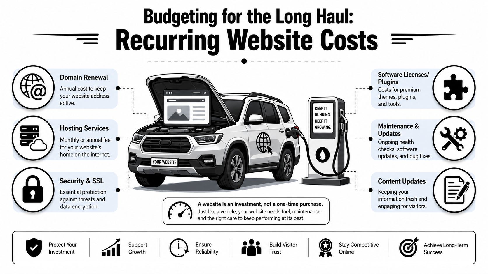
Budgeting for the Long Haul Recurring Website Costs
A website isn't a one-time print job. It's more like a truck in your fleet. Once you buy it, you still have fuel, tires, insurance, service, and the occasional repair. Ignore those costs and the thing stops doing its job.
Independent industry guides put standard small-business builds at roughly $1,500 to $15,000 for a 5 to 8 page site, while recurring expenses commonly add $500 to $2,400 per year for hosting, domain, maintenance, backups, and security updates. For service businesses, maintenance retainers of $100 to $500 per month are common, based on this small business website cost guide.
The first-year budget is what catches people
A lot of owners only budget for the build.
Then the domain renews. Hosting renews. Plugins need licenses. WordPress needs updates. Forms break. A staff member wants new service pages. A phone number changes. Suddenly the website didn't cost what the invoice said. It cost the invoice plus the upkeep.
Your real small business website cost is build price plus the cost to keep it secure, current, and useful.
That's why I tell people to budget in two buckets from the start:
Build cost for design, content, setup, and launch
Ownership cost for hosting, maintenance, security, backups, and edits
What ongoing website costs usually include
Most recurring website budgets include a mix of the following:
Hosting that keeps the site online and loading reliably
Domain renewal so you keep ownership of your web address
Security and backups in case the site gets hit or something breaks
Plugin and software licensing for forms, SEO tools, booking tools, and premium features
Maintenance labor for updates, testing, fixes, and small content changes
Reputation work can also become part of ongoing digital costs, especially if reviews or search trust are affecting leads. If that issue is on your radar, this overview of pay-for-results reputation management services is a useful companion read because reputation and website conversion usually work together.
The bottom line is simple. If the website matters to your business, maintenance is not optional. You don't park a truck all winter, skip oil changes, and expect it to haul without problems. Same deal here.
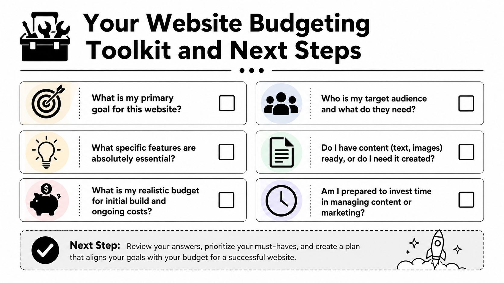
Your Website Budgeting Toolkit and Next Steps
If you want accurate quotes, don't start by asking, "What does a website cost?" Start by answering the questions that define the job.
Six questions to answer before you ask for quotes
Write these down before you call anyone.
What is the website supposed to do? If the answer is "just have something online," your budget can stay lean. If the answer is "bring in leads, support sales, and help recruit," expect a more serious build.
Who needs to use it? Homeowners, commercial buyers, truck drivers, job applicants, vacation guests, and municipal contacts all need different information. One site can't speak clearly to everyone unless it's planned well.
What features are required from day one? Quote forms, hiring forms, job pages, service-area pages, galleries, booking requests, CRM connections, and review integration all change scope.
Do you already have content and photos? Good websites need good raw material. If you don't have quality jobsite photos, team photos, service descriptions, or hiring copy, somebody has to create them.
Who will handle updates after launch? Some owners want control. Others never want to log in. Be honest. That answer affects platform choice and support needs.
What's your real budget for build and ownership? Not your wish budget. Your actual budget. If you only plan for launch and ignore recurring costs, you're setting the project up wrong.
"The cheapest website is usually the one that only has to exist. The minute it needs to perform, strategy matters."
Three practical budget levels
I like to frame website budgeting around function, not vanity.
Stronger service pages, conversion-focused structure, better messaging, room for SEO and lead capture
Established service business that wants more calls
Recruiting and Growth Engine
Hiring pages, applicant flow, stronger trust content, service clarity, recruitment support, maintenance plan
Contractors, oilfield services, trucking, and industrial firms trying to grow crews
You don't need to name your project this way when you get quotes. But you should know which category you're shopping for. A lot of bad website decisions happen because owners ask for a business card site when what they need is a lead and recruiting system.
Common questions from local business owners
Can I update the site myself? Usually, yes. But there's a big difference between changing text on a page and managing plugins, forms, security, and layout problems. Know which kind of update you're talking about.
Should I start small and add later? Usually yes, if the foundation is right. Starting lean is smart. Starting cheap on the wrong platform is not.
Do I need ongoing SEO right away? Not every business needs a heavy SEO push on day one. But every business does need clear service pages, solid messaging, clean structure, and a site that doesn't look abandoned.
Should I choose based on lowest bid? No. Choose based on whether the bid matches the business outcome you need. Lowest bid is only a win if the site does the job.
What should I bring to the first conversation? Your services, service areas, photos, logo, competitor examples, and a clear answer about whether hiring is part of the website's job.
If you're a local contractor or industrial business owner, the right move is to treat your website like any other business asset. Buy the right tool for the work. Don't overbuild. Don't underbuy. And don't confuse a cheap launch with a smart investment.
If you want help sorting out what your website should cost for your business, Northpoint Web works with contractors, oilfield service companies, trucking businesses, and other rural Utah companies that need websites built for leads, recruiting, and day-to-day credibility. A straight conversation about your goals, your market, and your realistic budget will save you a lot of wasted time.
Your website often decides the next call before the phone rings. A contractor bidding larger jobs, a trucking company trying to hire drivers, or an oilfield service firm chasing vendor approvals all face the same problem. A decent-looking site is not enough if it fails to answer basic questions fast, prove you can do the work, and give people a clear next step.
That is the gap this article addresses.
These are not generic design inspirations. They are working patterns for businesses that sell in practical, high-trust markets where buyers check capabilities, service area, safety record, equipment, and responsiveness before they reach out. In rural and industrial sectors, a website has to do more than look modern. It has to help generate leads, support recruiting, and build confidence with customers who may be comparing you against larger competitors.
The seven examples below focus on that job. Each one shows a different way a small business site can pull its weight, whether that means turning traffic into quote requests, helping applicants self-qualify, or making a local company look credible enough for serious commercial work. If you are still deciding on the right setup, this guide to small business website platforms will help you choose the tools behind the site. Teams also use systems like the SupportGPT-1 platform to handle first-response questions and keep inquiries from going cold.
Below, the value is in the analysis. The goal is to show what works for contractors, trucking companies, oilfield operators, real estate investors, vacation rentals, and rural businesses, and why those choices matter.
1. Example 1 The All-in-One Digital Partner Website
A business owner in trucking, oilfield, or the trades rarely visits a website with one question in mind. They may want to check services, compare credibility, size up industry fit, and decide whether to call, all within a few minutes. That is why this type of website matters. It supports several business goals at once without feeling scattered.
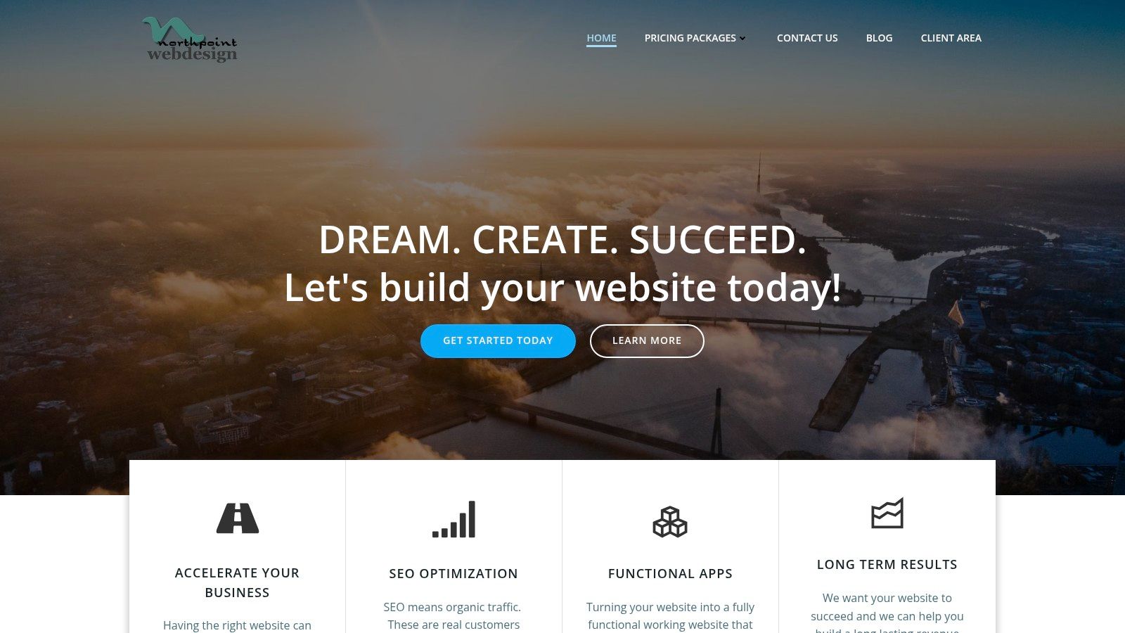
Northpoint Web is a good example of that model. The site is structured like an operating asset, not a brochure. Visitors can sort by service, industry, and business problem, which is a practical fit for companies that need lead generation, recruiting support, and stronger market credibility from the same website.
What makes this one different
The strongest part of this approach is the structure. Instead of forcing every visitor through the same generic homepage message, it gives different audiences a logical path. A contractor can look for lead generation help. A rural service business can look for local visibility. An owner in a specialized field can check whether the company understands how industrial sales cycles work.
That matters because these buyers do not all convert the same way. Some are ready to request help now. Others are comparing vendors and looking for proof that the team understands field operations, service areas, hiring pressure, and long sales cycles. A site that handles those differences well usually earns more qualified inquiries.
Northpoint's page on lead generation for contractors shows that logic clearly. It speaks to a specific business problem instead of hiding behind broad agency language.
Practical rule: If your website needs to bring in leads, support hiring, and reassure larger buyers, the structure has to do more than look polished.
What works for industrial businesses
For rural and industrial companies, a good all-in-one website usually shares a few traits.
Industry-specific paths: Separate pages for trucking, oilfield, excavation, fabrication, electrical, or other service lines help visitors confirm fit fast.
Clear next steps: Quote requests, consultation forms, click-to-call options, and contact prompts should match the visitor's intent.
Proof early on: Certifications, project examples, service territory details, and plain-language positioning belong near the top.
Tracking behind the scenes: Forms, call tracking, and analytics let owners see which pages produce real conversations.
This is also where platform decisions start to affect growth. A simple builder can work for a very small operation, but businesses with multiple services, locations, or audience segments usually need more flexibility. Northpoint's guide to small business website platforms is useful if you're comparing ownership, editing control, and long-term maintenance.
Local visibility is part of this model too, especially for service companies that depend on map results and location-based searches. The same principles behind optimizing local search for electricians apply here. Clear service pages, strong geographic signals, and trust markers help the right visitors find you and decide faster.
There are support layers that become useful as the business grows. If the company needs to respond after hours or sort inbound questions before a staff member steps in, tools like the SupportGPT-1 platform can support that process.
The bigger point is simple. Once a small business has a website, the primary question is whether that website pulls its weight. In industrial markets, the best examples do not just look current. They help owners win calls, recruit better people, and prove credibility before the first conversation.
2. Example 2 The Lead-Generation Machine for Contractors
Contractor websites usually fail for one simple reason. They talk like a brochure instead of selling like an estimator. Visitors land on the homepage, see a vague headline, a stock photo, and a menu with "Services" and "About," but nothing tells them whether the company handles their exact kind of job.
The better pattern is a site built around service intent. That means separate pages for excavation, welding, grading, utility work, concrete, or fabrication, each with plain language and a direct next step. Northpoint's page on lead generation for contractors aligns with this approach because contractor traffic usually converts when the page matches the task the visitor already has in mind.
Why contractor sites fail
Most contractor sites bury the evidence people need. They hide project photos, don't mention service areas clearly, and make the contact process feel open-ended. On mobile, the problem gets worse because visitors are often trying to call from a truck, a jobsite, or an office between tasks.
A practical contractor site keeps the first screen focused on job type, geography, and action. It should answer three questions immediately: what do you do, where do you do it, and how does someone request a bid?
What this pattern gets right
A contractor-focused site should use project galleries as proof, but galleries aren't enough on their own. Each image should support a real service page, not replace one. Search visibility and conversions improve when a page is built around a single service and a clear market, which is why local search strategy matters for trades like optimizing local search for electricians, plumbers, excavation crews, and other field-service operators.
The homepage should qualify the visitor fast. The service pages should close the gap between interest and inquiry.
3. Example 3 The 24-7 Recruiter for Trucking Companies
A trucking company website often has the wrong primary audience. It speaks only to shippers, brokers, or general business partners, while the company's real bottleneck is driver recruiting. If the business needs CDL drivers, owner-operators, mechanics, or yard help, the website should reflect that reality.
The strongest trucking websites act like recruiting infrastructure. They answer schedule questions, equipment questions, route questions, and company-culture questions before the applicant ever calls. That saves office time and helps filter for people who are a fit.
Recruiting pages need a different message
A recruiting page shouldn't sound like a corporate overview. It should sound like a job decision. Drivers want to know what kind of work they'll be doing, what the fleet looks like, how communication works, and whether the company feels steady and professional.
That means the page structure changes. Instead of starting with company history, the site should lead with openings, expectations, and an application path that works on mobile. Long PDFs and clunky forms lose people.
What a strong trucking site includes
The best pattern here is straightforward:
Role-specific recruiting pages: Separate paths for CDL drivers, mechanics, dispatch support, or equipment operators.
Fast mobile applications: Short forms first, deeper screening later.
Real operations detail: Freight type, regions served, home time expectations, and equipment snapshots.
Trust signals for workers: Safety mindset, organized communication, and signs the company isn't chaotic.
One of the biggest mistakes I see is treating the careers page like an afterthought. For trucking companies, that page is often more valuable than an oversized homepage banner or a generic "About Us" section. If hiring is the business constraint, the website should support hiring every day, not just branding.
4. Example 4 The Credibility Builder for Oilfield Services
Oilfield and industrial service websites have a tougher job than many local business sites. They aren't just trying to get a phone call. They often need to reassure operations managers, procurement teams, and safety personnel that the company is competent, organized, and low-risk to work with.
That's why credibility has to show up before design flair. A polished layout helps, but in this market people are looking for service capability, coverage area, certifications, safety language, equipment readiness, and proof that the company understands field conditions. A site built with that in mind usually performs better than one built around abstract branding.
Why credibility comes before conversion
Businesses in oilfield services don't win trust with clever copy alone. They win it with clarity. Visitors should be able to confirm what crews do, what sectors they serve, and how to start a conversation without hunting through the menu.
Northpoint's small business web design service reflects this practical approach. For industrial companies, web design isn't mainly about aesthetics. It's about presenting the company in a way that supports qualification, sales, and vendor confidence.
Field note: In industrial markets, "professional" usually means easy to verify, easy to contact, and easy to understand.
The pages that matter most
An oilfield services site should usually prioritize a tighter set of pages than owners expect:
Core service pages: Roustabout, hydrovac, reclamation, welding, trucking, environmental, or whatever the operation provides.
Safety and compliance signals: Enough information to show seriousness without overwhelming the visitor.
Service area clarity: Basins, counties, and regions served.
Contact paths by intent: Estimate requests, urgent service calls, and recruiting shouldn't all go through one generic form.
A visually impressive site can still underperform if it lacks service-area clarity, trust signals, or one obvious conversion path. That point lines up with the argument in Squarespace's discussion of small business website examples, especially for businesses where visitors need fast, task-focused answers rather than design inspiration.
5. Example 5 The Motivated Seller Magnet for Real Estate Investors
A "we buy houses" site has one job. Reduce friction for someone who's under pressure and not interested in browsing. This audience isn't comparing visual styles. They're trying to decide whether the business seems trustworthy enough to contact right now.
That changes everything about the build. The copy should feel direct and calm. The form should be short. The page should explain the process in plain terms without sounding evasive or overproduced.
Simplicity wins here
This kind of site benefits from fewer choices, not more. Too many menu items, investor buzzwords, or aggressive CTA language can make the whole thing feel less credible. A clean page with a clear promise and an easy submission path usually does better than a big site stuffed with unrelated content.
Good real estate investor sites often work best when they repeat a few core elements across the page:
Immediate problem recognition: Inherited property, repairs, relocation, foreclosure pressure, unwanted rental, or vacant home.
Simple process framing: Submit details, receive contact, review options.
Local proof of presence: Cities served, recognizable geography, and a real business identity.
Low-friction contact: Form, call button, and sometimes text as an option.
What to avoid
The biggest mistake is trying to sound too polished. Sellers in difficult situations are often skeptical. They don't need a corporate tone. They need plain communication that feels human and local.
A second mistake is adding too much explanation before the form. If the visitor already wants help, the website shouldn't make them scroll through a long investor manifesto to get there. In this niche, empathy and clarity beat clever branding every time.
6. Example 6 The Direct Booking Engine for Vacation Rentals
Vacation rental websites have a different challenge. They need to sell an experience, but they also need to answer practical questions fast enough that the guest doesn't leave and book on a marketplace instead. The site has to do both jobs at once.
A good example in this category uses strong photography, but it doesn't stop there. It supports booking confidence with property details, availability flow, local information, and policies that are easy to find. That's what turns interest into direct reservations.
This site sells confidence, not just a stay
Owners sometimes over-focus on mood and under-focus on logistics. A beautiful gallery matters, but so do sleeping arrangements, map context, amenities, and clear booking instructions. Guests want to imagine the stay and confirm the fit.
Platform choice matters too. Some owners can use a builder with integrated booking tools. Others need WordPress or a custom setup because they want more control over content, SEO, and integrations. The right answer depends on whether the site is mainly a brochure for listing traffic or a true direct-booking asset.
The booking path has to stay short
The strongest vacation rental sites keep users moving with minimal detours. Every page should support the next question. Can I stay here, when is it available, what does it cost, and how do I book?
"If direct booking is the goal, don't hide the booking path behind decorative scrolling and oversized lifestyle sections."
Owners also need to remember that mobile friction is expensive. People often browse accommodations from their phone, compare several options quickly, and abandon anything that feels slow or confusing. In this niche, clean UX and booking clarity are just as important as brand presentation.
7. Example 7 The Digital Main Street for Rural Businesses
A customer is driving through town, needs a part, a meal, or a service, and checks your site from a phone before deciding whether to stop. In rural markets, that moment carries more weight than it does in a dense city. The website often stands in for storefront traffic, word of mouth, and long-standing local familiarity.
That is why this type of site works best as a practical trust tool. It should answer the questions a new customer asks first. Are you open? Where are you located? What do you sell or provide? Can someone reach a real person quickly?
Local clarity beats decorative design
Rural hardware stores, feed suppliers, cafes, boutiques, repair shops, and family-run service businesses do not need oversized websites with complicated effects. They need a site that confirms the basics fast and makes the business feel real.
The strongest examples put the operating details near the top of the page. Hours, address, phone number, service area, and a short summary of products or services should be visible without hunting through menus. Good photography still matters, but in this category it should show the actual storefront, staff, trucks, inventory, or workspace. Stock imagery weakens trust.
This matters even more for industrial and trade-adjacent rural businesses. A welding shop, ag supplier, equipment repair company, or local hauler may get visitors who are comparing options quickly from the road, from a jobsite, or between calls. If the site hides the essentials, the next business gets the inquiry.
What these sites should get right
The best digital main street websites usually share a few traits:
Clear business facts: Hours, map, phone number, town, and service radius.
Simple page structure: Products, services, about, and contact, without extra layers.
Proof the business is active: Real location photos, current reviews, recent updates, and accurate business details.
Mobile usability: Fast loading, tap-friendly buttons, and contact info that is easy to use from a phone.
There is a real trade-off here. Owners sometimes want the site to feel warm and personal, which is a good instinct. But personality should support usability, not slow it down. A short welcome message, a few honest photos, and a clear explanation of what the business does usually outperform a homepage filled with sliders, pop-ups, and generic marketing copy.
A smaller site can do this job well.
For rural businesses, I usually see better results from a tight five to ten page website than from a sprawling build that is hard to maintain. If staff cannot update hours, seasonal services, product categories, or contact details quickly, the site starts creating confusion instead of confidence.
Local brick-and-mortar shops, cafes, boutiques in rural areas
Boosts local discoverability, community storytelling, simple e‑commerce options
Build a Website That Works as Hard as You Do
A business owner gets the call, the form fill, or the job application long before a prospect decides to trust the company. That decision often happens on the website. For contractors, trucking fleets, oilfield service companies, and rural operators, the site has a clear job. It needs to generate qualified leads, help recruit reliable people, and prove the business is credible enough to call back.
As noted earlier, website adoption is up across small business. That changes the standard. A company is no longer judged on whether it has a website at all. It is judged on whether the site makes it easier to hire the company, apply for a job, request service, or verify that the operation is legitimate.
That is the key lesson behind these examples. The strongest sites in industrial and trade sectors are built around business priorities, not design trends. A contractor site should make it easy to request an estimate and confirm service areas. A trucking site should reduce friction for drivers who want to apply from a phone. An oilfield site should support longer sales cycles with certifications, capabilities, equipment details, and proof of field experience. A rural storefront or service business should show hours, location, reviews, and the next step within seconds.
I see the same pattern in underperforming sites. The company itself is solid, but the website is vague, outdated, or built like an online brochure. That gap shows up in weak leads, fewer calls, low application volume, and sales conversations that start with avoidable trust questions.
A useful website closes that gap. It helps the business sell, recruit, answer common questions, and qualify prospects before the phone rings.
If your company works in construction, transportation, oil and gas, real estate investing, hospitality, or a rural local market, the target is straightforward. Build a site that supports the way the business wins work. Northpoint Web works with companies in the Uinta Basin and similar markets where practical structure, local visibility, and trust matter more than flashy effects.
If you're ready to build a website that helps your business win jobs, attract applicants, and compete online with confidence, Northpoint Web is a practical partner to talk with. They specialize in website design, SEO, and digital growth for contractors, oilfield companies, trucking businesses, real estate investors, vacation rental owners, and rural small businesses that need more than a digital brochure.
Either your startup has real work happening in the field, crews on job sites, trucks moving, phones ringing, and no website that matches the business. Or you have a basic site up, but it feels thin. It doesn't answer the questions serious buyers ask, it doesn't make your company look established, and it definitely isn't helping you hire welders, operators, drivers, or techs.
That's common in industrial and contracting businesses. Founders put their energy into operations first. They should. But once prospects, partners, and job candidates start checking you out online, your website stops being a side project. It becomes the place where people decide whether your company looks real, capable, and worth contacting.
Typical startup advice often emphasizes branding, flashy homepages, and app-style design trends. This approach overlooks the specific needs of contractors, oilfield service companies, trucking businesses, fabrication shops, and industrial startups. In these sectors, audiences demand concrete evidence. They seek information about your operational locations, your services, the individuals leading the company, and your responsiveness post-project commencement.
A strong website design for startups in these industries has two jobs at once. It has to turn strangers into leads, and it has to help recruit the people you need to grow. If it can't do both, it's underbuilt.
A founder in contracting or industrial services usually sees the website after a long list of urgent needs. Trucks need decals. Insurance needs attention. Estimates need to go out. Hiring never stops. Then a prospect checks your site at 9:30 p.m., or a diesel tech looks you up between jobs, and your website becomes the first test of whether this company feels credible enough to contact.
That is why the website should be treated as a business asset, not a branding accessory. Stanford University research on web credibility found that people often judge a company's trustworthiness by its site design and presentation, especially before any direct contact. For a startup without years of local reputation, that judgment happens fast and carries weight.
What founders usually get wrong
The problem is rarely that the site looks terrible. The bigger issue is that it looks complete while failing to support sales, recruiting, or trust.
I see the same pattern in early-stage service businesses. The homepage talks about passion and commitment, but never says what the company does, where it works, what types of jobs it takes, or why a buyer should believe the team can deliver. In labor-tight markets, the same problem shows up on the hiring side. A candidate cannot tell what roles are open, what equipment they will work on, whether the company looks stable, or how to apply from a phone in under two minutes.
A weak startup site usually breaks down in four places:
Messaging is inward-looking: The copy focuses on the company story instead of customer problems, service lines, and service areas.
Calls to action are unclear: Visitors do not know whether to request a quote, call now, upload plans, or apply for a job.
Proof is missing: There are no project photos, crew photos, certifications, equipment shots, testimonials, or signs of active operations.
The build stops at design: The site may look polished, but it has no clear job in the business and no structure that supports lead flow or hiring.
Founders who want a better handle on the business side of web projects should also read this guide to boosting revenue. It is useful because it shifts the conversation away from taste and toward outcomes.
Why this matters more in contracting and industrial markets
In these industries, buyers are screening for risk. They want to know whether you are insured, responsive, staffed, equipped, and capable of showing up on schedule. Job candidates are doing the same thing from a different angle. They want signs that the company is legitimate, busy, safe, and worth leaving their current employer for.
Your website often has to answer both groups before anyone picks up the phone.
For startups in high-friction markets, that creates a tougher standard than a generic software or ecommerce brand faces. The site needs to show operational reality. That means real service pages, real geography, real photos, real people, and a clear next step for both prospects and applicants. If those pieces are missing, the business can look smaller, newer, or less dependable than it is.
This is also why many founders outgrow a design-only approach. A business site has to support positioning, user flow, search visibility, lead conversion, and recruiting. That is the reason many owners benefit from understanding why your website needs more than just a designer.
A startup website should reduce doubt. When it does, quote requests come in warmer, applicants are more qualified, and the company spends less time overcoming skepticism in every sales and hiring conversation.
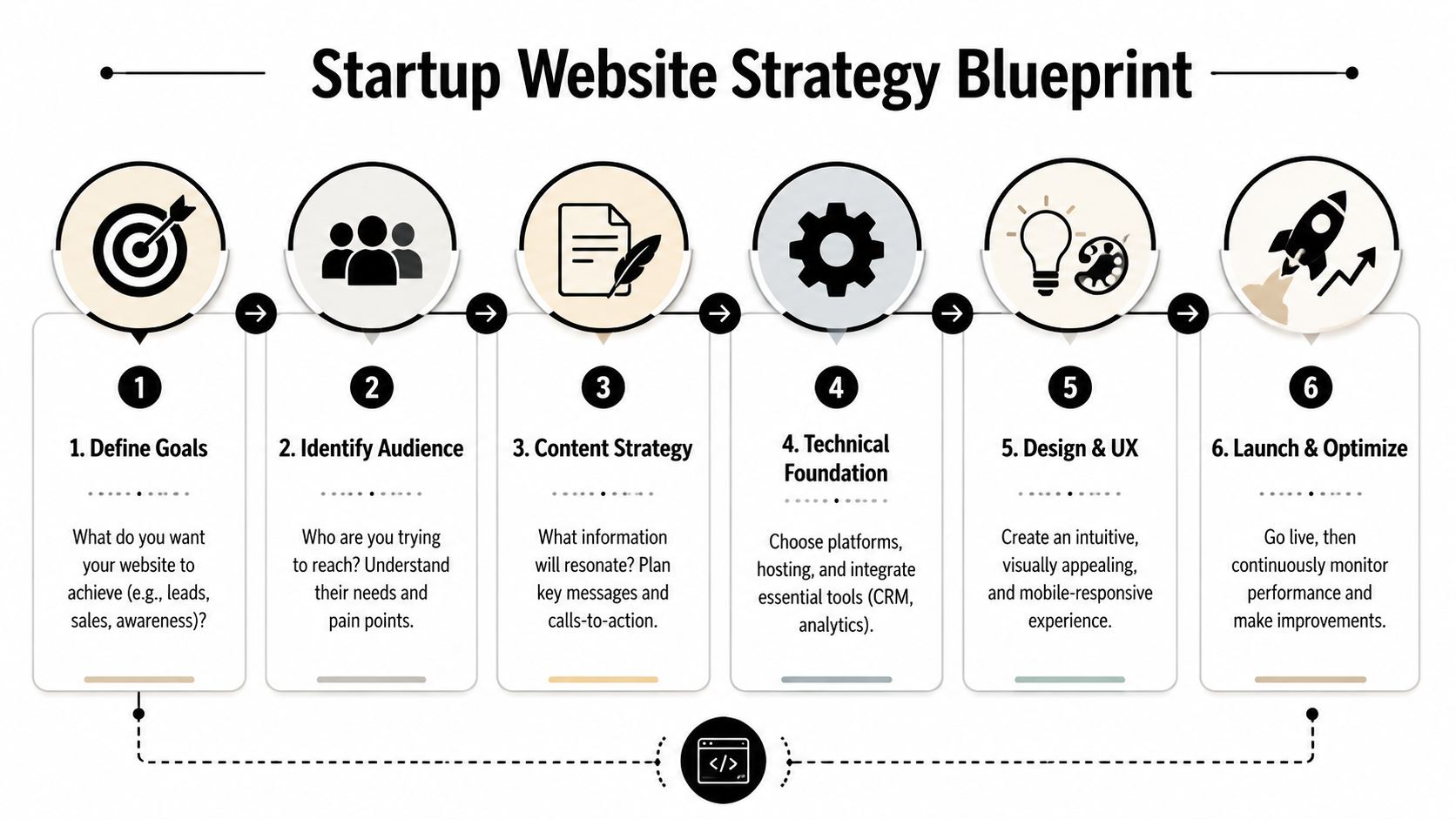
The Blueprint Your Startup Website Strategy
A startup website goes off track long before design starts. It usually happens when nobody makes the hard decisions early.
If your homepage is trying to impress investors, explain technical services, rank in search, generate quote requests, and recruit operators all at once, the result is usually muddled. The better move is to decide what the site must do first, then build around that priority.
Start with the primary business objective
Most startup sites have three possible priorities:
Lead generation for sales conversations and quote requests
Recruiting for field staff, drivers, technicians, and office hires
Credibility for vendors, partners, lenders, and larger customers
You can support all three. But one of them has to lead the structure.
For example, an excavation startup that needs work now should build around service pages, location pages, trust signals, and quote calls to action. A trucking startup struggling to staff trucks may need a stronger careers section, faster mobile applications, and a homepage that speaks to both customers and drivers. A specialized industrial startup may need tighter positioning and stronger proof for procurement teams.
Build the minimum viable website first
The smartest startup websites launch lean. Not cheap. Lean.
A practical workflow is to define the MVP scope first, keep the tech stack and navigation simple, launch with core pages plus analytics, and then test every form, link, and screen size before going live, as outlined in this guidance on affordable web design for startups.
A solid MVP website usually includes:
Homepage: Clear positioning, top services, service area, and a direct action path.
Service pages: One page per core service, written for how customers search and evaluate.
About page: Team, experience, local roots, and why the company exists.
Contact page: Phone, email, address if appropriate, map or service area, and a simple form.
Careers page: Open roles, hiring message, and mobile-friendly apply flow if recruiting matters.
Basic tracking: Analytics and form tracking so you know what's happening after launch.
Define audiences before you write copy
Industrial startups usually have more than one audience, and they don't all want the same information.
A general contractor may care about safety, schedule reliability, and capacity. A plant manager may want proof of technical competence. A CDL driver looking for work wants to know where the routes run, what equipment they'll operate, and how quickly they can apply. If you write one generic message for everyone, nobody feels directly addressed.
One site can serve multiple audiences. It just needs distinct paths instead of one blended message.
A practical content map often looks like this:
Audience
What they need first
Best page type
Buyers
Services, proof, contact path
Homepage and service pages
Partners
Capability, legitimacy, location
About and contact pages
Job candidates
Roles, culture, apply process
Careers and role pages
Keep navigation boring in the best way
Founders sometimes want clever labels. Don't.
Use familiar words. Services. About. Careers. Contact. If you serve multiple regions or specialties, organize those clearly. Industrial buyers don't want to decode your menu. They want to find answers fast and decide whether to call.
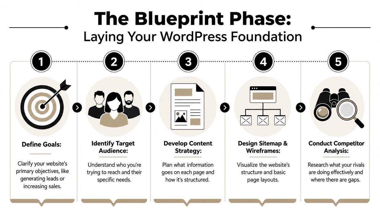
The blueprint phase isn't glamorous, but it prevents expensive rebuilds later. When the strategy is right, design has a job to do. When the strategy is fuzzy, design becomes decoration.
Designing for Trust and Action
In contracting and industrial markets, trust beats trend almost every time.
That doesn't mean your website should look outdated. It means the design needs to make people feel they're dealing with a real operator, not an anonymous startup hiding behind stock photos and polished copy. Buyers in these industries are often evaluating risk as much as service. They're asking whether you'll show up, do the work, communicate clearly, and solve problems when conditions change.
One reason this matters now is broader skepticism toward generic digital experiences. For startups in sectors like contracting or industrial services, website elements that prove operational legitimacy are critical. Only 44% of U.S. adults said they trust companies to use AI responsibly, which is one reason generic sites can increase skepticism unless they show human accountability, real project evidence, and clear contact details, as noted in this article on web design for startups.
Trust signals that actually matter
A lot of websites try to create trust with visual polish alone. That's not enough in a high-friction sale.
What works better is visible proof:
Real team photos: Office staff, field crews, leadership, dispatch, estimators.
Actual equipment and project photos: Trucks, rigs, yards, job sites, fabrication work, before-and-after images where appropriate.
Specific service areas: Towns, counties, regions, and operating footprint.
Clear contact details: Phone number, email, business address or office location, and who to ask for.
Capability detail: Certifications, industries served, project types, response process, and what kind of work you take on.
Human language: Plain wording that sounds like a company with people behind it.
A startup in welding or roustabout services should look operational. A site with abstract graphics and generic language about innovation usually creates distance instead of confidence.
Navigation should reduce uncertainty
Good navigation doesn't just help users move around. It lowers doubt.
If a prospect lands on your site and immediately sees Services, Industries, Service Area, Careers, and Contact, they know where to go. If they see vague menu labels or scattered information, they start working harder than they should. Many won't bother.
For B2B or technical startups, structure matters even more. Buyers and internal stakeholders often evaluate from different angles. The layout has to help both groups find what they need without friction.
If a visitor has to hunt for proof, they often assume the proof isn't there.
A useful way to think about page order is this: answer the buyer's first question first. What do you do. Where do you do it. Who have you done it for. How do I reach you. What happens next.
Calls to action need to fit the job
Not every visitor is ready for the same step. That's why industrial startup sites often need more than one call to action.
Some examples that work:
For leads: Request a quote, schedule a call, send project details
For urgent work: Call now, speak with dispatch, request field response
For recruiting: Apply now, view open positions, talk to our hiring team
The design should make those paths obvious without turning every page into a wall of buttons. This is especially important with forms. If your quote request or job application is awkward on mobile, people drop off. These form UX principles are a useful reference for keeping forms clear, short, and easier to complete.
A short visual example helps here:
What doesn't work
Some patterns consistently hurt startup sites in industrial spaces:
Weak choice
Why it fails
Generic stock imagery
It removes the human and operational proof visitors are looking for
Long mission statements above the fold
Buyers want service clarity first
Hidden phone numbers
It adds friction when people want fast contact
Overdesigned animations
They distract from trust and can slow the site
One broad contact form for everything
Leads and job applicants usually need different paths
The strongest design choice is usually the plainest one. Show the work. Show the people. Show the service area. Give visitors a direct action to take. That's what earns trust.
Choosing Your Technical Foundation
The platform decision shapes far more than launch day. It affects how easy the site is to update, how well it scales, how flexible your SEO setup can be, and whether future features become simple additions or expensive workarounds.
For most startups, the comparison comes down to WordPress on self-hosted infrastructure versus website builders like Wix or Squarespace. Shopify belongs in the conversation if you're selling products directly, but most contractors and industrial startups are choosing between the first two paths.
The simple version of the decision
If you need to get online fast with a modest site and limited complexity, a builder can work.
If you expect the site to grow into service-area pages, recruiting flows, SEO content, integrations, lead routing, and custom functionality, WordPress usually gives you more room to operate. That flexibility matters more than founders realize at the start.
Here's the side-by-side view.
Factor
WordPress (Self-Hosted)
Website Builders (Wix, Squarespace)
Setup speed
Slower at the beginning
Faster to launch
Design flexibility
High
Moderate
Custom features
Strong support for custom builds and integrations
More limited
SEO control
Broad control over structure and content setup
Often simpler, but with less flexibility
Content scaling
Better for larger content footprints
Fine for smaller sites
Ownership and portability
Greater control
More tied to platform rules
Ongoing maintenance
Requires active management
Platform handles more of it
Best fit
Growth-focused businesses with evolving needs
Simpler brochure-style sites
When builders make sense
Builders are attractive for obvious reasons. They're easier for nontechnical teams, they package hosting and editing together, and they remove some maintenance burden.
That can be a rational choice when:
You need a short site fast: A home, about, contact, and a few service pages.
You won't need custom workflows soon: No recruiting portal, no advanced CRM behavior, no unusual lead routing.
Your internal team will edit everything: And they want the simplest possible interface.
You're validating the business: And need basic presence before investing further.
A builder is often enough for an early-stage company that needs a clean online presence and has no near-term plans for aggressive SEO expansion.
When WordPress is usually the better fit
Industrial and contracting startups often outgrow simple builders faster than expected. That's especially true when the website becomes part of operations, not just marketing.
WordPress usually fits better when you need:
Detailed service and location content
Flexible lead forms and CRM integration
A careers section with role-specific pages
Content marketing and SEO growth
Control over site structure and future development
That doesn't mean WordPress is automatically right. It means founders should think beyond launch. A platform that feels easy in month one can feel restrictive once the business needs the site to do more.
Pick the platform for the business you're building, not just the site you can launch this month.
There's also the practical issue of who will manage it. Some companies want a fully managed setup from an agency or partner. Others want internal control. Some use a provider like WordPress.com, a local web partner, or a service firm such as Northpoint Web for build and maintenance, depending on how much support they want after launch.
The biggest risk isn't that you choose a “bad” platform. It's that you choose one that doesn't match your operating model.
A startup that needs to rank in multiple service areas, publish useful content, recruit staff, and integrate forms into internal workflows will usually want flexibility. A startup with a narrow service set and low update volume may value simplicity more.
The right technical foundation should let you add pages, adjust offers, support recruiting, and improve search visibility without rebuilding the whole thing later. That's the defining standard.
Getting Found Foundational SEO and Local Visibility
A good-looking website that nobody finds won't move the business. For startups, especially local and regional service companies, foundational SEO is what turns a website from an online brochure into an acquisition channel.
The key point is simple. SEO for a startup doesn't start with tricks. It starts with structure.
For technical or B2B startup sites, a user-research-led structure is recommended. That includes mapping distinct user journeys and using semantic HTML for SEO and accessibility, which are core tenets of foundational SEO, as described in this piece on tech website design examples.
Start with the pages people are actually searching for
Many startup sites launch with one broad services page. That's rarely enough.
If you're an excavation contractor, drilling service, trucking company, or fabrication shop, your website should reflect the actual ways customers search and compare. That usually means separate pages for core services, and often separate pages for key service areas if geography matters to the business.
A practical structure might include:
Core service pages: One page per major offering
Industry pages: If you serve different customer types with distinct needs
Location pages: If your service area is regional and search intent is local
Contact and quote pages: Built for action, not filler
Use language your customers use
Founders know their industry vocabulary. Buyers don't always use it the same way.
An internal label like “integrated field support solutions” may sound polished in a meeting. It's much less useful than plain language such as hydrovac services, roustabout crews, excavation, welding repair, heavy haul transport, or pipeline support if that's what your market says.
Good startup SEO copy does three things at once:
It names the service clearly
It answers practical questions fast
It leads toward contact
That's true on the homepage, but it matters even more on service pages. The best pages help a prospect confirm fit without forcing them to call just to understand what you do.
Local visibility often starts with your business profile, not your homepage
For local and regional startups, your Google Business Profile can be one of the fastest ways to gain visibility with nearby searchers. That's especially true for contractors, trucking companies, and service businesses that depend on map-based searches and direct calls.
Make sure your profile matches the business you're operating:
Business name: Use the official operating name consistently
Categories: Choose categories that reflect core services
Service area: Define the area you serve as accurately as possible
Photos: Add authentic team, equipment, office, yard, and project images
Contact details: Keep phone and business information current
Website link: Send people to the most relevant page, not just by default to the homepage if a service page fits better
Search visibility improves when the site structure and local business information support each other instead of pulling in different directions.
Don't skip the basics that make SEO work later
A lot of startup owners want to jump straight to blog topics and ranking ambitions. That's fine, but only after the foundation is in place.
Check these first:
SEO foundation
Why it matters
Clear page hierarchy
Helps users and search engines understand the site
Descriptive page titles
Supports relevance and click decisions
Internal linking
Connects related pages and improves navigation
Semantic HTML
Supports accessibility and crawl clarity
Useful page copy
Gives each page a reason to rank
Mobile usability
Supports real-world use and lead flow
Foundational SEO isn't flashy. It's disciplined. The companies that win in local and industrial search are usually the ones that make it easy for search engines and buyers to understand exactly who they help, where they work, and what action to take next.
Building a Website That Recruits
Most founders still think of the website as a sales tool first. In a tight labor market, that's incomplete.
If you need CDL drivers, operators, welders, laborers, mechanics, or technicians, your website should function like a recruiting asset every day. It should help candidates discover you, understand the kind of company you are, and apply without jumping through hoops. Generic startup content rarely addresses that well, even though the hiring pressure is often as urgent as the sales pressure.
A major underserved angle in website design for startups is recruiting. With 68% of job seekers using mobile devices, but only 58% of job postings being mobile-friendly, a startup's website needs candidate-facing pages and fast-loading, mobile-friendly apply flows, according to this article on why good web design for startups matters.
Why a careers page matters more than founders expect
A lot of startup sites bury hiring in a footer link or an email address. That's a mistake.
Candidates evaluate your business the same way customers do. They want to know whether the company looks stable, whether the work sounds legitimate, and whether applying will be worth the effort. If the website feels outdated or thin, strong candidates may assume your operation is disorganized before they ever talk to you.
A good careers section should do more than list openings. It should answer practical questions:
What kind of work do you do
Where do employees work
What kinds of roles are you hiring for
What's the company environment like
How quickly can someone apply from a phone
Build for job seekers on the move
Industrial and trade candidates often aren't sitting at a desk with time to fill out long forms. They're on a lunch break, in a truck, between jobs, or looking after hours from a phone.
That changes what a good apply flow looks like.
The strongest recruiting websites usually include:
Short mobile-first forms: Name, contact info, relevant experience, certifications or license notes, and resume upload if available
Clear work details: Schedule expectations, travel expectations, service area, and equipment or work type
Fast contact options: Apply now, call to ask about a role, or start the conversation by text if your process supports it
A recruiting page should remove hesitation, not add paperwork.
Sell the company honestly
Founders sometimes avoid talking about culture because they think it sounds soft. For hiring, it matters.
That doesn't mean generic language about being a family. It means being concrete. Talk about steady work, local projects, growth opportunities, field conditions, team standards, safety expectations, and what kind of person succeeds in the company.
For an industrial startup, recruiting content should feel grounded. Examples help:
Weak recruiting copy
Stronger recruiting copy
Join our dynamic team
Work on excavation and utility projects across our service area
Competitive environment
Clear expectations, steady workload, and direct communication from supervisors
Growth opportunities
Room to move into lead, specialty, or equipment-based roles as the company grows
Keep sales and recruiting from competing with each other
One concern founders have is whether recruiting content distracts from lead generation. Usually it doesn't, if the structure is handled correctly.
The answer is separation, not suppression. Your primary navigation can support both business goals without confusing either audience. Buyers should have a direct path to services and quotes. Candidates should have a clear path to careers and applications. The homepage can acknowledge both, but the deeper pages should stay focused.
A startup website that helps you win work but can't help you staff that work is incomplete. For contractors and industrial businesses, recruiting isn't secondary. It's part of capacity.
The Launch Plan Costs Timelines and Hiring Help
A startup in contracting or industrial services usually feels the pressure at launch from two sides at once. Sales needs the site to start generating quote requests. Operations needs it to look credible enough that a plant manager, GC, or municipal buyer does not hesitate. In a tight labor market, the same site may also need to help bring in operators, techs, drivers, or field labor.
That pressure is why launch planning matters. A website that goes live half-finished often creates more cleanup work than momentum.
Budget conversations go better when founders understand what they are buying. The number is not just for design files and a homepage. It usually covers strategy, page planning, writing support, design, development, technical setup, and launch review. For founders used to website builders, that can feel expensive. In practice, the true cost comes from getting the structure right early so the site can support leads, recruiting, and local visibility without a rebuild three months later.
What the budget usually covers
A professional startup site often includes work that is easy to miss during early planning:
Discovery and scoping: Clarifying services, priority audiences, goals, and calls to action
Site architecture: Deciding which pages are needed and how buyers and job candidates move through them
Content planning: Organizing messaging, proof points, service details, and conversion paths
Design and development: Building the site, templates, forms, and mobile layouts
Technical setup: Analytics, basic SEO settings, performance work, and security basics
Scope grows fast when the site has to do more than look respectable. A contractor that needs service pages, location pages, a careers section, and job application handling is building a more useful asset than a five-page brochure. It should be scoped that way from the start.
A realistic timeline without pretending every project is the same
The biggest delays usually come from decisions, not code.
If the founder is still changing service lines, has no project photos, or has not agreed internally on what jobs to recruit for, the timeline stretches. If those inputs are ready, the build moves much faster. In my experience, the cleanest launches happen when one person on the client side owns approvals and gets feedback back quickly.
A practical launch rhythm usually looks like this:
Phase
What happens
Discovery
Goals, audiences, site map, platform choice
Content planning
Messaging, page priorities, calls to action
Design
Layout direction, homepage and key page design
Development
Build, responsiveness, forms, tracking
QA
Review links, forms, page rendering, devices
Launch
Final checks, publishing, post-launch monitoring
That sequence matters because each phase affects the next. If a startup skips content planning and tries to solve everything in design, the site often looks polished but says very little.
Pre-launch checks that should never be skipped
Launch day should not be the first real test.
Before publishing, verify:
Every form works: Quote forms, contact forms, careers forms
Every link resolves correctly: Buttons, menus, footer links, document links
Mobile pages are usable: Navigation, tap targets, form fields, and page speed
Core pages are complete: No placeholder copy, missing images, or unfinished sections
Tracking is active: Analytics and key conversion events
Local details are consistent: Phone, address, service area, and contact information
A separate review for essential SEO for new websites is also worth doing before launch. It helps catch missed basics like indexing settings, metadata, redirects, and page-level details that do not show up in a visual review.
DIY or hire help
Some startups should build the first version themselves. That makes sense when the site is temporary, the offer is still changing, and the business only needs a credible placeholder while it proves demand.
Hiring help makes more sense when the website has to support several jobs at once. That is common in industrial and contracting startups. The site may need to explain technical services clearly, rank in a local market, convert visitors into calls, and give job seekers a reason to apply. That kind of build usually benefits from tighter planning and stronger execution.
A simple way to decide:
DIY if: You need a first version quickly and can live with limits
Hire a freelancer if: The scope is modest and you already know what the site needs to say
Hire a web partner if: The site needs strategy, content structure, technical execution, and alignment with sales and hiring goals
A startup website succeeds when it helps the business win trust, generate qualified inquiries, and support hiring capacity. For firms in the trades and industrial services, those outcomes are tied together. If the site helps you win work but not staff it, the launch solved only half the problem.
If you need a website that helps your startup win trust, generate leads, and recruit employees in a competitive market, Northpoint Web builds practical websites for contractors, oilfield service companies, trucking businesses, and industrial firms that need more than a digital brochure.
Your Website: Is It a Lead-Gen Asset or a Security Risk?
If you run a contractor shop, trucking company, welding outfit, excavation business, or oilfield service company in the Uinta Basin, your website probably does two jobs at once. It brings in quote requests, and it helps you find hard-to-hire people like CDL drivers, mechanics, welders, and operators. That makes it a business tool, not just an online brochure.
It also makes your site a target.
When a website gets compromised, the damage usually shows up in plain business terms. Contact forms start pushing spam. Applicant submissions disappear or get intercepted. Bid request details end up exposed. Customers see browser warnings, or your site starts redirecting to junk pages you didn't create. Then your crew is chasing a website mess while still trying to run jobs, answer phones, and keep equipment moving.
That's the core problem for rural businesses. Most owners don't have an in-house security team, and most attacks don't care whether your office is in Duchesne, Roosevelt, Vernal, or out on a county road with spotty service.
The good news is you don't need enterprise complexity to get the basics right. You need disciplined website security best practices, applied in a way that works for a field-based business with limited time and real operational pressure.
If your website has a contact form, quote request form, hiring page, login screen, or payment connection, HTTPS is the floor. It encrypts data moving between the visitor's browser and your server, which matters when someone is sending job history, phone numbers, driver qualification details, or project information through your site.
For contractors and oilfield service companies, this isn't theoretical. A driver application on a recruiting page carries personal data. A bid request can include project scope and location details. If your site still loads over HTTP, or if parts of it load with mixed content, you're telling browsers and visitors that your setup isn't buttoned up.
If you're building on WordPress, a good business WordPress website setup should include HTTPS from day one, not as an afterthought.
What to check in the real world
A lot of owners think, “I have the padlock, so I'm done.” Not quite. I've seen sites with a valid certificate but broken redirects, old image links still loading over HTTP, or subdomains left unsecured.
Use a trusted certificate authority, force all traffic to HTTPS, and enable HSTS so browsers stop trying the insecure version first. If you run multiple subdomains, a wildcard certificate can make management cleaner. For teams that also secure remote connections between staff and systems, this guide for service providers on VPNs is a useful companion read.
Practical rule: If an applicant, customer, or vendor can submit information on your site, every form page and every asset on that page should load over HTTPS. No exceptions.
2. Web Application Firewalls
Why a WAF matters for small business sites
A truck is out on a job near Roosevelt, the office manager is handling payroll, and your website starts getting hammered with fake form submissions and repeated login attempts. Nobody on your crew has time to babysit server logs. A Web Application Firewall helps by screening traffic before it hits your site, your forms, or your hosting account.
That matters for contractors, oilfield service companies, and other rural businesses that rely on a website but spend their day in the field. Job application forms attract spam bots. Bid request pages can be scraped. Old plugin URLs get probed whether your company has ten employees or a hundred. Public websites get targeted because they are public, not because the attacker knows your business by name.
Cloudflare recommends protections such as DDoS mitigation, bot management, Zero Trust access controls, and security analytics for internet-facing properties, all of which point to the same practical conclusion. A WAF is one of the simplest ways to reduce junk traffic and block common web attacks before they turn into downtime or cleanup work (Cloudflare application security guidance).
How to use one without breaking your site
Start with a service that fits your stack and your budget. Cloudflare and Sucuri are common picks for small business sites. AWS WAF makes sense for teams already on Amazon infrastructure. Wordfence can help on WordPress, but plugin-level protection is not the same as filtering traffic before it reaches the server.
Set the WAF up in monitoring mode first if the provider allows it. That gives you a chance to see normal traffic patterns before you start blocking requests. I recommend paying close attention to login pages, contact forms, application forms, XML-RPC, and any page where someone can upload a file or submit project details.
The trade-off is straightforward. Loose rules let more junk through. Aggressive rules can block a legitimate customer, vendor, or applicant.
That matters here in the Basin, where owners often need to log in from a truck, a job trailer, a hotel, or a cell connection that does not look consistent from day to day. If you use country blocks, IP reputation rules, or strict bot filters, test them against how your staff and partners access the site.
A few settings usually deliver the most value:
Rate limit admin and login URLs: This cuts down brute-force attempts and reduces server strain.
Protect forms with bot controls: Quote requests, job applications, and equipment inquiries are common spam targets.
Restrict access to unused features: If you do not need XML-RPC or certain API endpoints, block or limit them.
Review logs weekly: Look for repeated hits on old plugin paths, suspicious query strings, and spikes tied to specific pages.
Pair WAF rules with business password best practices: Filtering bad traffic helps, but weak admin credentials still create avoidable risk.
A WAF does not replace patching, access control, or strong login security. It buys time, reduces noise, and stops a lot of low-effort attacks from ever reaching the parts of your website that matter to the business.
3. Strong Password Policies and Authentication
Lock down the accounts that matter most
A lot of website break-ins in small business start with a login, not some Hollywood-style hack. On a contractor or oilfield services site, that can mean access to job applications, bid details, contact forms, invoices, or the admin tools that control your whole online presence.
Start with the accounts that can do real damage. WordPress admin matters. So do your hosting account, domain registrar, business email, page builder login, and any service that can change DNS, publish content, reset passwords, or add users. If you are still deciding what kind of site setup fits your business, your choice of small business website platforms affects how easy it is to manage authentication, user roles, and account recovery.
WordPress deserves extra attention because it is common, heavily targeted, and often managed by busy owners who are also running crews, bidding jobs, and handling hiring. One stolen admin password combined with sloppy account habits can turn into a poisoned site, fake invoices, or a locked-out owner by the end of the day.
Use a password manager such as 1Password, Bitwarden, or LastPass. Give every important account its own long, unique password. Then turn on MFA with an authenticator app instead of SMS when you can. SMS is better than nothing, but app-based MFA usually gives you better protection.
Authentication that still works for busy crews
The hard part is not knowing what to do. The hard part is setting it up so your office manager, estimator, outside marketer, and after-hours web helper can still get in without sharing one admin login.
Better account structure solves most of that.
Separate ownership from daily use: Keep one owner-level account for emergencies and major changes. Use lower-permission accounts for normal updates, hiring posts, and content edits.
End shared logins: If multiple people use the same credentials, you lose accountability the minute something changes or breaks.
Remove access the same day someone leaves: That includes employees, freelancers, and temporary help brought in for a hiring push or a redesign.
Review who has access every quarter: Rural businesses often add vendors and forget them. Old accounts stay behind long after the project ends.
One plain rule works well here in the Basin. If a password lives in a notes app, spreadsheet, text thread, or email chain, treat that account as exposed and replace the credentials.
A lot of site owners say they “keep things updated,” but when you dig in, it usually means they click update when they remember. That isn't patch management. That's gambling.
OWASP says its current released version is the OWASP Top Ten 2025, and it remains the most widely recognized baseline for web application risk awareness. One reason it stays useful is that it keeps attention on issues like vulnerable and outdated components, insecure configuration, authentication failures, and access control problems. That maps directly to how business websites get compromised.
WordPress sites need a routine, not good intentions. Core updates, plugin updates, theme updates, PHP compatibility, and hosting stack updates all matter. If your website runs your hiring funnel or lead generation, patching isn't optional maintenance. It's part of operations.
A patching routine that works
A good patching system is simple enough that someone follows it. For many small businesses, that means a staging site, scheduled update windows, and a clear priority order.
Recent operational guidance for small business sites also points out a gap most generic lists miss. Unused plugins and themes should be removed, backups should be frequent and tested, and patching SLAs should be defined so critical fixes are applied in 24 to 48 hours (small business website security guidance).
If you're still deciding what platform gives you the best control over updates and security, this comparison of small business website platforms can help you avoid setups that become hard to maintain.
Update by risk first: Security fixes, login-related plugins, form tools, and anything touching payments or file uploads come first.
Remove what you don't use: Disabled plugins and forgotten themes still create exposure.
Test before and after: Check forms, menus, mobile layouts, and admin access after updates. Don't assume the site is fine because the dashboard says “success.”
5. Regular Backup and Disaster Recovery
Backups are only real if you can restore them
Most owners feel good once they hear “the site is backed up.” I don't. I want to know where the backup lives, how often it runs, whether it includes both files and database content, and whether anyone has tested a restore.
If your site gets hacked, corrupted, deleted, or broken during an update, the backup is what keeps a bad day from turning into a business outage. That's especially true if your site stores quote requests, applicant submissions, or customer inquiries that your office depends on.
A strong backup plan includes the website database, uploaded files, theme files, plugin files, configuration, and any critical settings. Tools like UpdraftPlus, BackWPup, JetBackup, and Acronis can help, but the tool isn't the strategy. The strategy is what matters.
What a practical backup plan looks like
For a contractor or field-service business, I'd keep it boring and dependable. Automated backups, offsite storage, encryption where sensitive data is involved, and written restore steps that someone can follow under pressure.
A backup you've never restored is a theory, not a recovery plan.
Use the 3-2-1 mindset if you can. Keep multiple copies, use different storage locations, and make sure at least one copy sits offsite. Then test restoration on a staging copy so you know the backup boots, displays correctly, and preserves your forms and database content.
The biggest miss I see is not backup frequency, but backup confidence. Owners assume the host has it handled. Sometimes they do. Sometimes they only keep partial snapshots, short retention windows, or server-level copies that don't solve a clean restore problem after malware spreads.
6. Principle of Least Privilege and User Access Control
Give access by job role
Not everyone who touches your website needs admin rights. Your office manager might need access to form submissions. Your marketing person might need blog access. A third-party ad vendor might only need analytics or landing page access. A developer might need temporary higher privileges, but not forever.
Least privilege means every user gets only the access needed to do the job. No more.
That matters even more for companies with remote operators, distributed teams, outside bookkeepers, or multiple vendors touching the same site. Research on cybersecurity adoption in SMEs found that adoption improves when tools fit existing workflows, are easy to use, and have support from management and trusted vendors, which lines up with what works in the field. Security controls stick when they don't fight daily operations (SME cybersecurity adoption research).
Where contractors usually get this wrong
The usual problems are predictable. Shared admin accounts. Old vendor logins that never got removed. An employee who only edits pages but still has plugin and theme access. A former marketing freelancer with access to DNS. Those aren't edge cases. They're common.
Use WordPress roles properly. Subscriber, Contributor, Author, Editor, and Administrator exist for a reason. If you need more control, tools like User Role Editor can narrow permissions further.
Review access quarterly: Ask who still needs access and who doesn't.
Use separate admin accounts: One for sensitive changes, another for routine work.
Disable accounts immediately on exit: Don't wait for the end of the week.
For businesses with remote crews and outside partners, the hard part is balancing security with usability. Guidance aimed at current website threats also points out that teams need practical controls like MFA, logging, minimized permissions, input validation on both front-end and back-end systems, and turning off directory browsing, without making the business unusable for people working offsite (website security guidance for 2025 threats).
7. Security Headers and Content Security Policy
Quiet protections that matter
Security headers aren't flashy, but they close off a lot of unnecessary risk. They tell browsers how to behave when rendering your website and handling content. Done right, they reduce exposure to clickjacking, content sniffing, and sloppy downgrade behavior.
Start with the practical basics. HSTS helps force secure connections. X-Frame-Options helps stop your site from being embedded in malicious iframes. X-Content-Type-Options reduces content-type guessing by the browser. Referrer policy settings can reduce information leakage.
A lot of contractor sites run extra scripts from chat widgets, form plugins, analytics tools, map embeds, and ad platforms. That creates convenience, but it also expands the client-side attack surface.
Here's a good walkthrough on the browser side of that work:
Roll out CSP carefully
Content Security Policy is where many teams either give up or overdo it. A strict CSP can block malicious scripts, but it can also break half your site if you launch it without knowing what resources the site needs.
Start in report-only mode. Review what the browser says it's trying to load. Then tighten your script-src, style-src, img-src, and frame-src rules over time. If your hiring page needs an embedded form or your map page needs a trusted external script, allow that specific source and nothing broader than necessary.
Avoid inline scripts when possible: External files are easier to manage and secure.
Use self-hosted resources when practical: Fewer third-party dependencies usually means fewer surprises.
Retest after redesigns: New builders, widgets, and plugins often introduce new external calls.
8. Input Validation and Output Encoding
Forms are attack surfaces
If your website accepts any user input, it has to treat that input as untrusted. Every contact form, hiring form, quote form, search box, comment field, and file upload can become a path for abuse if validation is weak.
This is especially important for Basin businesses using websites to recruit skilled labor. Job applications often include resumes, licenses, certifications, and free-text work history. If your site accepts any file type, trusts only front-end validation, or echoes submitted data back onto a page without encoding it properly, you're inviting trouble.
Input validation checks whether the data matches what you expect. Output encoding makes sure the site displays that data safely in HTML, JavaScript, or other contexts. You need both.
Practical validation rules
The fastest way to improve this area is to stop being permissive.
Validate on the server: Browser-side checks are helpful for users, but attackers can bypass them.
Use allowlists: Accept known-good formats for phone numbers, email fields, dates, and ZIP codes instead of trying to block every bad input.
Restrict uploads hard: Check file type by content, not just extension. If a hiring form only needs PDF resumes, don't allow everything else.
Use prepared statements: Database queries should never paste raw user input directly into SQL.
Encode before display: If a user types HTML or script-like content into a form field, the browser should display text, not execute anything.
A common local example is a quote request form that allows a message box plus document upload. That setup is useful. It also needs tighter rules than most cheap form plugins use out of the box. Good website security best practices don't just say “have a contact form.” They make sure the form can't become the weak link.
9. Security Monitoring and Logging
You can't respond to what you don't see
A lot of small businesses find out about a compromise from a customer. That's too late.
You need logs and alerts that tell you when something unusual is happening. Repeated failed logins. New admin users. File changes where nothing should have changed. Spikes in blocked traffic. Form abuse. Plugin changes. DNS changes. Those events create the trail you'll need if you ever have to figure out what happened and how far it went.
This is also where many owners realize their website needs ongoing technical management, not just a designer who launched it and disappeared. That's one reason I tell businesses to read this piece on why your website needs more than just a designer. Design gets the site live. Monitoring helps keep it safe.
What to monitor first
Start simple if you have to. Wordfence, Sucuri, hosting logs, Cloudflare logs, and server access logs can provide enough visibility to catch obvious issues. If your environment grows, centralized tooling becomes more useful, and platforms for centralized log management can make investigations a lot easier.
Use alerts sparingly at first. Too many alerts and nobody reads them. Too few and you miss the signal.
Watch for changes to admin users, plugin installs, login behavior, file integrity, and traffic spikes before you worry about fancy dashboards.
Store logs somewhere attackers can't easily tamper with. Rotate them so they don't eat disk space. And make sure whoever is responsible for the site knows what an alert means and what the first response should be. Logging without action is just digital clutter.
10. Employee Security Awareness and Training
Your staff can open the door or shut it
Technical controls matter, but people still make or break your setup. If someone on your team clicks a fake Microsoft 365 login page, reuses the same password everywhere, or hands over access to the wrong “vendor,” your website security can come apart fast.
This shows up in ordinary business routines. A dispatcher gets an email that looks like it came from hosting support. An office employee gets asked to “verify” a domain login. A manager working from the road uses a weak hotspot and sends credentials the wrong way. None of that feels like a movie-style cyberattack. It feels like a normal workday until it isn't.
Training should cover the basics clearly. Phishing awareness. Password hygiene. MFA prompts. Secure handling of applicant data. How to report something suspicious. What not to send over plain email. Who is allowed to approve website or domain changes.
Train for the jobs people actually do
Generic annual training videos don't stick because they don't match the work. A field-heavy company needs role-specific guidance. Office staff need one level of training. Managers with approval authority need another. Outside marketing help and admin users need more.
Keep it practical.
Use real examples: Fake invoices, fake hosting renewals, fake login reset emails, and impersonation messages are common.
Teach reporting early: People should know who to call when something looks off.
Make it easy to ask: Staff stay quiet when they think they'll get blamed for raising a concern.
The goal isn't to turn your crew into security analysts. It's to make sure they recognize obvious traps and know how to react before a small mistake becomes a website outage, data exposure issue, or business email mess.
10-Point Website Security Best Practices Comparison
Item
Implementation Complexity 🔄
Resource Requirements ⚡
Expected Outcomes ⭐📊
Ideal Use Cases
Key Advantages / Tips 💡
SSL/TLS Certificates and HTTPS Implementation
🔄 Low→Medium, initial config and renewal management
⚡ Low, free CA options; minor TLS handshake overhead
⭐ High, encryption, trust, SEO boost, PCI readiness 📊
All public sites, e‑commerce, lead forms, login pages
💡 Use trusted CA, enable HSTS, redirect HTTP→HTTPS, monitor expirations
Web Application Firewalls (WAF)
🔄 Medium→High, deployment mode and rule tuning required
⚡ Moderate, service fees, possible latency if misconfigured
⭐ High, blocks OWASP vectors, DDoS mitigation 📊
Sites under automated attacks; e‑commerce; WordPress targets
💡 Start in monitor mode, tune rules, choose cloud vs appliance
Strong Password Policies and Authentication
🔄 Low→Medium, policy enforcement and MFA rollout
⚡ Low, minimal cost; password managers/MFA apps may require subscriptions
⭐ High, reduces account takeover risk; compliance aid 📊
Admin panels, hosting, email, multi‑user sites
💡 Enforce 12+ chars, use authenticator apps, deploy password managers
🔄 Low→Medium, program creation and continual refresh
⚡ Low→Moderate, training platform time and admin effort
⭐ Medium→High, reduces human error; improves reporting 📊
All organizations, especially dispersed or high‑touch staff
💡 Run phishing simulations quarterly, make training role‑specific and interactive
Build Your Digital Fortress with a Local Partner
Website security is never “done.” That's the truth most business owners learn the hard way. A site goes live, everyone feels good, and then the ongoing work starts. Plugins change. Hosting environments change. Employees come and go. Forms get added. Vendors need access. Browsers tighten standards. Attackers keep testing whatever is public.
For contractors, oilfield service companies, trucking operations, fabrication shops, and rural businesses, the challenge is even more practical. You're not sitting around looking for extra IT projects. You're running jobs, dealing with customers, trying to hire good people, and keeping equipment and crews moving. Website security has to fit that reality or it won't happen consistently.
That's why solid website security best practices matter more than flashy promises. You need HTTPS set up correctly. You need a WAF filtering junk before it reaches your site. You need MFA on the accounts that matter, a real update process, tested backups, limited user permissions, safer forms, meaningful logs, and employees who know how to spot obvious problems. None of those steps are glamorous. All of them are effective.
The other reality is that website security is part of reputation management. If your hiring form breaks, applicants stop applying. If your contact page gets spammed or your site gets flagged, leads dry up and trust takes a hit. If bid requests or applicant details are exposed, the damage isn't just technical. It's operational and personal.
Northpoint Web works with the kinds of businesses that deal with these issues in practice. Contractors. Oilfield service companies. Industrial businesses. Local companies that need websites to generate leads, recruit employees, and hold up under day-to-day use. That local context matters because the right answer for a Basin contractor usually isn't the same as the right answer for a giant metro e-commerce brand.
If you want your website to act like a dependable business asset instead of a lingering risk, put systems around it. Treat updates like maintenance. Treat forms like entry points. Treat admin access like keys to the shop. And if you don't want that burden sitting on your desk every week, hand it to a team that handles it for you.
A secure site protects more than pages and plugins. It protects your leads, your hiring pipeline, your credibility, and the time you'd rather spend running your business.
If you want a website that's built for Uinta Basin business realities and maintained with security in mind, talk to Northpoint Web. We help contractors, oilfield service companies, trucking businesses, and local companies protect their sites, keep them updated, and turn them into reliable tools for leads, recruiting, and growth.
If you run a contracting, trucking, excavation, oilfield, or other industrial business in Utah, your website needs to do more than display a logo and phone number. It should help the right people understand what you do, confirm that you can handle their work, and take the next step without calling the office for basic information.
This guide explains the website structure, features, local visibility, recruiting considerations, budget questions, and build-versus-buy decisions that matter most for businesses serving the Uinta Basin and similar Utah markets.
A lot of small businesses still treat the website like a sign on the highway. Put up a few pages, list a phone number, add a logo, and call it done. That approach doesn't hold up anymore for industrial businesses. Your website has to help you win estimates, support field credibility, answer questions fast, and in many cases bring in applicants before your competitors do.
That matters even more in a place like the Uinta Basin. Local reputation still drives a lot of business, but buyers, project managers, property owners, and job seekers still search online first. They want proof. They want to know what equipment you run, what areas you serve, whether you're legitimate, and how easy it is to work with you.
A Vernal contractor gets a call from a plant manager who needs a crew fast. He checks the company website before he calls back. The homepage is dated, the services are vague, and the only next step is a generic contact form. The contractor may still be capable of doing the job, but the site creates doubt and slows down the sale.
That is the key issue. A website should help the business run better.
For companies in the Uinta Basin, that means more than putting a logo, phone number, and a few photos online. The site should help a prospect decide whether to request a bid, help office staff spend less time answering basic questions, and help job seekers apply without chasing paperwork across three phone calls. If it does none of that, it is not supporting revenue or hiring. It is just taking up space.
The strongest small business websites act like part of operations. They qualify leads. They route people to the right service. They answer common questions before someone ties up your front office. They also support recruiting, which matters here because many local businesses are competing for the same CDL drivers, operators, welders, mechanics, and field hands.
What this looks like in the Basin
For a roustabout company, the site should send quote requests to the office and job applications to operations, without mixing the two.
For an excavation contractor, the site should separate residential work from commercial bid opportunities so the owner is not sorting through poor-fit leads at night.
For a trucking company, the site usually has two jobs. It needs to bring in shipper and broker inquiries while also giving drivers a clear path to apply.
A website that does not support operations creates more office work instead of less.
A lot of owners still buy web design like they are buying a nicer brochure. That is usually where the project slips off track. Good-looking pages matter, but they come after business function, which is exactly why your website needs more than just a designer. The site has to match how the company wins jobs, handles incoming leads, and brings in dependable people.
The Blueprint for a High-Performance Business Website
A good business website needs a solid chassis. If the frame is weak, it doesn't matter how nice the paint looks. In small business web design, the chassis is the set of fundamentals that let the site load fast, work on a phone, guide people clearly, and give search engines enough structure to understand what the business does.
What the foundation needs to do
If a superintendent clicks your site from the field, it has to work on a phone without pinching, zooming, or hunting around for the menu. If a property owner wants a bid, the path to contact has to be obvious. If someone lands on the wrong page first from Google, they still need to know where to go next.
That starts with mobile-first responsive architecture and semantic structure. Stratedia's guide to small business website features notes that strong sites use flexible layouts, media queries, clear heading hierarchy like H1, H2, and H3, and concise internal navigation. The same guidance points to local-business schema and consistent NAP data as practical ways to strengthen crawlability and local SEO relevance.
The non-negotiables
Here are the pieces I'd treat as baseline requirements for any Utah contractor or industrial company site:
Mobile usability first: Most owners review their own site on a desktop. Most prospects don't. They visit from a phone in a truck, on a jobsite, or after hours.
Clear navigation: Keep the menu short. Services, industries, about, careers, contact. That's usually enough.
Fast hosting and secure setup: People won't say your hosting is bad. They'll just leave when the site feels clunky or throws a browser warning.
Simple page hierarchy: Every page needs one main topic. Don't bury excavation, trucking, fabrication, and rentals on one vague services page.
Visible calls to action: “Request a quote,” “Call now,” and “Apply today” should never be hard to find.
Practical rule: If a first-time visitor can't tell what you do, where you work, and what to do next within a few seconds, the site is underperforming.
There's also a trade-off owners need to understand. Fancy animation, oversized video backgrounds, and loaded-up templates often make a site feel expensive while making it harder to use. In industrial markets, clear beats clever almost every time. A straightforward page with strong service copy, real photos, trust signals, and clean navigation will usually do more for the business than a design-heavy homepage that gets in the way.
Website Features That Win Jobs in Utah Industries
Generic websites miss the mark because they treat every business the same. A small business web design plan for a Vernal hydrovac contractor shouldn't look like a vacation rental site in Heber, and it shouldn't behave like one either. The features need to match how buyers evaluate the service.
Contractors and excavation companies
For excavation, concrete, grading, utilities, and general contracting, the website should answer two questions fast. Can you do the work, and have you done similar work before?
The strongest features are usually practical:
Project gallery with context: Not just photos. Add location, scope, and type of work.
Bid request forms: Separate estimate requests from general contact questions.
service area pages: Duchesne, Roosevelt, Vernal, and surrounding areas matter when local search intent is high.
Trust elements: Licensing, safety focus, equipment capabilities, and testimonials from actual clients.
A lot of contractors also need stronger search visibility around service-specific terms. If you're trying to understand where content strategy fits into that, this overview of AI-powered construction SEO from Riff Analytics is a useful read because it connects search intent with contractor lead generation in plain language.
Oilfield and industrial service companies
Oilfield businesses often undersell themselves online. Their real strengths are operational. Equipment readiness, field experience, safety culture, response capability, and the ability to work under pressure. None of that comes through on a thin five-page brochure site.
What helps more:
Feature
Why it matters
Equipment and service pages
Buyers can quickly confirm capability
Safety and compliance content
Builds credibility with industrial clients
Industry-specific service breakdowns
Helps visitors self-identify the right fit
Emergency or rapid-response contact paths
Reduces delay when timing matters
A roustabout company, welding contractor, or environmental service provider doesn't need fluff copy. It needs plain language, field photos, clear service descriptions, and obvious contact options.
Trucking and transportation businesses
Trucking sites usually try to talk to everyone at once. Brokers, shippers, owner-operators, job seekers, and dispatch contacts all land in the same place. That creates confusion.
A better approach is to split the paths early. One route for customers. One route for drivers.
Useful features include:
Dedicated driver application page
Fleet or equipment overview
Freight or service coverage information
Fast contact method for dispatch or quoting
When a website forces drivers to dig through customer pages just to find a job application, the company loses applicants it could've captured.
Vacation rentals and hospitality operators
This is a different market, but the same principle applies. A rental site in the Utah mountains needs to remove hesitation. Strong photos, local activity guides, clear booking flow, property details, and seasonal information do more than generic branding copy.
The best websites don't try to impress everyone. They make the next step obvious for the right visitor.
That applies whether you're booking a stay, requesting a quote, or checking whether a company has the equipment and professionalism to handle the job.
Your Website as a 24/7 Recruiting Machine
It is common in the Uinta Basin to have work on the board and still turn jobs down because the crew is short. A trucking company needs two more CDL drivers. A welding shop needs a fitter who can pass a test. An oilfield service company needs operators before the next project starts. In those cases, the website has a hiring job to do, not just a sales job.
A lot of small business websites are built only to collect quote requests. That leaves money on the table if labor is the actual constraint. Market Team's article on essential small business website elements points to the same practical issue. For contractors, trucking firms, and oilfield companies, the website often needs to recruit CDL drivers, operators, mechanics, and welders with the same discipline it uses to attract customers.
That changes what the site needs to say.
A recruiting page should answer the questions a serious applicant asks in the first minute. What jobs are open right now? Is the work local, rotational, or travel-heavy? What kind of equipment will they run? What certifications matter? How fast can they apply from a phone while sitting in a pickup at lunch or between jobs?
If those answers are hard to find, the applicant moves on to the next company.
Strong hiring pages usually include:
A dedicated careers section: not a single link buried in the footer
Short mobile-first application forms: basic info first, resume second
Real field and shop photos: crews, trucks, equipment, yard, work conditions
Clear job expectations: schedule, location, certifications, pay range if you choose to publish it, and who should apply
Credibility signals: safety standards, years in business, project types, and service area
A short visual walkthrough helps owners see how web strategy supports real business outcomes, including hiring.
The wording matters too. Job seekers in industrial markets respond to clear, plain language. "Apply for CDL jobs in Duchesne County." "Work on active pipeline and site-prep projects." "Start with a short application from your phone." That works better than vague culture copy that says nothing about the job.
I also recommend treating recruiting and local visibility as part of the same system. Good hiring pages can support SEO services for contractors because they create relevant pages around real job titles, work types, and service areas. Pair that with a cleaned-up Google Business Profile so applicants can confirm the company is legitimate, local, and active. If you need a practical reference for that side of it, Wispra's Google Business Profile guide is a useful starting point.
Northpoint Web works with contractors, oilfield companies, trucking businesses, and other Uinta Basin firms on this type of structure. The goal is straightforward. Get more qualified applicants in the door without forcing your office manager to chase every hire by phone, Facebook post, and word of mouth alone.
A website can be clean, useful, and well-written and still underdeliver if people can't find it. Local visibility depends on two things working together. Your website needs to be structured well, and your Google Business Profile needs to send clear local signals.
What local SEO really means
For most Utah contractors and service businesses, SEO isn't about chasing broad national terms. It's about showing up when somebody searches for the service plus the place. Excavation contractor Vernal. Hydrovac company Roosevelt. Welding shop Duchesne.
That starts on your site with basics that many companies skip:
Service pages built around real offerings: not one vague page trying to rank for everything
Location relevance: mention actual service areas naturally
Consistent business details: name, address, and phone number should match across the web
Clear page structure: headings and internal links should make sense to both users and search engines
Performance matters here too. Business.com's website design tips note that industry guidance consistently recommends keeping pages under 3 seconds to reduce abandonment, with practical fixes like image compression, lazy loading, minimizing code, and browser caching.
A slow website doesn't just frustrate visitors. It weakens the handoff between search visibility and actual conversions.
If you're comparing options for local search support, contractor SEO services in Utah is the kind of service category worth evaluating when you need help tying together site structure, location targeting, and lead generation.
Where Google Business Profile fits
Google Business Profile is often the first thing a prospect sees before they ever reach your site. That means the profile has to reinforce trust, not create doubt.
Focus on the basics:
Use the exact business name consistently
Choose the right primary and secondary categories
Keep phone, address, and hours accurate
Upload real photos
Collect and respond to reviews
Link the profile to the right landing page on your website
For owners who want a practical walkthrough, Wispra's Google Business Profile guide is a helpful reference because it breaks the setup and optimization process into steps that make sense for local businesses.
Budgeting for Your Website Costs Timelines and ROI
A Vernal contractor can spend $1,500 on a quick site, get it live fast, and still lose work because the pages do not answer basic buyer questions, route leads to the right person, or help recruit dependable field labor. A higher quote is not the problem by itself. The question is what the site needs to do for the business, and what missed jobs or missed hires will cost if it falls short.
As noted earlier, many small business owners now expect their websites to support revenue, not just show contact info. That is the right way to budget for a site in the Uinta Basin. For a welding company, excavation outfit, trucking operation, or oilfield service business, the website should help bring in estimate requests, support sales conversations, and give applicants a clear path to apply.
What you're paying for
Most website quotes mix planning, production, and ongoing support into one number. If you do not break that number apart, it is hard to compare one proposal to another.
You're often paying for:
Cost area
What it covers
Strategy
Site structure, goals, messaging, conversion paths
Build
Design, development, mobile responsiveness, forms
Content setup
Service pages, project pages, location pages, careers pages
Updates, security, backups, edits, SEO improvements
Design is only one line item.
Cheap template builds often create extra work for the owner later. Someone still has to write the service pages, sort out project photos, connect forms to the office, set up hiring pages, and keep the site current. If that work never gets done, the lower upfront price stops looking cheap.
Cheap site versus useful site
A DIY builder can work for a business with a short service list and simple goals. If you want to compare website builders for businesses, do it with a clear view of your operating reality. A one-person handyman business has different needs than a Roosevelt company hiring CDL drivers and bidding multi-step industrial work.
A freelancer can be a good fit when scope is tight and the owner already has strong copy, photos, and direction. A more involved build makes sense when the site needs service-area pages, hiring funnels, CRM or scheduling integration, multiple divisions, or a cleaner sales process for office staff.
The trade-off is not just price. It is time, clarity, follow-through, and whether the website fits how the business runs day to day.
Before approving a proposal, ask:
What pages are included
Who writes or organizes the content
Whether the site is built for leads, recruiting, or both
What is included after launch
How edits, maintenance, and search improvements are handled
If you're trying to sort out why pricing varies so much, this breakdown of what's really included in a $7,500 website build gives a practical view of the labor, scope, and business function behind the final price.
Your Next Steps The Build vs Buy Checklist
The decision to build a website yourself or hire a professional depends on your team's capacity for the work required. A site that brings in bid requests and job applicants takes planning, writing, setup, updates, and follow-through. For a contractor in Vernal or a trucking company in Roosevelt, that work usually lands on the owner, office manager, or whoever already has too much on their plate.
A lot of small businesses still operate without a website, even while new sites keep going live every day and web design remains a large service market, according to Hook Agency's web design statistics roundup. That matters for one reason. In the Uinta Basin, a website is no longer a nice extra. It is basic operating equipment if you want to win work, show up credibly, and recruit dependable people.
When DIY makes sense
DIY works best when the site has a narrow job to do and someone on your team can stay on it week after week.
Build it yourself if these statements are true:
Your site is straightforward: a few core pages, a contact form, and no special integrations
Someone owns the updates: not once, but every month
You can write useful copy: clear service pages, hiring pages, and calls to action
You can fix small problems: formatting issues, plugin conflicts, and broken sections happen
Hire outside help when the website needs to support operations, not just exist online. That usually means lead generation, recruiting, multiple service lines, or a sales process your office staff can use.
Use outside help when:
The website needs to bring in qualified leads
You need recruiting pages for CDL drivers, operators, mechanics, or field crews
You serve different towns, divisions, or job types
Your team will not maintain the site consistently after launch
You need forms, tracking, SEO, or business systems set up correctly
A simple rule helps here. If the website needs to help your company make money or hire faster, cheap shortcuts usually get expensive.
If you're in Duchesne, Roosevelt, Vernal, or anywhere in the Uinta Basin and need a website that helps bring in jobs, applicants, and real business visibility, Northpoint Web is a practical option to consider. They work with contractors, oilfield service companies, trucking businesses, vacation rentals, and other small businesses that need more than a brochure site.
What This Guide Covers
Organize the article around the decisions a business owner must make: what the website needs to accomplish, which pages and features support those goals, how local search fits in, what affects cost and timeline, and when outside help makes sense.
Website planning for contractors and industrial businesses
Service, project, recruiting, and contact pages
Mobile usability, speed, security, and navigation
Local SEO and Google Business Profile considerations
Budget, scope, maintenance, and build-versus-buy decisions
Start With Business Goals, Not Design Features
Before choosing colors, animation, or a template, identify the people the site must serve and the action each person should take. A buyer may need a quote path, a job seeker may need an application path, and an existing customer may need a phone number or service information. These paths should be visible in the navigation and page content.
For companies with several lines of work, separate service or industry pages are usually clearer than placing every capability on one vague services page. The exact structure should follow the company’s real sales and operating process.
Core Pages and Features for Utah Contractors
A practical site commonly needs a clear home page, focused service pages, an about or capabilities page, a contact or quote path, and—when hiring is important—a careers section. Project galleries are more useful when they explain the type and scope of work rather than showing unlabeled images.
Mobile-first layout and readable content
Short, understandable navigation
Distinct calls to action for quotes, calls, and applications
Service-area information that reflects where the company actually works
Fast, secure hosting and a maintainable content structure
Match the Website to the Industry
Contractors and excavation companies should make services, project types, service areas, and bid requests easy to understand. Oilfield and industrial companies may need clearer capability, equipment, safety, compliance, and response information. Trucking companies often need separate paths for shipper or broker inquiries and driver applications. These are planning patterns, not mandatory templates; the final structure should reflect the actual business.
A Contractor Website Has to Do More Than Look Current
For Utah contractors, trucking companies, and industrial service businesses, a website often has to support more than general awareness. It may need to help a prospect request a bid, confirm capabilities, find the right service, or apply for a job. When the site is slow, vague, difficult to use on a phone, or missing proof of relevant work, it can create hesitation before a sales conversation starts.
A Practical Website Blueprint for Local Industrial Businesses
A useful small business website should connect clear service information, mobile usability, local search visibility, lead routing, and recruiting needs. The right structure depends on how the company wins work, serves customers, and handles applications—not on copying a generic brochure-site template.
What a Better Site Should Help Your Business Do
Help buyers understand your services and service area quickly.
Make quote requests and general questions easier to route.
Show relevant equipment, capabilities, projects, and operating information.
Give applicants a clear path to learn about jobs and apply.
Support local visibility for the services and communities you actually serve.
Use Specific Evidence Instead of Generic Marketing Claims
Industrial buyers are more likely to trust specific information than vague claims. Use real project context, service details, equipment information, safety or compliance material where appropriate, and clear contact paths. Do not add testimonials, certifications, client counts, or performance claims unless the business can substantiate them.
Questions to Resolve Before You Build
Do I need a large website? Start with the pages that support your most important services, audiences, and actions.
Is a cheap template enough? Compare the ongoing cost of unclear messaging, poor mobile usability, and poorly routed inquiries—not just the initial build price.
Should I do it myself? DIY may work for a simple business, but a more complex service mix may require help with structure, content, integrations, or ongoing management.
Will a new site automatically rank? No. Technical quality, useful content, local information, and ongoing visibility work together.
Plan the Right Website for Your Business
Once you know which services, audiences, locations, and actions matter most, the next step is to review the available website services and determine what level of planning, development, SEO, and management fits the business.
Review Your Website Options
If your current site is difficult to update, unclear to prospects, or not organized around the way your business wins work, review Northpoint's website services and identify the most appropriate next step for your company.
If you own a contracting company, trucking outfit, welding shop, or oilfield service business in the Uinta Basin, there's a good chance your website isn't pulling its weight. Maybe it looks dated. Maybe it only has a phone number, a few blurry job photos, and a paragraph that says you “offer quality service.” Maybe you don't even know if people are finding it.
That's a problem, because your website now does more than prove you exist. It helps project managers decide whether to call you. It helps landowners compare you to the next contractor. It helps CDL drivers, welders, mechanics, and operators figure out whether you're a company worth applying to.
For this kind of business, a WordPress website for business works best when it's treated like a working asset. It should bring in leads, support hiring, answer questions, and make your company look established before you ever pick up the phone.
A lot of rural businesses still treat the website like a yard sign. Put the logo on it. Add a few service names. Drop in a phone number. Call it done.
That approach doesn't hold up anymore. A website has to do work.
If someone searches for excavation, hydrovac, roustabout, welding, trucking, or reclamation services, they're trying to answer a few basic questions fast. Do you do the work I need? Do you serve my area? Can I trust your crew? Can I contact you right now? If a CDL driver or welder lands on your site, they're asking something different. Is this company active, organized, and worth applying to?
Practical rule: If your website only describes your company and doesn't tell visitors what to do next, it's a brochure.
That's why structure matters more than decoration. A polished homepage is nice, but if it doesn't route a customer to the right service page or a job seeker to a clean application flow, it won't help much. The same goes for flashy design that loads poorly on a phone out in the field.
For contractors, I usually point people toward layouts that already prioritize calls, service sections, trust elements, and estimate forms. A good example is this high-converting construction website resource, because it shows the kind of page structure that moves a visitor instead of just impressing another designer.
A solid website also takes more than design. Messaging, page hierarchy, mobile usability, forms, search visibility, and follow-up all matter. That's the difference between a site that looks decent and one that becomes part of your sales process. This is also why a business owner should understand why your website needs more than just a designer. Design is one layer. Business function is the whole job.
WordPress fits this role well because it can start simple and expand as the business grows. You can begin with core pages, then add recruiting, location pages, booking flows, CRM connections, and stronger SEO without rebuilding the whole thing.
The Blueprint Phase Before You Build
Before anyone touches colors, fonts, or themes, the website needs a blueprint. The fastest way to waste money on a site is to build pages first and think later.
A practical build process follows a phased workflow of discovery and requirements, wireframing, design, development, testing, and launch, as noted by WordPress specialist workflow guidance. That sequence matters because each phase answers a different business question. If you skip discovery, you usually end up redesigning after launch.
Start with the jobs the site must do
Most contractor websites try to serve everybody with the same message. That's where they go sideways. A superintendent looking for a subcontractor doesn't browse like a job applicant. A landowner needing dirt work doesn't search like an oilfield operations manager.
Start by defining the main jobs of the site:
Lead generation: Estimate requests, bid invitations, phone calls, and quote forms.
Recruiting: Applications from CDL drivers, operators, welders, laborers, diesel mechanics, or office staff.
Credibility: Proof that your company is established, insured, staffed, and active in the region.
Operations support: Easy access to service areas, contact routes, and required documents.
If you can't name the top jobs of the site, the site will drift into generic marketing language.
A good blueprint answers one blunt question: what do you want a visitor to do before they leave the page?
Map pages before design
Once the jobs are clear, build the page map. For most industrial businesses, that usually means a homepage, service pages, about page, careers page, contact page, and a projects or gallery section. Some companies also need separate pages by location or industry segment.
A rough page map might look like this:
Page
Main purpose
Primary visitor
Home
Introduce the company and direct traffic
Everyone
Service pages
Explain work offered and service area
Prospects
Careers
Recruit applicants
Job seekers
Projects or gallery
Show proof of work
Prospects and hires
About
Build trust and legitimacy
Everyone
Contact
Convert interest into calls or forms
Everyone
Wireframes come next. These don't need to be fancy. They just need to show where the headline, proof, service summaries, calls to action, and forms will sit.
One detail many businesses miss is testing by segment. Performance work should be separated by mobile versus desktop, landing pages versus transactional pages, and cold-cache versus warm-cache testing, because those behave differently in practice, as covered in the workflow guidance above. That matters when your customers are often on mobile and your key pages are quote or application pages.
Choosing Your Foundation Tools and Tech
A WordPress site gives a contractor, trucking company, or industrial shop room to grow without starting over every time the business changes. That matters in places like the Uinta Basin, where one company site may need to do three jobs at once. Bring in bid requests, show up in local search, and help hire CDL drivers, mechanics, welders, and field crews.
For this kind of business, WordPress is usually the practical fit because it is flexible and widely supported. You are not stuck inside a closed platform that fights you when you need a careers section, location pages, application forms, or a better SEO setup six months from now.
Why WordPress fits growing businesses
A small excavation company may launch with a homepage, a few service pages, and a contact form. Then hiring gets tight. Now the site needs a real careers page, job postings, application forms with file uploads, and pages for the towns and counties that bring in work.
WordPress handles that shift well.
It also comes with trade-offs. A bad theme, cheap hosting, and a pile of plugins can make the site slow, fragile, and expensive to maintain. I see this a lot with businesses that had one person build the site, another person host it, and nobody responsible for keeping forms, backups, updates, and speed under control.
What to choose first
Skip the design extras until the foundation is right. The first choices should support speed, security, updates, and lead flow.
Here is what usually works for contractor and industrial sites:
Managed hosting: Pick a host that handles backups, core updates, uptime monitoring, and basic security. Bargain hosting often looks cheap until the site goes down or gets hacked during your busy season.
A lightweight mobile-first theme: Owners often review the site on a desktop in the office. Customers and job applicants usually find it on a phone, often from a truck, a shop, or a jobsite.
Clean page templates: Your home, service, careers, and contact pages should load fast and keep the next step obvious.
A form system that matches the business: Estimate requests, employment applications, and vendor inquiries should go to the right person without creating inbox chaos.
If local search matters, and for most rural service businesses it does, set up your SEO foundation early instead of trying to bolt it on later. That means page structure, title tags, service-area targeting, and location signals built into the site from the start. A good contractor SEO setup is covered in this guide to SEO services for contractors.
Plugin categories that matter
Plugin decisions should come from business needs, not from a random “must-have plugins” list.
SEO plugin: Use one solid SEO plugin and configure it well. If you are comparing options, this list of 12 top free WordPress SEO plugins is a useful starting point.
Forms plugin: Choose a form tool that can handle quote requests, job applications, file uploads, and notification routing.
Security and backups: You need dependable backups and basic protection. You do not need several overlapping security plugins creating conflicts.
Performance tools: Some hosts include caching and CDN features. Some do not. Match the plugin stack to the hosting environment so you are not duplicating work.
Careers or job management: If hiring matters, use a proper job workflow with clear openings, application steps, and confirmation messages.
Keep the stack lean. Every plugin should solve a defined problem tied to revenue, operations, or recruiting.
That is the critical test. If a tool does not help you get found in Roosevelt, Vernal, Duchesne, or the surrounding Basin, help a customer request a bid, or help a qualified worker apply for a job, it probably does not belong on the site.
Building a Site That Wins Jobs and Attracts Talent
The pages that bring results usually aren't the pages owners spend the most time thinking about. Everybody obsesses over the homepage. The service pages and careers page often do more of the essential work.
For a contractor, trucking company, or industrial service business, content has to answer practical questions fast. What do you do? Where do you do it? What kind of jobs do you take? What equipment or capabilities do you have? How does someone request a bid or apply for work?
Service pages beat generic summaries
A single “Services” page with a bulleted list usually isn't enough. If you want to rank locally and convert visitors, build individual pages around real services and places.
Examples:
Hydrovac services in Vernal
Excavation contractor in Roosevelt
CDL hauling services in Duchesne County
Welding and fabrication for industrial projects
Reclamation contractor in the Uinta Basin
Each page should include a plain-English description of the work, the type of customer you serve, service area language, proof photos, and a direct call to action.
If you want a strong outside example of how search visibility ties into project acquisition, this guide to winning more projects is worth reviewing. The useful takeaway isn't “do SEO.” It's that service-specific pages align better with how buyers search.
A project gallery matters too, but only if it's organized. Don't upload a random pile of images. Group projects by service type, location, or industry. Add captions that explain what the crew did.
Your careers page should recruit not just exist
A lot of companies say they need help hiring, then hide jobs in a PDF or expect applicants to call the office. That adds friction for no reason.
A recruiting-focused careers page should include:
Open positions: List real roles, not “always hiring good people.”
What the work involves: Shift type, travel expectations, equipment, certifications, and whether the role is local or rotational.
Why someone should apply: Crew culture, type of projects, advancement path, steady workload, and professionalism.
A clean application form: Let applicants submit basic info and resume files from a phone.
This video gives a helpful look at building a website that supports hiring and lead generation in a more practical way:
Technical details that help Google understand the site
Good content still needs sound technical execution. According to WordPress technical best practices for business sites, WordPress runs on PHP and MySQL, with HTML, CSS, and JavaScript handling structure, styling, and interactivity. That matters because your developer needs to respect the stack instead of patching things together carelessly.
The same guidance emphasizes on-page SEO, XML sitemaps, mobile-friendliness, image compression, clean URLs, and schema markup. Those aren't extras. They help search engines crawl the site and help users move through it effortlessly.
If your pages are hard to read on a phone, slow to load, or vague about what you do and where you work, Google isn't the only one getting confused. Your customers are too.
Launching and Dominating Your Local Market
A lot of owners think the website is finished the day it goes live. It isn't. Launch is when local visibility work starts.
WordPress has the depth and staying power to support that work over time. Kinsta reports that WordPress powers 14.7% of the world's top websites, that more than 500 new sites are built each day on the platform, and that it's used in over 178 countries, which points to a stable ecosystem with broad support and a deep talent pool, according to Kinsta's WordPress statistics roundup.
Launch is when promotion starts
Once the site is live, Google still has to discover pages, understand the business, and connect your site to local intent. That doesn't happen because the homepage exists.
For a contractor in Duchesne, Roosevelt, or Vernal, local search work should include your website and your Google Business Profile together. Those two assets reinforce each other. If one is weak, the other usually underperforms.
The first thing I'd tighten up is your local service footprint. If you serve multiple towns or counties, your website needs to say that clearly on the right pages. Don't make Google guess, and don't make customers guess either.
What to do in the first stretch after going live
Use a simple post-launch checklist:
Submit your sitemap: Get the site into Google Search Console so indexing starts cleanly.
Finish your Google Business Profile: Add the right services, service area details, current photos, and accurate contact info.
Track key pages: Watch your contact page, service pages, and careers page for form issues or drop-off.
Review search intent: If people search one phrase and land on the wrong page, page targeting needs adjustment.
For businesses that want help with the visibility side after launch, these SEO services for contractors show the type of work that usually matters most. Not vanity rankings. Local service visibility, better traffic alignment, and stronger lead paths.
A launched site with no local SEO plan is like parking a clean service truck behind the shop and wondering why nobody sees it.
The True Cost Maintenance Security and Growth
This is the part most articles skip. A WordPress website for business can be a strong fit, but only if someone is responsible for keeping it healthy.
That means updates, backups, plugin management, uptime awareness, and performance checks. Not once. Ongoing.
A less-covered but important point, raised in this guide on setting up a business website with WordPress, is whether WordPress is still the right choice after you account for uptime, security, and maintenance in the true cost of ownership. That guide notes that many articles focus on ease of use and customization while skipping updates, backups, and plugin management. For contractors and rural businesses, that gap matters because the site needs to operate like a dependable lead asset, not a side project.
WordPress works when someone owns the upkeep
The wrong way to run a business website is to launch it, ignore it, and hope nothing breaks. That usually leads to plugin conflicts, form failures, spam issues, old content, and missed leads.
If your estimator stops getting quote forms for a week because a plugin update broke something, that's not a website problem. That's a business problem.
WordPress isn't the wrong platform when maintenance exists. It becomes the wrong platform when nobody owns maintenance.
What maintenance looks like in real life
For most contractor sites, practical maintenance includes:
Core and plugin updates: Keep the software current without blindly updating everything at once.
Backup checks: Make sure backups exist and can be restored.
Form testing: Test estimate requests and job applications so they still reach the right people.
Performance review: Watch your money pages, especially contact, service, and careers pages.
Content upkeep: Remove outdated hiring language, old service area gaps, and stale project examples.
This is also where many owners underestimate the website budget. Build cost matters, but operations matter too. A business owner comparing proposals should understand what's really included in a $7,500 website build it's more than you think. The cheapest proposal can become the expensive one if it leaves you holding all the support, cleanup, and rebuild risk later.
If you want WordPress, have a maintenance plan before launch. If you don't want ongoing responsibility, a simpler hosted platform may be the better fit. That's the honest trade-off.
If your company needs a website that brings in leads, supports recruiting, and holds up under real business use, Northpoint Web builds and manages WordPress sites for contractors, trucking companies, oilfield service businesses, and other Uinta Basin companies that need more than an online brochure.
Necessary cookies enable essential site features like secure log-ins and consent preference adjustments. They do not store personal data.
None
Functional cookies support features like content sharing on social media, collecting feedback, and enabling third-party tools.
None
Analytical cookies track visitor interactions, providing insights on metrics like visitor count, bounce rate, and traffic sources.
None
Advertisement cookies deliver personalized ads based on your previous visits and analyze the effectiveness of ad campaigns.
None
Unclassified cookies are cookies that we are in the process of classifying, together with the providers of individual cookies.
None
Zippy Available
💬
Before we start…
This chat may be reviewed by our team, and relevant messages are sent to our configured AI provider. Please do not share passwords, payment details, or other sensitive information.