
Your website often decides the next call before the phone rings. A contractor bidding larger jobs, a trucking company trying to hire drivers, or an oilfield service firm chasing vendor approvals all face the same problem. A decent-looking site is not enough if it fails to answer basic questions fast, prove you can do the work, and give people a clear next step.
That is the gap this article addresses.
These are not generic design inspirations. They are working patterns for businesses that sell in practical, high-trust markets where buyers check capabilities, service area, safety record, equipment, and responsiveness before they reach out. In rural and industrial sectors, a website has to do more than look modern. It has to help generate leads, support recruiting, and build confidence with customers who may be comparing you against larger competitors.
The seven examples below focus on that job. Each one shows a different way a small business site can pull its weight, whether that means turning traffic into quote requests, helping applicants self-qualify, or making a local company look credible enough for serious commercial work. If you are still deciding on the right setup, this guide to small business website platforms will help you choose the tools behind the site. Teams also use systems like the SupportGPT-1 platform to handle first-response questions and keep inquiries from going cold.
Below, the value is in the analysis. The goal is to show what works for contractors, trucking companies, oilfield operators, real estate investors, vacation rentals, and rural businesses, and why those choices matter.
Table of Contents
- 1. Example 1 The All-in-One Digital Partner Website
- 2. Example 2 The Lead-Generation Machine for Contractors
- 3. Example 3 The 24-7 Recruiter for Trucking Companies
- 4. Example 4 The Credibility Builder for Oilfield Services
- 5. Example 5 The Motivated Seller Magnet for Real Estate Investors
- 6. Example 6 The Direct Booking Engine for Vacation Rentals
- 7. Example 7 The Digital Main Street for Rural Businesses
- 7 Small Business Website Examples Compared
- Build a Website That Works as Hard as You Do
1. Example 1 The All-in-One Digital Partner Website
A business owner in trucking, oilfield, or the trades rarely visits a website with one question in mind. They may want to check services, compare credibility, size up industry fit, and decide whether to call, all within a few minutes. That is why this type of website matters. It supports several business goals at once without feeling scattered.
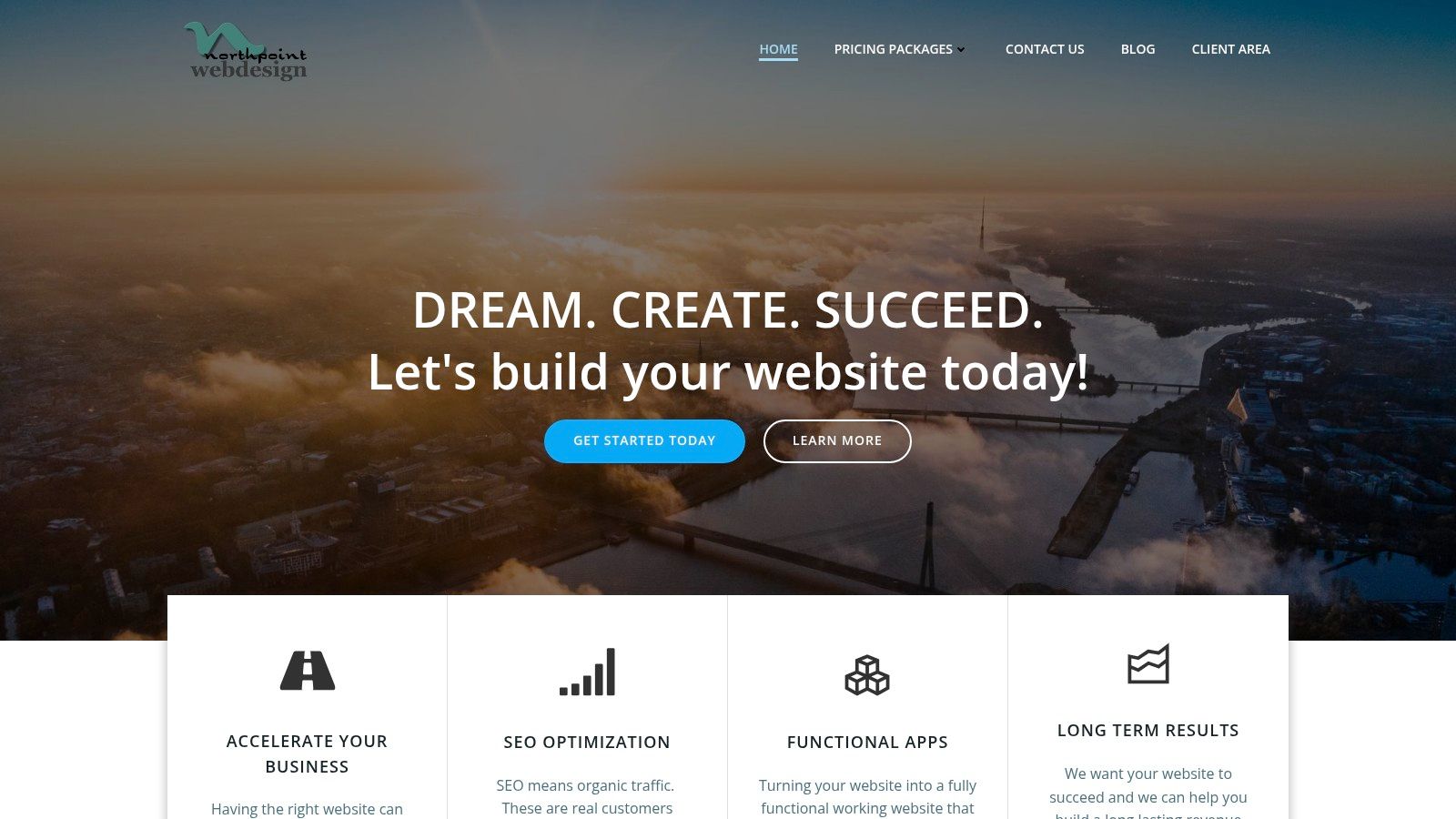
Northpoint Web is a good example of that model. The site is structured like an operating asset, not a brochure. Visitors can sort by service, industry, and business problem, which is a practical fit for companies that need lead generation, recruiting support, and stronger market credibility from the same website.
What makes this one different
The strongest part of this approach is the structure. Instead of forcing every visitor through the same generic homepage message, it gives different audiences a logical path. A contractor can look for lead generation help. A rural service business can look for local visibility. An owner in a specialized field can check whether the company understands how industrial sales cycles work.
That matters because these buyers do not all convert the same way. Some are ready to request help now. Others are comparing vendors and looking for proof that the team understands field operations, service areas, hiring pressure, and long sales cycles. A site that handles those differences well usually earns more qualified inquiries.
Northpoint's page on lead generation for contractors shows that logic clearly. It speaks to a specific business problem instead of hiding behind broad agency language.
Practical rule: If your website needs to bring in leads, support hiring, and reassure larger buyers, the structure has to do more than look polished.
What works for industrial businesses
For rural and industrial companies, a good all-in-one website usually shares a few traits.
- Industry-specific paths: Separate pages for trucking, oilfield, excavation, fabrication, electrical, or other service lines help visitors confirm fit fast.
- Clear next steps: Quote requests, consultation forms, click-to-call options, and contact prompts should match the visitor's intent.
- Proof early on: Certifications, project examples, service territory details, and plain-language positioning belong near the top.
- Tracking behind the scenes: Forms, call tracking, and analytics let owners see which pages produce real conversations.
This is also where platform decisions start to affect growth. A simple builder can work for a very small operation, but businesses with multiple services, locations, or audience segments usually need more flexibility. Northpoint's guide to small business website platforms is useful if you're comparing ownership, editing control, and long-term maintenance.
Local visibility is part of this model too, especially for service companies that depend on map results and location-based searches. The same principles behind optimizing local search for electricians apply here. Clear service pages, strong geographic signals, and trust markers help the right visitors find you and decide faster.
There are support layers that become useful as the business grows. If the company needs to respond after hours or sort inbound questions before a staff member steps in, tools like the SupportGPT-1 platform can support that process.
The bigger point is simple. Once a small business has a website, the primary question is whether that website pulls its weight. In industrial markets, the best examples do not just look current. They help owners win calls, recruit better people, and prove credibility before the first conversation.
2. Example 2 The Lead-Generation Machine for Contractors
Contractor websites usually fail for one simple reason. They talk like a brochure instead of selling like an estimator. Visitors land on the homepage, see a vague headline, a stock photo, and a menu with "Services" and "About," but nothing tells them whether the company handles their exact kind of job.
The better pattern is a site built around service intent. That means separate pages for excavation, welding, grading, utility work, concrete, or fabrication, each with plain language and a direct next step. Northpoint's page on lead generation for contractors aligns with this approach because contractor traffic usually converts when the page matches the task the visitor already has in mind.
Why contractor sites fail
Most contractor sites bury the evidence people need. They hide project photos, don't mention service areas clearly, and make the contact process feel open-ended. On mobile, the problem gets worse because visitors are often trying to call from a truck, a jobsite, or an office between tasks.
A practical contractor site keeps the first screen focused on job type, geography, and action. It should answer three questions immediately: what do you do, where do you do it, and how does someone request a bid?
What this pattern gets right
A contractor-focused site should use project galleries as proof, but galleries aren't enough on their own. Each image should support a real service page, not replace one. Search visibility and conversions improve when a page is built around a single service and a clear market, which is why local search strategy matters for trades like optimizing local search for electricians, plumbers, excavation crews, and other field-service operators.
The homepage should qualify the visitor fast. The service pages should close the gap between interest and inquiry.
One redesign case study from MarketingSherpa recorded an 18% increase in overall conversion rate and an 18% increase in overall revenue after launch. That doesn't mean every redesign produces the same lift. It does show that targeted UX changes can materially change outcomes when the site removes friction instead of adding polish for its own sake.
3. Example 3 The 24-7 Recruiter for Trucking Companies
A trucking company website often has the wrong primary audience. It speaks only to shippers, brokers, or general business partners, while the company's real bottleneck is driver recruiting. If the business needs CDL drivers, owner-operators, mechanics, or yard help, the website should reflect that reality.
The strongest trucking websites act like recruiting infrastructure. They answer schedule questions, equipment questions, route questions, and company-culture questions before the applicant ever calls. That saves office time and helps filter for people who are a fit.
Recruiting pages need a different message
A recruiting page shouldn't sound like a corporate overview. It should sound like a job decision. Drivers want to know what kind of work they'll be doing, what the fleet looks like, how communication works, and whether the company feels steady and professional.
That means the page structure changes. Instead of starting with company history, the site should lead with openings, expectations, and an application path that works on mobile. Long PDFs and clunky forms lose people.
What a strong trucking site includes
The best pattern here is straightforward:
- Role-specific recruiting pages: Separate paths for CDL drivers, mechanics, dispatch support, or equipment operators.
- Fast mobile applications: Short forms first, deeper screening later.
- Real operations detail: Freight type, regions served, home time expectations, and equipment snapshots.
- Trust signals for workers: Safety mindset, organized communication, and signs the company isn't chaotic.
One of the biggest mistakes I see is treating the careers page like an afterthought. For trucking companies, that page is often more valuable than an oversized homepage banner or a generic "About Us" section. If hiring is the business constraint, the website should support hiring every day, not just branding.
4. Example 4 The Credibility Builder for Oilfield Services
Oilfield and industrial service websites have a tougher job than many local business sites. They aren't just trying to get a phone call. They often need to reassure operations managers, procurement teams, and safety personnel that the company is competent, organized, and low-risk to work with.
That's why credibility has to show up before design flair. A polished layout helps, but in this market people are looking for service capability, coverage area, certifications, safety language, equipment readiness, and proof that the company understands field conditions. A site built with that in mind usually performs better than one built around abstract branding.
Why credibility comes before conversion
Businesses in oilfield services don't win trust with clever copy alone. They win it with clarity. Visitors should be able to confirm what crews do, what sectors they serve, and how to start a conversation without hunting through the menu.
Northpoint's small business web design service reflects this practical approach. For industrial companies, web design isn't mainly about aesthetics. It's about presenting the company in a way that supports qualification, sales, and vendor confidence.
Field note: In industrial markets, "professional" usually means easy to verify, easy to contact, and easy to understand.
The pages that matter most
An oilfield services site should usually prioritize a tighter set of pages than owners expect:
- Core service pages: Roustabout, hydrovac, reclamation, welding, trucking, environmental, or whatever the operation provides.
- Safety and compliance signals: Enough information to show seriousness without overwhelming the visitor.
- Service area clarity: Basins, counties, and regions served.
- Contact paths by intent: Estimate requests, urgent service calls, and recruiting shouldn't all go through one generic form.
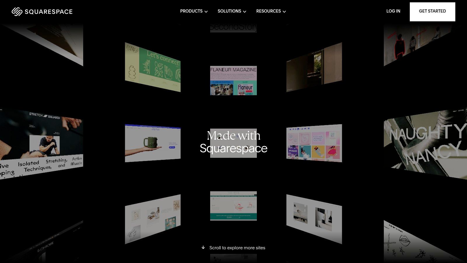
A visually impressive site can still underperform if it lacks service-area clarity, trust signals, or one obvious conversion path. That point lines up with the argument in Squarespace's discussion of small business website examples, especially for businesses where visitors need fast, task-focused answers rather than design inspiration.
5. Example 5 The Motivated Seller Magnet for Real Estate Investors
A "we buy houses" site has one job. Reduce friction for someone who's under pressure and not interested in browsing. This audience isn't comparing visual styles. They're trying to decide whether the business seems trustworthy enough to contact right now.
That changes everything about the build. The copy should feel direct and calm. The form should be short. The page should explain the process in plain terms without sounding evasive or overproduced.
Simplicity wins here
This kind of site benefits from fewer choices, not more. Too many menu items, investor buzzwords, or aggressive CTA language can make the whole thing feel less credible. A clean page with a clear promise and an easy submission path usually does better than a big site stuffed with unrelated content.
Good real estate investor sites often work best when they repeat a few core elements across the page:
- Immediate problem recognition: Inherited property, repairs, relocation, foreclosure pressure, unwanted rental, or vacant home.
- Simple process framing: Submit details, receive contact, review options.
- Local proof of presence: Cities served, recognizable geography, and a real business identity.
- Low-friction contact: Form, call button, and sometimes text as an option.
What to avoid
The biggest mistake is trying to sound too polished. Sellers in difficult situations are often skeptical. They don't need a corporate tone. They need plain communication that feels human and local.
A second mistake is adding too much explanation before the form. If the visitor already wants help, the website shouldn't make them scroll through a long investor manifesto to get there. In this niche, empathy and clarity beat clever branding every time.
6. Example 6 The Direct Booking Engine for Vacation Rentals
Vacation rental websites have a different challenge. They need to sell an experience, but they also need to answer practical questions fast enough that the guest doesn't leave and book on a marketplace instead. The site has to do both jobs at once.
A good example in this category uses strong photography, but it doesn't stop there. It supports booking confidence with property details, availability flow, local information, and policies that are easy to find. That's what turns interest into direct reservations.
This site sells confidence, not just a stay
Owners sometimes over-focus on mood and under-focus on logistics. A beautiful gallery matters, but so do sleeping arrangements, map context, amenities, and clear booking instructions. Guests want to imagine the stay and confirm the fit.
Platform choice matters too. Some owners can use a builder with integrated booking tools. Others need WordPress or a custom setup because they want more control over content, SEO, and integrations. The right answer depends on whether the site is mainly a brochure for listing traffic or a true direct-booking asset.
The booking path has to stay short
The strongest vacation rental sites keep users moving with minimal detours. Every page should support the next question. Can I stay here, when is it available, what does it cost, and how do I book?
"If direct booking is the goal, don't hide the booking path behind decorative scrolling and oversized lifestyle sections."
Owners also need to remember that mobile friction is expensive. People often browse accommodations from their phone, compare several options quickly, and abandon anything that feels slow or confusing. In this niche, clean UX and booking clarity are just as important as brand presentation.
7. Example 7 The Digital Main Street for Rural Businesses
A customer is driving through town, needs a part, a meal, or a service, and checks your site from a phone before deciding whether to stop. In rural markets, that moment carries more weight than it does in a dense city. The website often stands in for storefront traffic, word of mouth, and long-standing local familiarity.
That is why this type of site works best as a practical trust tool. It should answer the questions a new customer asks first. Are you open? Where are you located? What do you sell or provide? Can someone reach a real person quickly?
Local clarity beats decorative design
Rural hardware stores, feed suppliers, cafes, boutiques, repair shops, and family-run service businesses do not need oversized websites with complicated effects. They need a site that confirms the basics fast and makes the business feel real.
The strongest examples put the operating details near the top of the page. Hours, address, phone number, service area, and a short summary of products or services should be visible without hunting through menus. Good photography still matters, but in this category it should show the actual storefront, staff, trucks, inventory, or workspace. Stock imagery weakens trust.
This matters even more for industrial and trade-adjacent rural businesses. A welding shop, ag supplier, equipment repair company, or local hauler may get visitors who are comparing options quickly from the road, from a jobsite, or between calls. If the site hides the essentials, the next business gets the inquiry.
What these sites should get right
The best digital main street websites usually share a few traits:
- Clear business facts: Hours, map, phone number, town, and service radius.
- Simple page structure: Products, services, about, and contact, without extra layers.
- Proof the business is active: Real location photos, current reviews, recent updates, and accurate business details.
- Mobile usability: Fast loading, tap-friendly buttons, and contact info that is easy to use from a phone.
There is a real trade-off here. Owners sometimes want the site to feel warm and personal, which is a good instinct. But personality should support usability, not slow it down. A short welcome message, a few honest photos, and a clear explanation of what the business does usually outperform a homepage filled with sliders, pop-ups, and generic marketing copy.
A smaller site can do this job well.
For rural businesses, I usually see better results from a tight five to ten page website than from a sprawling build that is hard to maintain. If staff cannot update hours, seasonal services, product categories, or contact details quickly, the site starts creating confusion instead of confidence.
7 Small Business Website Examples Compared
| Example | 🔄 Implementation Complexity | ⚡ Resource Requirements | 📊 Expected Outcomes (⭐) | Ideal Use Cases | 💡 Key Advantages |
|---|---|---|---|---|---|
| Example 1: The All-in-One Digital Partner Website | High, multiple integrations (CRM, SEO, AI) | Medium–High, ongoing content, automation, technical upkeep | Strong multi-channel impact; sustained lead + credibility growth (⭐⭐⭐⭐) | Service-based businesses needing a central growth hub (contractors, agencies) | Centralizes lead gen, recruiting, credibility; scalable automation |
| Example 2: The Lead-Generation Machine for Contractors | Medium, focused funnels, landing pages, galleries | Medium, professional photos, local SEO, contact systems | High conversion of local, job-ready leads (⭐⭐⭐⭐) | Contractors seeking steady local job leads (excavation, welding, construction) | Optimized contact paths, visual proof, local SEO focus |
| Example 3: The 24/7 Recruiter for Trucking Companies | Medium, careers UX, multi-step forms, mobile-first | Low–Medium, hiring content, testimonials, application flow | Improved applicant quality and reduced drop-off (⭐⭐⭐) | Trucking firms hiring CDL drivers | Candidate-centered UX, faster apply flow, clear pay/benefit messaging |
| Example 4: The Credibility Builder for Oilfield Services | Medium–High, detailed specs, certification displays, case studies | Medium, documentation, fleet media, fast professional site | Higher trust with procurement; better success on bids (⭐⭐⭐⭐) | Oil & gas service providers targeting enterprise buyers | Emphasizes safety/compliance, equipment specs, long-cycle selling support |
| Example 5: The Motivated Seller Magnet for Real Estate Investors | Low, single-page lead funnel, very simple form | Low, short form, targeted messaging, domain | Fast capture of high-intent seller leads (⭐⭐⭐⭐) | Real estate investors targeting motivated/home-sale leads | Low friction, empathetic copy, rapid lead acquisition |
| Example 6: The Direct Booking Engine for Vacation Rentals | Medium, booking calendar + channel integrations | Medium, pro photography, booking software, calendar sync | Increased direct bookings and margin retention (⭐⭐⭐⭐) | Vacation rental owners/managers reclaiming direct bookings | Direct revenue control, better guest experience, brand building |
| Example 7: The Digital Main Street for Rural Businesses | Low–Medium, local SEO, Google integration, optional e‑commerce | Low, consistent NAP, GBP integration, modest content | Improved foot traffic and local sales (⭐⭐⭐) | Local brick-and-mortar shops, cafes, boutiques in rural areas | Boosts local discoverability, community storytelling, simple e‑commerce options |
Build a Website That Works as Hard as You Do
A business owner gets the call, the form fill, or the job application long before a prospect decides to trust the company. That decision often happens on the website. For contractors, trucking fleets, oilfield service companies, and rural operators, the site has a clear job. It needs to generate qualified leads, help recruit reliable people, and prove the business is credible enough to call back.
As noted earlier, website adoption is up across small business. That changes the standard. A company is no longer judged on whether it has a website at all. It is judged on whether the site makes it easier to hire the company, apply for a job, request service, or verify that the operation is legitimate.
That is the key lesson behind these examples. The strongest sites in industrial and trade sectors are built around business priorities, not design trends. A contractor site should make it easy to request an estimate and confirm service areas. A trucking site should reduce friction for drivers who want to apply from a phone. An oilfield site should support longer sales cycles with certifications, capabilities, equipment details, and proof of field experience. A rural storefront or service business should show hours, location, reviews, and the next step within seconds.
I see the same pattern in underperforming sites. The company itself is solid, but the website is vague, outdated, or built like an online brochure. That gap shows up in weak leads, fewer calls, low application volume, and sales conversations that start with avoidable trust questions.
A useful website closes that gap. It helps the business sell, recruit, answer common questions, and qualify prospects before the phone rings.
If your company works in construction, transportation, oil and gas, real estate investing, hospitality, or a rural local market, the target is straightforward. Build a site that supports the way the business wins work. Northpoint Web works with companies in the Uinta Basin and similar markets where practical structure, local visibility, and trust matter more than flashy effects.
If you're ready to build a website that helps your business win jobs, attract applicants, and compete online with confidence, Northpoint Web is a practical partner to talk with. They specialize in website design, SEO, and digital growth for contractors, oilfield companies, trucking businesses, real estate investors, vacation rental owners, and rural small businesses that need more than a digital brochure.
Comments are closed