A lot of contractor websites in the Uinta Basin fail in the same way. A landowner, plant manager, or superintendent pulls the site up on a phone between calls, tries to confirm services, can't find a direct contact path, and leaves. A driver looking for work taps into the careers page, gets sent to a clunky PDF, and never finishes. The business may be solid. The website just gets in the way.
That's the core issue with website user experience design. It isn't about making a site look trendy. It's about making the site easy to use when someone is in a hurry, on a weak signal, covered in dust, or comparing you to two competitors in the same afternoon.
For industrial companies, that difference shows up in quote requests, phone calls, applicant quality, and whether a customer trusts you enough to reach out at all. A website should work like a dependable field hand. It should answer common questions, direct people to the right next step, and keep doing that after hours, on weekends, and while your crew is in the field.
If your current site feels more like an online brochure than a business tool, that's usually a UX problem. A strong small business web design approach fixes that by making the website clearer, faster, and easier to act on.
Table of Contents
- Introduction From Digital Brochure to 24/7 Workhorse
- What Website User Experience Actually Means for Your Business
- How Good UX Drives Leads Recruitment and Credibility
- Practical UX Upgrades for Your Contractor Website
- Common UX Mistakes Costing Rural Businesses Money
- Your Prioritized UX Action Plan
Introduction From Digital Brochure to 24/7 Workhorse
Most contractor websites were built with good intentions. Put up the logo, list a few services, add some photos, and call it done. That worked when a website was mostly there so people could say, “Yep, they have one.”
That's not how people use websites now. They use them to make decisions. They check if you handle hydro excavation or roustabout work. They look for service areas. They want a fast way to request a bid, ask about equipment, or apply for a job without playing hide-and-seek.
A website with weak user experience design acts like a locked job trailer. The tools may be inside, but nobody can get to them quickly. A strong UX setup turns that same site into a working asset. It guides a visitor to the right action, reduces dead ends, and gives people confidence that your company is organized before they ever speak to you.
Practical rule: If a visitor can't figure out what you do, where you work, and how to contact you within a short visit, your website is creating friction.
For contractor and oilfield service businesses, UX has to serve real business tasks:
- Lead generation: Make it obvious how to request a quote or call now.
- Hiring: Remove obstacles for drivers, operators, welders, and laborers who want to apply.
- Credibility: Show that your company is legitimate, active, and capable.
- Clarity: Help customers understand services without making them decode industry jargon.
Good UX isn't fluff. It's field logic applied to a website. Put the right tool within reach. Label it clearly. Remove extra steps. Keep the path clean.
That's what turns a digital brochure into a 24/7 workhorse.
What Website User Experience Actually Means for Your Business
Contractors usually understand UX once you stop talking like a designer and start talking like a foreman. Think about a tool trailer. If every wrench, fitting, and cutoff wheel has a place, the crew moves faster. If everything is piled in the corner, people waste time, get irritated, and sometimes use the wrong thing.
Your website works the same way.
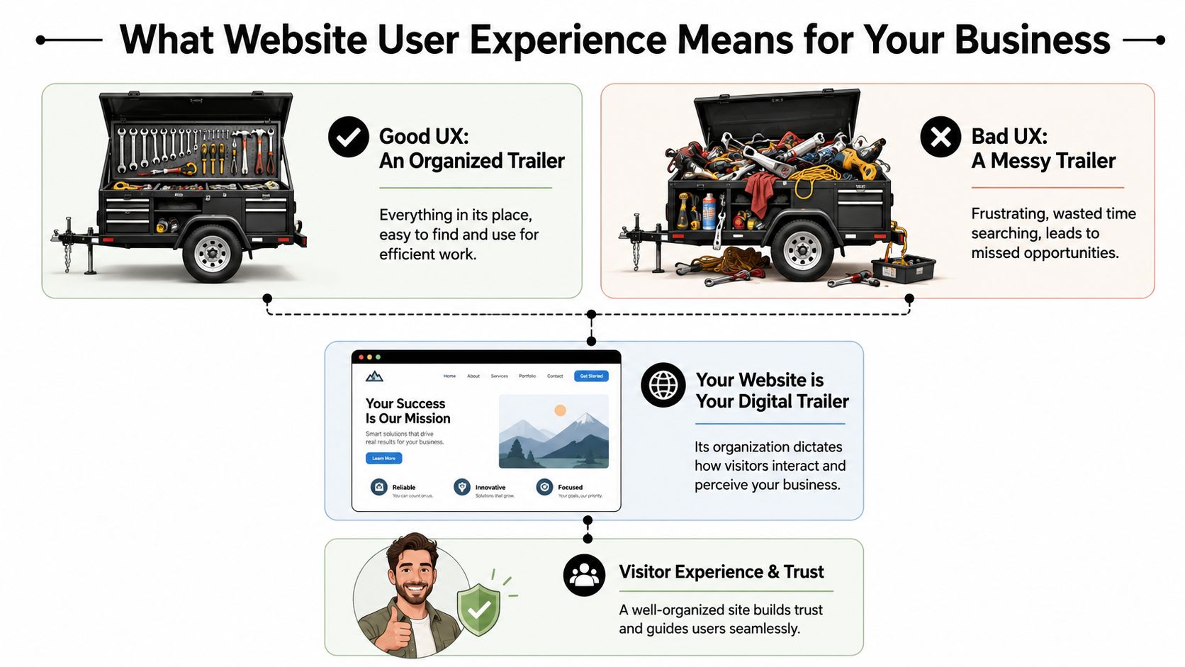
The tool trailer test
A visitor shows up with a job to do. They aren't there to admire your website. They want to know one of a few things fast.
Maybe they need a vac truck. Maybe they need welding support. Maybe they want to know if you work in Duchesne County, Uintah County, or beyond. Maybe they're a CDL driver looking for a better employer.
If the menu is confusing, the pages are scattered, or the contact options are buried, the site feels like a messy trailer. People don't say, “This site has poor information architecture.” They say, “I can't find anything,” and they leave.
That's why website user experience design matters. It organizes your digital space around what the visitor needs to accomplish, not around how your company happens to be structured internally.
Three pillars that matter
Most of UX for a contractor website comes down to three simple tests.
| Pillar | What the visitor is asking | What good looks like |
|---|---|---|
| Findability | Can I get to the page I need fast? | Clear menu, visible services, obvious contact path |
| Usability | Can I complete the task without frustration? | Short forms, click-to-call, readable text, mobile-friendly layouts |
| Trust | Does this company look legitimate and capable? | Professional design, current photos, clear service area, consistent branding |
The first pillar is navigation and layout. A strong site doesn't make people dig through vague labels like “Solutions” or “Resources” when what they need is “Services,” “Careers,” or “Request a Quote.”
The second is ease of use. A form that asks for too much too early kills momentum. A phone number that isn't clickable on mobile wastes an easy opportunity. Tiny text, weak contrast, and crowded pages make the site harder to use than it needs to be.
The third is trust. People judge your operation partly by how your website feels. If it looks outdated, broken, or unfinished, they start wondering what else is disorganized.
A polished website doesn't replace good field performance. It does help a buyer believe you'll deliver it.
The practical takeaway is simple. Review your site the way a stranger would. Don't ask whether it has all the information. Ask whether the right person can find and use that information without effort.
If the answer is no, that's a UX problem, not just a design problem.
How Good UX Drives Leads Recruitment and Credibility
A contractor doesn't invest in a website for compliments. The site needs to produce phone calls, quote requests, and applicants. That's where UX stops being abstract and starts looking like a business decision.
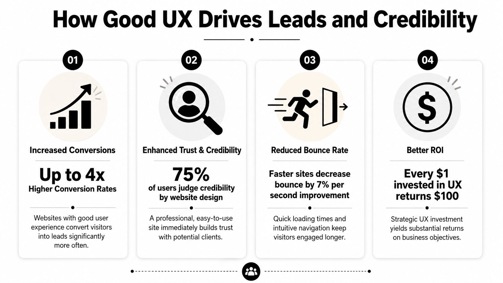
The upside can be substantial. According to DesignRush's roundup of UX statistics, every dollar invested in UX can generate up to $100 in return, which is often described as about 9,900% ROI. The same source also notes that frictionless UX design can increase conversion rates by as much as 400%. For a contractor or oilfield service company, that means the structure of the site can directly affect how many visitors become leads or applicants.
More leads with less friction
A good contractor website doesn't just say “contact us.” It clears a path.
If someone lands on your service page, they should see what you do, where you work, and what to do next. On many underperforming sites, the visitor has to hunt for all three. That's where leads disappear. Not because demand is weak, but because the path is clumsy.
A few things usually work well:
- Visible calls to action: “Request a Quote” in the main menu works better than hiding the contact path in the footer.
- Short forms: Ask only for what you need to start the conversation.
- Service-specific pages: A page about excavation should lead naturally to an excavation estimate request.
- Trust cues near the form: Reviews, safety credentials, and service area details reduce hesitation.
If you want a simple way to present credibility elements cleanly, a trust badge generator tool can help package reviews or proof points into something more usable than random screenshots.
For companies focused on lead flow, this is the same logic behind a better website conversion rate strategy. Reduce friction, and more of the traffic you already have turns into real opportunities.
Better recruiting starts with usability
Recruiting is where a lot of contractor sites inadvertently lose good people. The company says it's hiring, but the process sends applicants through a maze. Sometimes it's a PDF. Sometimes it's a desktop-only form. Sometimes the careers page is buried under “About.”
That setup filters out the wrong people. Not the unqualified ones. The busy ones.
A welder on break or a driver between loads won't jump through hoops to express interest. They'll move on to the company with the easier process. Good UX supports hiring by making the careers path obvious, mobile-friendly, and short enough to finish in a real-world setting.
If applying for a job feels like office paperwork, field talent won't finish it.
Credibility gets decided fast
Many local businesses underestimate how much website quality affects perception. A smaller company can look dependable and established online. A capable company can also look disorganized if the site is slow, sparse, or outdated.
Credibility comes from details people notice without thinking about them:
- Current project photos
- Readable service descriptions
- Consistent branding
- Clear company contact details
- A site that feels maintained rather than abandoned
For industrial buyers, that first impression matters because the consequences are more significant. They're not ordering a T-shirt. They're evaluating whether you seem reliable enough to handle a serious job.
Good UX tells them yes before the first phone call.
Practical UX Upgrades for Your Contractor Website
Most contractor websites don't need a fancy reinvention first. They need practical cleanup. Fix the places where users get stuck, and the site usually starts pulling more weight right away.

One useful way to think about it is task completion. CareerFoundry's overview of UX design notes that well-structured site hierarchies and optimized task flows can improve task completion rates by 20–40%. On a contractor site, that often means more visitors finishing a quote request or job application instead of dropping off halfway through.
Fix the high-friction spots first
Start with the pages tied directly to money and hiring. Don't begin with your history page or a logo refresh.
- Make the phone number tap-to-call: On mobile, this should work from the header on every page.
- Put “Request a Quote” in the main navigation: Not buried under a submenu.
- Create a real careers page: Don't force users to download a document to apply.
- Show service areas clearly: If you serve Vernal, Roosevelt, Duchesne, and surrounding areas, say so plainly.
- Use plain labels: “Hydrovac Services” beats vague menu text like “Capabilities.”
A lot of this is easier to manage when the site is built on a flexible platform. A well-structured WordPress website for business makes it easier to update service pages, hiring content, and forms without rebuilding the whole site every time something changes.
Build around the jobs people need done
Internal org charts make terrible website navigation. Customers don't care which department owns a service. They care whether you can solve the problem they have today.
That means pages should map to user tasks, such as:
| Visitor need | Best page or feature |
|---|---|
| Get pricing or availability | Quote form with a clear next step |
| Check service fit | Individual service pages with examples |
| Confirm service area | Service area page or map |
| Apply for work | Mobile-friendly careers page |
| Verify credibility | Projects, certifications, reviews, equipment info |
When this is done well, the site feels obvious. That's a compliment. Obvious is good. Obvious gets the job done.
Here's a practical walkthrough that shows the difference between cluttered interfaces and cleaner decision paths:
Use video and visuals to remove doubt
Contractor websites often lean too hard on text or, just as often, on giant photo galleries with no context. The better approach is to use visuals as proof.
Show trucks, crews, fabrication work, equipment, site conditions, and finished results. Add short captions so the visitor knows what they're seeing. A photo of a rig-up yard means more when it's tied to a service, project type, or capability.
A few upgrades usually pay off quickly:
- Replace generic stock images with real field photos.
- Use headings that answer questions people have.
- Keep forms short and place them near relevant content.
- Add FAQs for common concerns like service area, turnaround, or equipment types.
- Trim dead pages that don't help a visitor take action.
The best contractor websites feel less like advertisements and more like a well-run office counter. Clear signs, direct answers, and no wasted motion.
That's the standard to aim for.
Common UX Mistakes Costing Rural Businesses Money
Some website problems are annoying. Others directly cost you leads and applicants. Rural businesses often deal with both at the same time.
The hard truth is that many local contractor sites still make basic mistakes that turn away good traffic. Not because the owners don't care, but because the site was built once, then left alone while the business kept evolving.
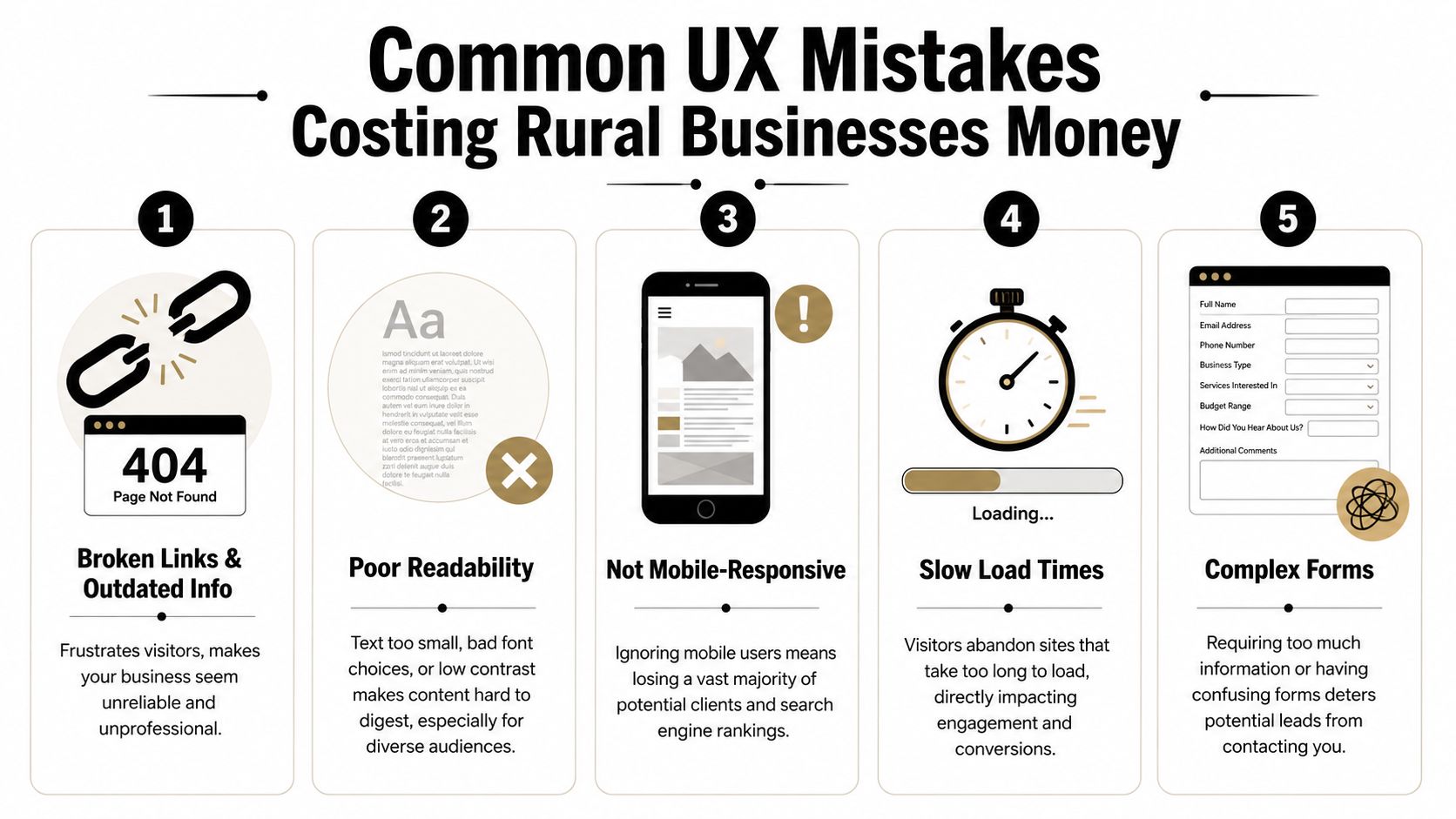
The expensive mistakes I see most often
The first is hidden contact information. If a user has to scroll, search, or switch pages just to find a phone number, the site is slowing down a ready-to-buy visitor.
The second is oversized image files. Contractors want to show off jobs, which makes sense. But if those photos are uploaded straight from a phone or camera with no compression, the site gets heavy fast. On a weak mobile connection, that hurts.
The third is document-first thinking. If your service details, job application, or equipment list live inside downloadable files instead of usable web pages, you're adding friction for no reason.
The fourth is unclear language. Local businesses sometimes write for insiders only. That works if the reader already knows your world. It fails when a property owner, office manager, or project coordinator needs plain-English confirmation that you do the work they need.
A quick diagnostic list helps:
- Buried contact paths: Visitors shouldn't have to hunt for a call or quote option.
- Outdated information: Old crew photos, expired job posts, and stale service pages make the business look inactive.
- Tiny text and weak contrast: Hard-to-read sites lose people fast.
- Forms that ask too much: Long forms feel like work, especially on mobile.
- Broken mobile layouts: If the site pinches, overlaps, or cuts off content, users won't fight through it.
Why rural conditions make bad UX worse
Rural users don't always browse on ideal connections. They may be on the road, on-site, or using older devices. That changes what “good enough” means.
According to the Wikipedia overview of user experience design, sites that exceed Google's Core Web Vitals thresholds for speed and stability can see conversion rates 10–30% higher than slower, poorly optimized sites. For Uinta Basin businesses, that matters because many visitors are using mobile devices in less-than-perfect network conditions.
Challenging environments expose weak websites. A slow-loading gallery, shifting layout, or heavy script might be tolerable on office fiber. It becomes a problem in the field.
Slow websites don't just test patience. They make the company look less professional than it is.
If your website only works well under perfect conditions, it isn't working well.
Your Prioritized UX Action Plan
Most owners don't need another vague reminder to “improve the website.” They need a sequence. What should get fixed first, what can wait, and what deserves a bigger rethink later.
The best UX plans start with friction removal, then move into structure, then into refinement. That keeps the work practical and tied to business results instead of endless tinkering.
This week
Handle the obvious issues first. These are the fixes that stop immediate leakage.
- Test your site on your own phone: Not in the office, but the way a customer would use it.
- Check every main contact path: Phone number, quote form, contact page, and careers page should all work cleanly.
- Move key actions higher: Put quote requests and job opportunities where they're visible without hunting.
- Remove dead weight: Broken pages, outdated PDFs, and old announcements should go.
- Review readability: If the text is hard to read, increase contrast and size.
A good companion for this step is a structured WCAG AAA checklist. Even if you don't pursue every accessibility standard at once, it gives you a practical way to catch readability and usability issues that affect real visitors.
The next 90 days
Once the urgent problems are fixed, clean up the foundation.
Build clearer service pages. Simplify the main menu. Create a dedicated careers section. Add real project photos with context. Make sure each important page points to one next action instead of several competing ones.
This is also the right time to rethink navigation depth. Critical pages should be easy to reach. Visitors shouldn't need to bounce through multiple layers just to find employment info, equipment details, or service-area coverage.
You'll usually get the best results by focusing on these business paths:
| Priority | What to improve | Why it matters |
|---|---|---|
| High | Quote flow | Direct impact on leads |
| High | Careers flow | Direct impact on recruiting |
| Medium | Service page clarity | Helps qualify the right inquiries |
| Medium | Mobile usability | Supports field and rural users |
| Ongoing | Photo and content updates | Keeps credibility current |
Longer-term improvements
After the basics are solid, you can add more advanced UX improvements. That might include better FAQ content, tighter local SEO alignment, stronger review presentation, or smarter automation around lead intake.
It may also include AI-assisted interactions. Used carefully, they can help answer common questions or guide users to the right page. But the experience has to stay clear and trustworthy. The Moqups article on hidden work in UX/UI design notes that as AI-driven interactions become more common, UX has to preserve transparency and trust. For a service business, that means users should understand what the tool is doing and still have a clear path to a real human when needed.
Don't bolt on an AI chat widget just because everyone else is doing it. If it blocks the contact form, gives muddy answers, or feels like a gimmick, it hurts more than it helps.
The long-term goal is simple. Build a site that works under real conditions, supports the way your customers and applicants behave, and keeps earning its place in the business.
If your website isn't bringing in enough leads, helping you recruit, or reflecting the quality of your company, Northpoint Web can help. We build practical websites for contractors, oilfield service companies, trucking businesses, and other growing companies in the Uinta Basin that need their site to do more than sit online.
Comments are closed