A lot of trucking company owners are sitting on the same problem right now. The website looks decent enough. It has a truck photo, a phone number, maybe a short paragraph about reliable service. But it isn't bringing in serious freight inquiries, and it isn't helping recruit the kind of drivers you want to hire.
That usually happens because the site was built like a brochure instead of a working sales and recruiting tool. In regions like the Uinta Basin, that mistake gets expensive fast. A small to mid-sized carrier doesn't have room for dead weight marketing. Every page needs to either help a shipper trust you, help a driver see a future with you, or move someone toward a call, quote request, or application.
Most general advice misses the hard part. A trucking company website has to serve two different audiences with different questions, different urgency, and different decision criteria. If you mix them together carelessly, both sides get a worse experience.
Table of Contents
- Why Your Old Trucking Website Is Costing You Money
- The Blueprint Before You Build
- Designing for Trust and Action on Any Device
- Must-Have Pages for Your Trucking Website
- Getting Found by Local Shippers and Drivers
- Launching Your Site and Hiring a Pro
Why Your Old Trucking Website Is Costing You Money
An old trucking site usually doesn't fail because it's ugly. It fails because it makes people work too hard.
A shipper lands on the homepage and can't tell what lanes you run, what freight you handle, or how to request a quote without digging through a cluttered menu. A driver lands on that same homepage and sees generic company talk, no clear hiring path, and no fast answer to the questions they care about. Pay structure, equipment, home time, and how to apply.
That's the true cost. Not the design itself. The lost call, the abandoned form, the qualified applicant who moves on to a competitor with a cleaner process.
Practical rule: If a shipper or driver has to guess where to click next, the website is underperforming.
Most trucking company website design problems come from the same assumption. Owners think the website's job is to prove the business exists. That was enough years ago. It isn't enough now.
Your website needs to do two separate kinds of work:
- Sell capability to shippers. Show service area, freight types, equipment, safety, responsiveness, and a simple quote path.
- Sell the opportunity to drivers. Show what it's like to work there, what trucks they'll run, what kind of work they'll do, and how to apply without hassle.
- Remove friction. Make the next step obvious on every key page.
There's another issue many companies overlook. Accessibility and usability affect whether people can use your site in the first place. If you want a practical primer on why that matters, ADA Compliance Pros on web accessibility is worth reading. It connects compliance to real-world usability, which is exactly how business owners should think about it.
A working site isn't a vanity project. It's part dispatcher, part salesman, part recruiter.
The Blueprint Before You Build
The worst time to decide what your website should do is after the homepage mockup is already on the screen. Good trucking company website design starts with structure, not colors.
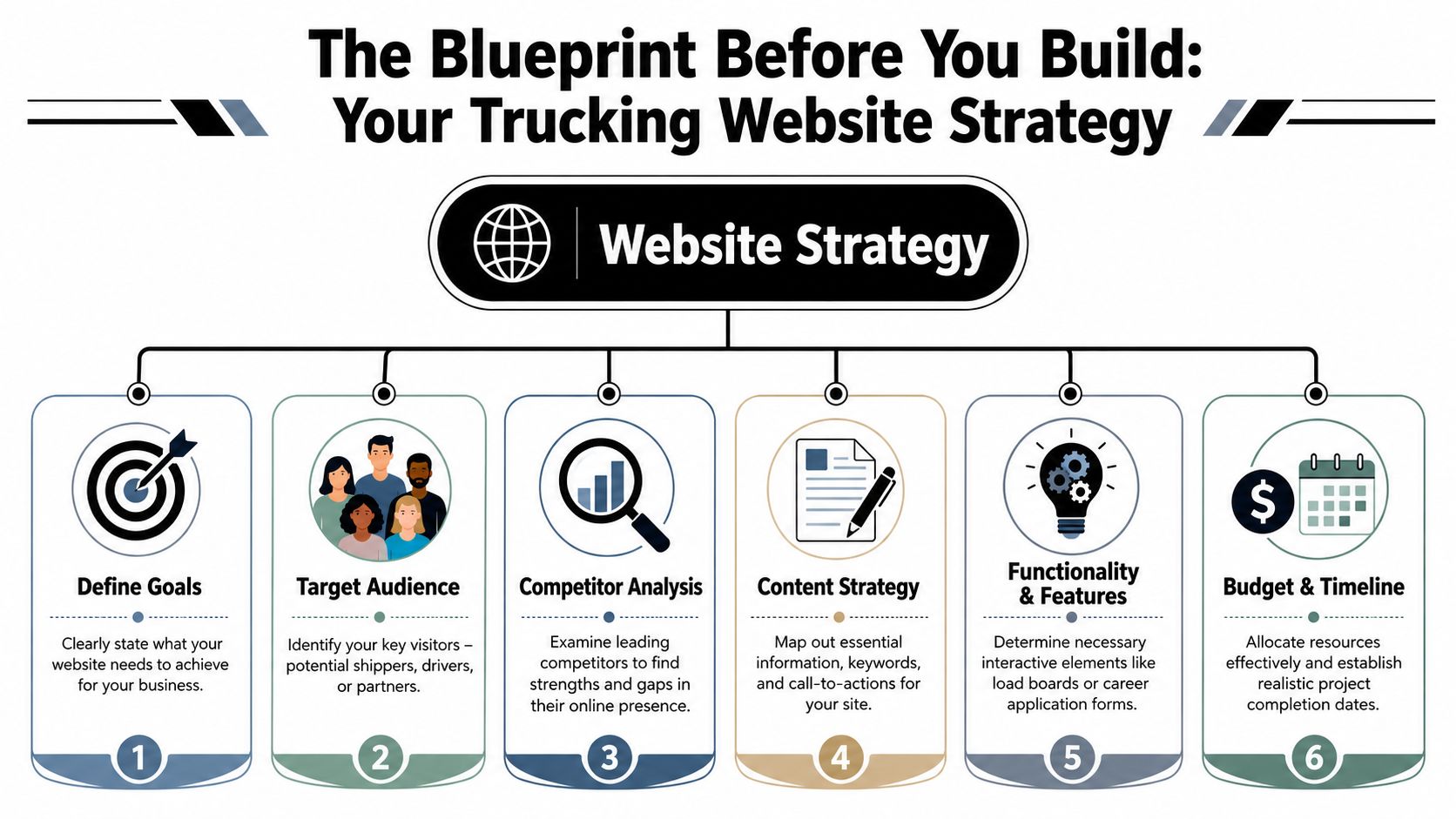
Start with the two jobs your site has to do
Most carriers don't need a complicated digital strategy. They need a clear one.
Industry roundups have explicitly recommended separate pathways for shippers and drivers rather than forcing both audiences through the same funnel, because mixing them too early can hurt lead quality and applicant flow, as noted by The Whit Group's trucking website design roundup.
That means your first planning decision is priority.
If freight sales are the immediate pressure, your homepage should lead with service credibility and quoting. If hiring is the bigger pain point, the homepage can still support shippers, but the recruiting path needs to be visible immediately. Not buried in a footer link called Careers.
A practical homepage layout for small and mid-sized carriers usually looks like this:
| Visitor type | What they need first | Best first action |
|---|---|---|
| Shipper | Service area, freight type, reliability signals | Request a quote |
| Driver | Job type, equipment, work expectations | Apply now |
| Broker or partner | Fast company verification and contact info | Call or contact operations |
Build the page structure before the design
Navigation should reflect how people think, not how the owner talks about the business in the yard.
A clean structure often includes:
- Home for high-level trust and routing
- Services for freight capabilities and lanes
- Equipment or Fleet for operational proof
- About or Safety for credibility
- Careers for recruiting content
- Contact for fast outreach
Keep the top navigation tight. Too many tabs usually signal poor planning, not more information.
One of the best ways to avoid bloated menus is to sketch the site hierarchy first. Even a one-page outline in Google Docs or a whiteboard session can save a lot of redesign later. If you're comparing frameworks for lead flow and page intent, LeadBlaze's lead generation website guide gives a useful marketing-first perspective. For companies that need a simpler business site foundation before industry customization, this overview of small business web design is also a practical reference.
The homepage should route visitors. It shouldn't answer every question for every audience.
Set one primary action for each audience
Too many trucking websites throw five calls to action on the same screen. Call us. Email us. Request a quote. Apply now. Get started. Learn more. That isn't strategy. That's indecision.
Pick the main action for each path and support it consistently.
For shippers, that usually means a short quote form, direct phone access, and service pages tied to specific hauling capabilities. For drivers, it means a dedicated recruiting page with a real application flow and plain language about the job.
Before design starts, write down these three things:
Primary business goal
More freight leads, more driver applications, or both with a clear ranking.Primary visitor questions
Shippers ask whether you can handle the job. Drivers ask whether the job is worth taking.Proof points you can show
Fleet photos, service descriptions, certifications, testimonials, equipment details, dispatch availability.
If those aren't settled, the design phase usually turns into expensive guesswork.
Designing for Trust and Action on Any Device
A trucking website doesn't get much time to make its case. Visitors decide quickly whether the company looks established, responsive, and worth contacting.
Mobile-first is the baseline
This isn't optional. 60.67% of website traffic arrives from mobile devices, according to Wix's guide to making a trucking website. If your site doesn't work smoothly on a phone, a lot of your audience is gone before they read a line of copy.
That matters more in trucking than in a lot of industries. Drivers are browsing on breaks. Dispatchers are checking vendors between tasks. Shippers and brokers may be searching while traveling or after hours. They want a fast answer, not a desktop-only experience squeezed onto a small screen.
If you want a strong technical companion on the search side of mobile performance, this agency playbook for mobile SEO covers the practical side well.
Trust signals that actually matter
Shippers don't trust a carrier because the site uses a trendy font. They trust what they can verify quickly.
The strongest trust-building elements are usually simple:
- Real fleet photography rather than generic stock trucks
- Visible operating details such as service types, coverage areas, and equipment categories
- Safety and compliance information presented clearly
- Testimonials that sound specific, not anonymous and vague
- Direct contact paths that don't make someone hunt for a phone number
For many companies, conversion goes up when the design removes friction instead of trying to impress. This guide on how to improve conversion rate lines up with that approach. Make the path clearer, and more people take it.
A shipper looking at three carriers online will often choose the company that feels easiest to trust and easiest to reach.
What hurts conversions
The most common design mistakes are easy to recognize once you've seen a few of them.
| What works | What fails |
|---|---|
| Clear headline with service focus | Generic slogan with no operational detail |
| Phone number and CTA near the top | Contact info hidden in the footer |
| Short forms | Long forms that ask too much too early |
| Fast-loading media | Heavy hero videos and oversized images |
| Separate shipper and driver paths | One mixed message for everybody |
Good design in this industry is practical. It says, "We know what business we're in, and we know what you need next."
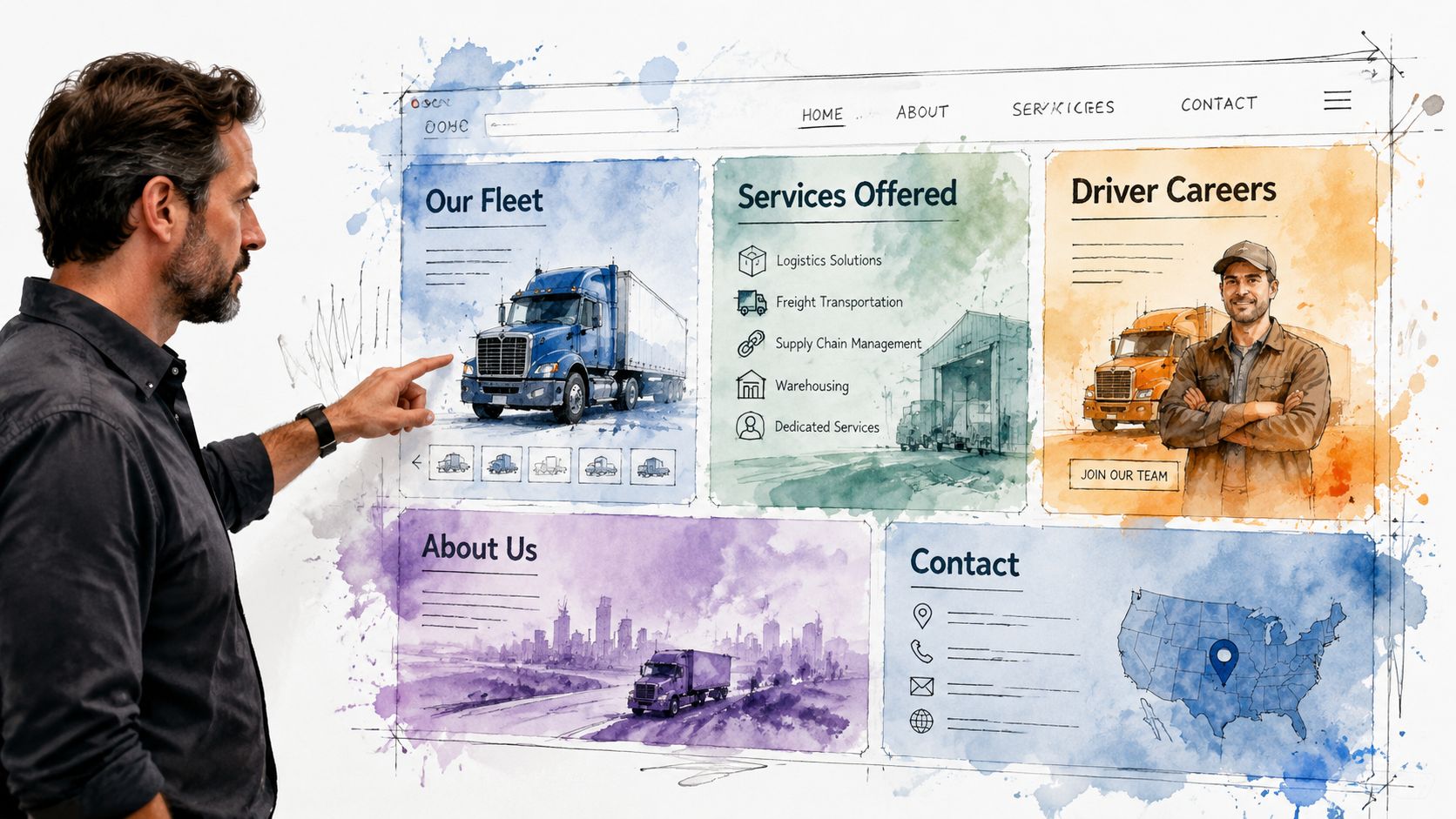
Must-Have Pages for Your Trucking Website
A trucking website earns its keep page by page. Every major page should answer a real business question, not just fill out a navigation menu.
The scale of the industry is one reason this matters. Trucks moved roughly 72.7% of the nation's freight by weight in 2024, according to the American Trucking Associations economics and industry data. A carrier's website isn't competing in a tiny niche. It's competing in a major freight market where buyers compare operational credibility quickly.
The pages that win shipper trust
The Services page should do more than say "we haul freight." It should spell out what kind of work you want.
If you haul flatbed, heavy haul, oilfield support, aggregate, regional freight, or specialized loads, say it plainly. Mention the industries you serve, the kind of jobs you're set up for, and the areas you regularly cover. This helps the right prospects qualify themselves before they call.
The Fleet or Equipment page is where many companies get lazy. They post one sentence and a truck photo. That's not enough. List the equipment categories you run and show the assets clearly. Shippers want to know if you have the tools and capacity for the job.
The Safety or About page should support confidence. Keep it factual. Include company background, operating standards, and the kind of details that signal professionalism and consistency.
The best service pages sound like they were written by someone who understands dispatch, equipment, and customer expectations. Because they should be.
Here's a quick content checklist for shipper-focused pages:
- Service detail with freight type and job fit
- Coverage clarity so visitors know where you operate
- Equipment proof with real photos and categories
- Quote CTA on every key page
- Trust content such as testimonials, credentials, or operational standards
A short visual explainer can also help business owners think through site structure and content balance:
The recruiting pages drivers actually use
A proper Careers section deserves its own hub, not a single paragraph on the About page.
Drivers want direct answers. What equipment will they drive? What kind of routes are involved? Is the work local, regional, oilfield, seasonal, or over-the-road? What does the company expect, and how hard is it to apply?
A recruiting section usually needs:
- Job-specific pages for different roles if you hire for more than one
- An application form that works on mobile
- Straightforward job copy without corporate fluff
- Photos of actual trucks and working conditions
- Contact options for people who want to ask before applying
The support pages most companies underbuild
The Contact page should be easy. A simple form, clickable phone number, service email, and clear location information are enough for most carriers.
Testimonials also deserve more attention than they usually get. If you've got strong customer feedback or driver feedback, don't hide it on one forgotten page. Place it where it supports the buying decision or hiring decision.
The homepage matters, but these support pages often do the actual closing work.
Getting Found by Local Shippers and Drivers
A solid site still won't help much if nobody local can find it. Trucking companies need visibility where intent is highest. Search results, map results, and branded searches tied to service areas.
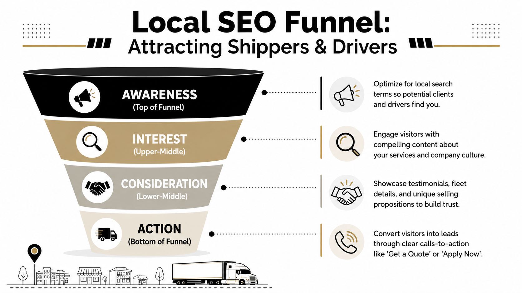
Local visibility starts with intent
The strongest local search strategy usually separates shipper intent from driver intent.
A shipper may search for freight hauling, oilfield trucking, flatbed service, or transportation support tied to a city or region. A driver may search for CDL jobs, local driving work, heavy haul positions, or oilfield trucking jobs. Those are different searches, and they should land on different pages.
That means your site should have local and service-specific pages where appropriate, clean page titles, and copy that reflects what you do in the markets you serve. If your business depends on regional visibility, this article on local SEO for contractors is useful even outside construction because the same local intent principles apply.
On-site tools that help visitors convert
Search rankings matter, but on-site usability closes the gap between traffic and leads.
One industry analysis reports that adding an internal search function can increase conversions by as much as 1.8 times, according to Promodo's trucking website design analysis. For a trucking site, that can be especially useful when a visitor wants a specific service page, lane detail, or job opening without digging through the menu.
Useful conversion tools often include:
- Internal search for users with a clear destination in mind
- Sticky quote or apply buttons on mobile
- Short forms matched to the page's purpose
- Location cues throughout the site so visitors know they're in the right place
Reviews and Google Business Profile still do heavy lifting
For local carriers, reputation often shows up before the website does. A Google Business Profile with accurate business information, business category alignment, and consistent contact details helps people verify they're dealing with a legitimate operation.
Reviews matter for both audiences. Shippers look for professionalism and responsiveness. Drivers pay attention to how a company is described by people who have worked with or for it.
Keep the basics clean:
- Business name, address, and phone consistency across your site and listings
- Fresh photos that reflect your current operation
- Review gathering as a regular process, not an afterthought
- Landing pages that match what someone searched for
A local SEO plan works best when the website and the business listing reinforce each other instead of sending mixed signals.
Launching Your Site and Hiring a Pro
A website launch shouldn't feel like flipping a switch and hoping for the best. It should feel like putting a finished truck into service after you've checked the tires, lights, brakes, and paperwork.
The basics still matter. A successful website build starts with clear audience segmentation and intuitive navigation, and common pitfalls include overloaded menus, poor mobile usability, slow-loading media, and hard-to-find contact details, as noted in NuTech Digital's guide to building a transportation business website.
What to check before launch
Before the site goes live, verify the obvious things people often miss.
- Forms work properly and send submissions to the right inbox
- Phone numbers are clickable on mobile
- Driver application flow is complete from first click to confirmation
- Service pages are indexed and readable with no placeholder copy
- Photos are compressed well enough that pages load quickly
- Contact details appear in the header, footer, or both
Also decide what counts as a lead before launch. A quote request, a phone call, and a completed application shouldn't all get lumped together. Track them separately so you know what part of the site is doing its job.
What to ask before hiring a web partner
A generic designer can build a pretty homepage. That doesn't mean they understand carrier operations, recruiting pressure, or industrial buyers.
Ask practical questions:
| Question | Why it matters |
|---|---|
| Have you built sites for trucking, industrial, or field service businesses? | Industry context changes structure and messaging |
| How do you handle separate shipper and driver paths? | This is the core strategic issue |
| Who writes the page copy? | Strong copy is usually the difference between a brochure and a lead tool |
| How will leads be tracked? | You need feedback after launch |
| What happens after launch? | Most sites need updates, support, and SEO follow-through |
Hire the team that asks smart business questions before they talk about colors.
A simple brief you can send out
If you want better proposals, give designers a cleaner brief. Something like this is enough:
Company overview
What you haul, where you operate, and what makes your operation different.Primary goals
More freight leads, better driver recruiting, or both in ranked order.Target audiences
Shippers, brokers, owner-operators, company drivers, or support hires.Required pages
Home, Services, Fleet, About, Safety, Careers, Contact, plus any location pages.Required functions
Quote form, driver application, click-to-call, testimonials, search, job pages.Assets available
Logo, fleet photos, certifications, reviews, service lists, recruiting details.Success metrics
More quote requests, more qualified calls, more completed applications.
A good build process isn't mysterious. It just requires somebody to think through the business before the design files start moving.
If your trucking company needs a website that brings in freight leads, attracts qualified drivers, and reflects how your operation works, Northpoint Web builds practical websites for industrial and transportation businesses in the Uinta Basin and beyond. The focus is simple. Clear structure, better visibility, and a site that helps your company win work and hire faster.
Comments are closed