When you’re launching or growing a business in the Uinta Basin, your website is your digital storefront. And like any good storefront, it needs to be built with local customers in mind. But finding the right web design partner in a rural area can feel challenging. Should you hire a remote agency, or is there a benefit to working with someone who knows Vernal, Roosevelt, and Duchesne firsthand?
For businesses across northeastern Utah, the answer is often clear: a local web designer understands your market, your community, and your unique needs better than anyone else.
The Local Advantage: More Than Just a Pretty Website
1. Understanding the Local Economy
Working with a designer who knows the Uinta Basin means working with someone who understands your customers. Whether you’re a contractor supporting the energy sector, a tourism business near Dinosaur National Monument, or a retailer serving the growing communities of Roosevelt and Duchesne, local expertise shows up in your website’s design .
A Vernal-based designer knows what resonates with Basin customers—the down-to-earth professionalism, the community-focused messaging, and the straightforward approach that local businesses value.
2. Face-to-Face Collaboration
Let’s be honest: building a website involves a lot of communication. When your designer is local, you can meet face-to-face, review mockups in person, and build a relationship that’s harder to achieve through email alone . That personal connection means your vision is understood more clearly from the start.
3. Community Investment
When you hire a local web designer, you’re keeping your money in the Uinta Basin. Businesses like Walston Net Design, a Vernal-based web development company serving Utah clients since 1998, demonstrate the staying power of local professionals who are invested in their community’s success . These are the people you’ll see at Chamber of Commerce events and local networking functions.
Your chosen designer should have a track record of working with small businesses like yours. Look for someone who understands the specific needs of contractors, retailers, and service providers in rural Utah markets .
2. Responsive Communication
In the fast-paced world of business, waiting days for email responses isn’t acceptable. A great local web designer prioritizes client communication and stays accessible when you need them.
3. Reasonable Pricing Without Surprises
Affordability matters, especially for startups and small operations. The best local designers offer transparent pricing structures without hidden fees—you should know exactly what you’re paying for.
4. Comprehensive Services
Ideally, your designer should offer everything you need in one place: custom web design, hosting, domain registration, and ongoing support . This saves you from juggling multiple vendors.
Why Northpoint Web Is Your Local Uinta Basin Partner
At Northpoint Web, we’re proud to serve businesses across Vernal, Roosevelt, Duchesne, and the entire Uinta Basin. We bring a unique combination of professional expertise and genuine local commitment to every project.
Here’s what sets us apart:
✅ Highly Responsive
We understand that your time is valuable. When you reach out with questions or concerns, we get back to you quickly—no waiting days for a reply. We treat every client like a priority.
✅ Reasonably Priced
We offer affordable website solutions starting at a budget-friendly rate, with transparent pricing that works for small businesses. No surprises, no hidden costs.
✅ Local Knowledge
We live and work in the Uinta Basin. We understand the local market, the customer base, and what makes businesses in Vernal, Roosevelt, and Duchesne succeed.
✅ Comprehensive Services
From affordable managed websites to custom lead generation systems, we offer everything you need under one roof .
How to Get Started
Finding the right web designer doesn’t have to be complicated. Here’s a simple process:
Check Portfolios: Review examples of local work to see if the design style matches your vision .
Read Reviews: Look for testimonials from other Basin businesses. Search for local business directories or ask around at Chamber events .
Schedule a Consultation: Meet potential designers face-to-face to discuss your project. A good local partner will take the time to understand your unique needs.
Ask About Ongoing Support: A website isn’t a one-time project. Make sure your designer offers maintenance, updates, and support after launch .
Ready to Build Your Local Online Presence?
Your business deserves a website that represents your brand and connects with local customers. As a Uinta Basin-based web design company, Northpoint Web combines professional expertise with a deep commitment to our community.
We’re highly responsive, reasonably priced, and dedicated to your success. Whether you’re in Vernal, Roosevelt, or Duchesne, we’re here to help you build a strong digital foundation for your business.
The Uinta Basin is experiencing a significant economic moment. With major infrastructure investments, a diversified economy, and a strong community focus on supporting local businesses, there’s never been a better time to be an entrepreneur in northeastern Utah.
Whether you’re a contractor, a retailer, or a service provider, establishing a strong digital presence is just as critical as having a solid business plan. At Northpoint Web, we specialize in helping local businesses build that foundation. Here is your step-by-step guide to launching a successful company in the Uinta Basin.
Step 1: Understand the Local Economy and Your Opportunity
The Uinta Basin’s economy has evolved significantly from its agricultural and mining roots. Today, it is a dynamic mix of energy extraction, tourism, and a growing service sector .
Energy and Infrastructure: The region is a hub for oil and gas, with new developments like the Savage crude-by-rail transload terminal connecting Uinta Basin producers to national markets . This creates opportunities for contractors, suppliers, and logistics companies.
Tourism and Recreation: With attractions like Dinosaur National Monument, Flaming Gorge, and Starvation Reservoir, tourism is a major economic driver .
Local Services: From retail to healthcare, the growing population in communities like Vernal, Roosevelt, and Duchesne creates constant demand for local services .
The Opportunity: The area is ripe for businesses that support these core industries and serve the local community. A professional online presence is key to capturing this diverse market .
Step 2: Craft a Solid Business Plan and Secure Funding
Before you build your website, you need a roadmap. The Uinta Basin offers resources to help you get started.
Leverage Local Support: Programs like the ones run by the Uintah County Economic Development Commission are designed to support entrepreneurs. Look for workshops, grant opportunities, and networking events that can provide a jumpstart for your venture .
Understand Your Market: Identify your specific niche. Are you targeting energy companies, tourists, or local families? Your business plan should define your target audience and how you will reach them.
Step 3: Build Your Digital Foundation (This is Where We Come In)
In today’s market, your website is often the first impression you make. For a business in the Uinta Basin, a strong online presence means being found by customers searching for your services.
Here’s how Northpoint Web can help you build a powerful digital home base:
1. A Professional, Affordable Website
You need a website that is modern, mobile-friendly, and reflects your brand. We specialize in creating Affordable Managed Websites and Contractor Websites designed to showcase your projects and expertise [citation:https://northpointweb.com/services/]. These aren’t just templates; they are built to convert visitors into customers.
2. Lead Systems and Automation
A beautiful website is just the beginning. To truly grow, you need a system to capture and follow up with leads. Our Lead Systems and Automation services ensure no opportunity slips through the cracks [citation:https://northpointweb.com/services/]. This is crucial for competitive markets.
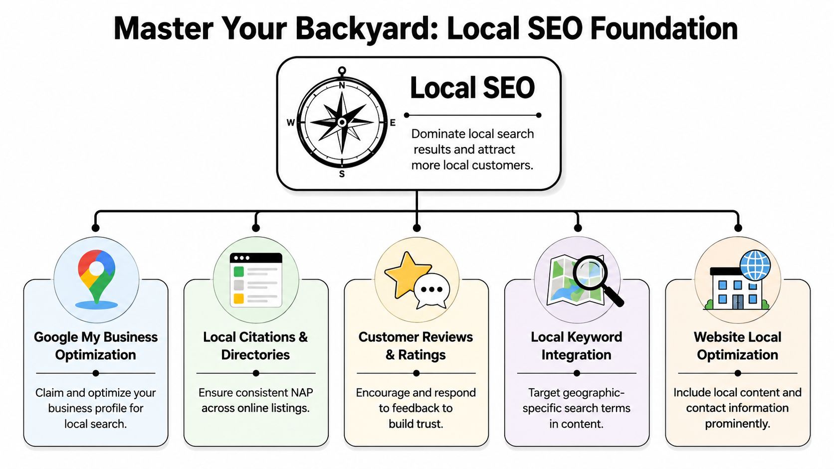
3. Local SEO
“Search Engine Optimization” is how customers find you. We build SEO Foundations into every site, helping your business rank for local searches like “contractor in Vernal” or “web design Uinta Basin” [citation:https://northpointweb.com/].
Step 4: Establish Your Brand and Community Presence
Connecting with the local community is vital in the Uinta Basin. “We’re dedicated to helping local businesses thrive and build connections,” [citation:https://northpointweb.com/] and that ethos is shared by successful local enterprises. Use your website and social media to highlight your involvement in local events, partnerships, or community initiatives.
Step 5: Plan for Growth and Future-Proof Your Business
The Uinta Basin is on an upward trajectory, and your business should be too. A scalable digital strategy is key.
Invest in Web Applications and Tools: As your business grows, you may need custom Web Applications and Tools to streamline operations, manage scheduling, or improve customer management [citation:https://northpointweb.com/services/].
Review and Adapt: Regularly review your website’s performance and adapt to new market trends. Your online presence should grow with your business.
Conclusion: Your Uinta Basin Success Story Starts Here
Starting a company in the Uinta Basin offers incredible opportunities. The key to success lies in combining a solid business strategy with a robust digital presence.
At Northpoint Web, we have the experience and the tools to help you every step of the way. We’re committed to providing top-notch web design and digital solutions that empower local businesses [citation:https://northpointweb.com/].
Empowering Utah’s Contractors with Affordable Websites
In today’s digital age, having a professional and functional website is essential for contractors and small businesses looking to stand out. At Northpoint Web, we specialize in creating affordable, managed websites tailored specifically for contractors in Utah, particularly in the Uinta Basin. Our goal is simple: to help you establish a robust online presence without breaking the bank.
Why Choose a Contractor-Specific Website?
Contractors have unique needs that differ from other industries. A successful contractor website should do more than just highlight services; it should effectively communicate capabilities, showcase past projects, and facilitate client interactions. Here are a few reasons why your contractor website matters:
Builds Credibility: A professional site instills trust in potential clients, helping them feel confident in your services.
Showcases Your Work: A dedicated portfolio section can highlight past projects, allowing clients to see your quality of work before they make a decision.
Streamlines Client Communication: Tools like estimate-request forms and scheduling can improve response times, ensuring you capture every opportunity.
Affordable Managed Websites: A Solution for Contractors
Northpoint Web offers a range of affordable website plans designed specifically for contractors. Here’s what you can expect:
1. Comprehensive Features
Responsive Design: Your website will look great on mobile, tablet, and desktop.
SEO Foundations: We’ll lay the groundwork for your site to rank well on search engines without making unrealistic guarantees.
Ongoing Support: Enjoy peace of mind with our maintenance packages that include security updates and backups.
2. Tailored for Your Business Needs
Our offerings are specifically designed for contractors in various sectors, including:
General Construction
Excavation
Roofing
Custom Home Building
How We Ensure Your Website Stands Out
At Northpoint Web, we take a hands-on approach to web design. Our founder, Andy North, brings nearly three decades of experience in construction and project management, ensuring that your website is functional, practical, and aligned with industry standards. Here’s how we make it happen:
1. Understand Your Business
We begin by digging deep into your business operations and understanding what makes you unique compared to your competitors. This enables us to tailor the website specifically to your needs.
2. Clear Pricing Structure
We believe in transparency. Our pricing is straightforward, with no hidden fees, so you know exactly what you’re getting for your investment.
3. Personal Communication
When you work with Northpoint Web, you’re not just a ticket number. You’ll have direct communication with a skilled consultant who understands your business needs and objectives.
How to Get Started
Ready to elevate your online presence? Getting started with us is simple:
Contact Us: Call or text 435-733-0406 to share your vision.
Plan Your Website: We’ll work closely with you to create a tailored proposal.
Launch: After your approval, we’ll launch your new website and manage it for you.
Conclusion
In the competitive world of contracting, an affordable, responsive, and professional website can make all the difference. At Northpoint Web, we’re committed to empowering contractors in Utah with the tools and support needed to thrive online. Don’t let budget constraints hold you back from achieving your business goals. Contact us today to build a website that not only meets your needs but exceeds your expectations.
Your landing page is your digital storefront, your top recruiter, and your best salesperson, working around the clock. For contractors and industrial businesses in the Uinta Basin, a high-performing landing page isn't a luxury. It's what separates a steady flow of qualified calls in Vernal, Roosevelt, and Duchesne from a page that gets traffic but produces nothing.
A lot of local companies have the same problem right now. They're paying for ads, sharing jobs on Facebook, sending people to a website, and still not getting enough quote requests or job applicants. Usually the problem isn't the service. It's the page. The message is vague, the phone number is buried, the form asks too much, and the site loads poorly when someone checks it from a truck at a job site.
Good landing page design best practices aren't about trendy layouts. They're about making it obvious what you do, why you're credible, and what the visitor should do next. That applies whether you're booking excavation work, selling oilfield services, or recruiting CDL drivers who want a better local opportunity.
If you need a stronger foundation before redesigning a page, review these UX design principles. Then fix the parts that move leads.
1. Craft a Powerful Above the Fold First Impression
A drilling superintendent in Vernal clicks your ad between calls. A CDL driver in Roosevelt taps your hiring page from a phone in a truck stop. They give you a few seconds. If the top of the page is vague, slow, or generic, they leave.
Your first screen has one job. Tell people exactly what you offer, where you offer it, and why they should trust you enough to keep going. Basin businesses lose leads here by trying to sound polished instead of sounding clear.
Say What You Do and Where You Do It
Write the headline like a straight answer to the search or ad click. If someone searched for hydrovac work, say hydrovac work. If you are hiring drivers in Roosevelt, say that. Good examples are “Hydrovac Services in Vernal and Roosevelt” or “Now Hiring CDL Drivers in Roosevelt, Utah.” Weak headlines about quality, innovation, or excellence waste the most valuable space on the page.
The subheading should do one more thing. Explain the result. Faster excavation. Less oilfield downtime. Steady local driving routes. Better pay and home time. Keep it short and specific.
Keep the top of the page tight. Remove anything that pulls attention away from the offer. A campaign landing page should feel focused, not like a full website with ten exits.
Use this test before you publish:
Headline clarity: Name the exact service, crew type, or job opening.
Service area: Include Uinta Basin, Vernal, Roosevelt, Duchesne, or the actual coverage area.
Offer match: Make sure the image and headline match the ad or search term.
Visible action: Put the main button or phone number in view right away.
Real-world proof: Show trucks, equipment, crews, yards, or active job sites from your operation.
One more rule. If the hero section could belong to a contractor in Texas, North Dakota, or anywhere else, it is too generic for the Uinta Basin.
For industrial buyers and job applicants, clarity wins first. Branding can come later.
2. Place Strategic Calls to Action
A drilling superintendent in Vernal clicks your ad from the field. A CDL driver in Roosevelt lands on the same page during a lunch break. If both visitors see the same generic button, you lose one or both.
Your CTA has one job. Tell the right person exactly what to do next.
Contractors across the Uinta Basin miss leads here because they treat every visitor the same. That approach fails fast in industrial markets. A company looking for hydrovac support wants a quote or a phone call. A driver looking for work wants a fast application. Separate those paths early, and make the next step obvious.
Match the CTA to the Visitor Intent
Put the primary CTA high on the page. Repeat it after a proof section. Show it again near the bottom for visitors who need a little more information before they act. Use the same core wording each time so the page feels consistent and clear.
Button text should be plain and specific. “Get My Project Estimate” beats “Submit.” “Apply for CDL Position” beats “Learn More.” “Call Now for Emergency Service” beats almost everything when the job is urgent and the customer is standing on a muddy site with a problem that needs fixed today.
Message match matters. If someone clicked an excavation ad, the CTA should point to an excavation estimate or a direct call with your team. If they came from a recruiting campaign, send them to an application or recruiter contact. Do not dump both audiences into the same form and hope they sort it out.
Here's a practical setup for Basin businesses:
Emergency or outage work: “Call Now for Emergency Service”
Planned industrial or contractor work: “Get My Project Estimate”
Oilfield and field service inquiries: “Request a Jobsite Quote”
CDL recruiting page: “Apply for CDL Position”
Hiring page for hesitant applicants: “Talk to a Recruiter”
Mobile traffic: Use a large tap-to-call button fixed near the top or bottom of the screen
Placement matters, but hierarchy matters more.
If you want more than one CTA, rank them hard. One primary action. One secondary action. Everything else competes for attention and lowers response. For a trucking company, that usually means “Apply for CDL Position” is primary on hiring pages, while “Request a Freight Quote” stays secondary or moves to a separate page entirely.
Keep the design consistent too. Your main CTA should use one color, one style, and one message pattern across the page. If every section has a different button label, visitors slow down and start thinking instead of acting. On a good landing page, the next step feels obvious from the first screen to the last.
3. Build Unshakeable Trust with Local Social Proof
A Vernal operations manager lands on your page after searching for an excavation contractor. He is not looking for slogans. He is checking for signs that your crew is safe, reliable, local, and proven on jobs like his.
That decision happens fast in the Uinta Basin. People talk. They know which contractor returns calls, which company shows up ready, and which outfit creates headaches on site. Your landing page should reflect that local reputation with proof a buyer or job applicant can verify in seconds.
Put trust signals near the top of the page, not buried at the bottom. A short review snippet, a certification badge, a recognizable client logo, or a line that says "Licensed & Insured in Utah" gives visitors a reason to keep reading. For oilfield services, welding, trucking, excavation, and industrial maintenance, that proof carries more weight than another claim about quality.
Use proof that feels local and specific:
Show real credentials: Put licenses, insurance status, safety certifications, and years serving the Basin where people can see them quickly.
Use recognizable names carefully: If you have permission, add logos from regional contractors, energy companies, municipalities, or suppliers.
Feature detailed testimonials: A strong review mentions the work itself. Emergency line repair, pad prep completed on schedule, clean MSHA or OSHA practices, or fast response during a shutdown.
Add employee proof on hiring pages: CDL drivers, equipment operators, and field techs trust current crew members more than polished recruiting copy.
Include location context: Reviews from Roosevelt, Vernal, Duchesne, or surrounding communities feel more believable than generic praise with no place attached.
A testimonial that says "great service" does almost nothing. A testimonial that says your crew mobilized quickly, communicated clearly, and finished a pipeline support job without slowing the rest of the site does the job.
The same rule applies to recruiting. If you need CDL drivers or field hands, include short quotes about hours, equipment condition, safety expectations, and how the company treats people. That kind of proof answers the questions applicants have. If your team needs help tightening that messaging, review these website copywriting best practices for service pages.
One more rule. Keep every trust signal honest. Do not post stock testimonials, outdated certifications, or logos from companies that never approved their use. In a small regional market, that mistake spreads fast and costs you far more than one lead.
Specific credibility wins in the Basin. Generic praise gets ignored.
4. Write Benefit Focused Copy That Speaks to Your Customer
A Vernal plant manager lands on your page during a shutdown. A Roosevelt contractor needs a crew that can show up, do the work right, and stop slowing the schedule. A CDL driver in Duchesne is deciding whether your company is worth a call. None of them care about vague claims or polished slogans. They want proof that you solve the problem in front of them.
Write copy that answers the buyer's first question. Can you help me get the result I need without wasting my time?
That means benefits first, details second. “24/7 response” is a feature. “Get a crew on site fast to cut downtime and keep the job moving” is the benefit. “Modern fleet” is a feature. “Reduce delays with equipment that is ready to work in Basin conditions” is the benefit. Industrial buyers and applicants both scan for outcomes before they read the rest.
Recruiting pages need the same treatment. “Competitive pay” is weak and forgettable. “Steady work, dependable equipment, clear expectations, and pay that respects your experience” gives a CDL driver or operator a reason to keep reading. Say what the job gives them, not what the company wants to announce.
Use a simple structure on every service or hiring page:
Start with the problem they are trying to fix: shutdown support, pad prep delays, pipeline repair, driver turnover, hard-to-fill field roles
State the result clearly: faster response, fewer delays, safer work, better communication, steadier employment
Back it up with specifics: service area, crew capabilities, equipment, certifications, turnaround times, or types of work you handle in the Uinta Basin
Use plain language: write the way your customers, supervisors, and applicants talk on the phone
Good copy earns trust by being specific. If you serve oilfield sites, say that. If you handle excavation, trucking, roustabout work, welding, or emergency callouts across Vernal, Roosevelt, and Duchesne, put it on the page. Generic language makes serious companies look interchangeable.
Keep the writing lean, but do not strip out the substance. Industrial buyers usually need more detail than retail customers because their decisions involve greater risk. Good page copy matches the decision, the risk, and the local market you serve.
5. Leverage Authentic Industry Specific Visuals
A field superintendent in the Uinta Basin can spot a fake photo in seconds. So can a CDL driver looking at your jobs page after a 12-hour shift. If your page shows polished stock images instead of your actual trucks, crews, iron, and work sites, you look generic. Generic does not win industrial work.
Use photos that prove you belong in this market. Show your excavation crew on a real pad prep job near Vernal. Show your welding team in the shop and in the field. Show the trucks, trailers, and equipment you send out across Duchesne, Roosevelt, and the surrounding Basin. If you are hiring, show the cab, the yard, the shop, and the conditions applicants will walk into on day one.
Show the Work You Actually Do
Your visuals should answer the questions buyers and applicants already have. Do you have the equipment? Do you run a clean operation? Do your crews look experienced and safety-conscious? Do you really handle the type of work you claim?
That means close-up equipment shots, active jobsite photos, finished project images, shop capacity, and team photos taken in their actual environment. A trenching contractor should show trenching. An oilfield service company should show field work. A trucking company should show fleet condition and the kinds of loads it moves.
Keep the files light. Rural connectivity is still inconsistent across parts of the Basin, and oversized images slow the page down for people checking your site from the field. A huge background video in the first screen is a mistake. Use fast-loading images instead, and make any video optional.
Use visuals with discipline:
Use real photography: Book a local photographer for a half day and build a library you can use across service pages and hiring pages.
Show relevant scenes: Match the photo to the service, trade, or role on that page.
Compress every image: Resize and optimize files before upload so pages load quickly.
Skip autoplay video: Put video lower on the page and let visitors choose to play it.
Write specific alt text: Describe the crew, equipment, service, and location clearly.
Show professionalism: PPE, organized yards, maintained equipment, and clean shops all support trust.
Good visuals are proof. They show Basin customers and job applicants that you do real work, with real people, in the places you say you serve.
This is one of the easiest ways to improve a page and separate your company from lookalike competitors.
6. Design for Mobile First Job Site Accessibility
A superintendent in Naples needs a trenching contractor. A CDL driver in Roosevelt is checking job posts from his phone between runs. An oilfield service manager is looking up your number from a lease road with weak signal. If your landing page fights them on mobile, you lose the call.
Mobile-first design means the page works fast, reads clearly, and gives people one obvious next step on a phone. It is not a desktop layout squeezed onto a smaller screen. It is a field-ready page built for thumbs, glare, bad reception, and short attention spans.
That matters in the Uinta Basin more than it does in a city market.
Across Vernal, Roosevelt, Duchesne, and the outlying job sites, many visitors are checking your page from a truck cab or a piece of equipment, not from an office with strong Wi-Fi. Your mobile layout has to do the heavy lifting. If you want more leads, use the same mobile usability principles that improve landing page conversion rates in practice: how to improve conversion rate.
Build for Real Job Site Conditions
Start with tap targets people can successfully hit. Google's Android accessibility guidance recommends touch targets of at least 48 by 48 dp for mobile controls, which is a solid standard for call buttons, apply buttons, and quote buttons on contractor pages.
Then clean up the layout:
Make primary buttons large and obvious: “Call Now,” “Request Estimate,” and “Apply Now” should stand out and be easy to tap with one thumb.
Keep paragraphs short: Field users scan. Break copy into clear sections with strong subheads.
Use readable text sizes: If someone has to pinch and zoom, the page is already failing.
Keep contact options visible: A sticky call button or fixed CTA bar works well on mobile.
Strip out heavy extras: Large videos, oversized graphics, and fancy effects slow pages down where connectivity is weak.
Here is the standard I recommend for Basin contractors. The first screen should load quickly, explain what you do, name the service area, and offer one immediate action. For an excavation company, that might be a tap-to-call button and a short line about site prep, trenching, or utility work. For a recruiting page, it might be pay range, route type, and a fast apply button that works from the cab of a truck.
A good mobile page removes friction. A bad one asks people to work for basic information.
If a driver taps your hiring ad outside Myton, he should be able to read the job summary, see the pay or schedule, and contact you in seconds. If a production company needs a roustabout crew fast, they should not have to hunt through tiny menus or wait for half the page to load. Desktop polish still matters, but mobile usability is what gets the lead in this market.
7. Optimize Forms for Fast Leads and Job Applications
A CDL driver sees your hiring ad during a break in Roosevelt. An operations manager needs a trenching crew in Vernal before the end of the day. Both are ready to act. Then your form asks for eight fields, a resume, a full address, and a long message box. That lead is gone.
Forms on Basin landing pages should do one job. Start the conversation fast.
If you want more quote requests or more job applicants, cut the form down to the minimum your team needs to respond. Do not ask for every detail up front. You can get job history, project specs, insurance requirements, and scheduling details after the person contacts you.
Ask for Less, Get More Starts
For service pages, three fields is usually enough. Name, phone, and a short project note work for most excavation, oilfield service, welding, and site prep pages. If email matters more than phone for your process, use that instead. Keep it simple.
For recruiting pages, speed matters even more. A driver on a phone should be able to apply in under a minute. Start with name, phone, city, and an optional resume upload. Save the full application for the next step.
That matters in the Uinta Basin because a lot of these visits happen from the field, from the truck, or in areas with weak service. Long forms lose people before your office ever gets the chance to call back.
A practical setup looks like this:
Lead form: Name, phone, brief project note
Job form: Name, phone, city, optional resume upload
Button text: “Request Estimate,” “Talk to Our Team,” or “Apply Now”
Next-step message: Tell them when they will hear from you
Urgent work option: Put a tap-to-call number above the form
One more point. Match the form to the offer. A hydrovac emergency page should push calls first. A recruiting page for CDL drivers should push a fast apply form first. A general contractor estimate page can do either, depending on how your team handles inbound leads.
If traffic is coming in but the page is not producing calls or applications, check the form before you rewrite the whole page. Shorter forms fix a lot of conversion problems. If you also need to tighten your local search visibility for these service and hiring pages, use this guide to local SEO for contractors. This article on improving conversion rate is also useful after launch.
The best form is the shortest form that gives your team enough information to respond fast and well.
8. Integrate Local SEO to Dominate the Uinta Basin
A strong page still has to be found. Local SEO is what gets your landing page in front of the right searcher when someone types “hydrovac Vernal,” “excavation contractor Duchesne County,” or “CDL jobs near Roosevelt.”
Many contractors miss easy wins. They build one broad service page and expect it to rank for everything. It won't. Searchers use specific location and service combinations, and your page should reflect that clearly in the title, heading, copy, and supporting content.
Build Separate Pages for Separate Searches
Create landing pages around actual offers. If you run multiple services, separate them. Hydrovac work should have its own page. Roustabout services should have their own page. Hiring pages should be separate from service pages. A person looking for a job and a person looking for a contractor aren't the same visitor.
Keep the page locally grounded. Mention the actual service area, nearby towns, job types, and regional context. For industrial audiences, enough technical detail also matters for trust. Verified data shows that B2B decision-makers in industrial sectors often leave pages that feel too thin or generic, which is why local relevance and useful detail have to work together.
Use this local SEO foundation:
Title tags: Lead with the service and location.
Headlines: Match the search intent directly.
Body copy: Mention realistic project types and local service areas naturally.
Internal support: Link from related service pages and blog content.
Business consistency: Keep your company name, address, and phone consistent across the web.
If you need a deeper local strategy, this guide to local SEO for contractors is the right starting point.
A page that ranks but doesn't convert is wasted traffic. A page that converts but never gets found is wasted effort. You need both.
8-Point Landing Page Best Practices Comparison
Use this table to decide what to fix first. If you run an excavation company in Roosevelt, an oilfield service crew in Vernal, or you are hiring CDL drivers across the Basin, start with the items that improve clarity, trust, and response speed fastest.
Item
Implementation Complexity 🔄
Resource Requirements ⚡
Expected Outcomes ⭐
Ideal Use Cases 💡
Key Advantages 📊
Craft a Powerful "Above the Fold" First Impression
Medium, copy + design, needs testing 🔄
Low to Medium, headline writer, hero image, designer ⚡
High, lower bounce, better early qualification ⭐
Local landing pages, recruiting, emergency service pages 💡
Immediate clarity, stronger engagement, better message match 📊
Place Strategic Calls-to-Action (CTAs)
Low to Medium, placement + testing 🔄
Low, design + basic CRO tools ⚡
High, more calls, form fills, and quote requests ⭐
Your Landing Page Checklist for Uinta Basin Success
Building a strong landing page isn't about flashy design trends. It's about removing confusion, reducing friction, and making trust obvious from the first screen. If you own an excavation company, oilfield service business, trucking company, welding shop, or another contractor operation in the Uinta Basin, your page needs to work for the way local people search, browse, and make decisions.
The standard homepage approach usually isn't enough. A landing page should match one offer to one audience with one clear next step. If you're recruiting CDL drivers, build the page around the job. If you're selling emergency field service, build the page around fast response. If you're trying to win excavation work, focus the message on reliability, equipment capability, service area, and proof that you've done this kind of work before.
The basics still matter most. Lead with a clear headline. Put the contact action where people can see it. Show local trust markers early. Use real photos, not filler images. Keep forms short. Make the page easy to use on a phone in the field. And if your audience is industrial or B2B, don't strip out so much detail that the page feels shallow. Serious buyers need enough information to believe you know what you're doing.
Here's the simple gut check.
Headline: Does it clearly say what you do and who you serve locally?
CTA: Is the main action obvious, direct, and repeated in the right places?
Trust: Can visitors see proof fast, including licensing, reviews, logos, or employee credibility?
Mobile: Is the page easy to read, tap, and use on a job site?
Copy: Does the writing focus on the customer's problem and outcome instead of your company talking about itself?
Form: Did you ask only for the information needed to start the conversation?
SEO: Is the page built around a real service plus a real location people search for?
If your current pages aren't bringing in enough leads or applicants, don't assume you need more traffic. Often you need a better page. Better messaging, better structure, better trust signals, and better usability usually make the biggest difference.
Northpoint Web builds lead-generation and recruiting websites for contractors and industrial businesses in the Uinta Basin. If you want landing pages that help you win more jobs, attract better applicants, and compete harder online, a focused strategy call is the fastest place to start.
Northpoint Web helps contractors, oilfield service companies, trucking businesses, and local companies across the Uinta Basin build landing pages that generate real leads and real applicants. If your website isn't pulling its weight, talk with Northpoint Web and get a practical plan built for your business, your market, and the way people find you in rural Utah.
A lot of contractor websites in the Uinta Basin fail in the same way. A landowner, plant manager, or superintendent pulls the site up on a phone between calls, tries to confirm services, can't find a direct contact path, and leaves. A driver looking for work taps into the careers page, gets sent to a clunky PDF, and never finishes. The business may be solid. The website just gets in the way.
That's the core issue with website user experience design. It isn't about making a site look trendy. It's about making the site easy to use when someone is in a hurry, on a weak signal, covered in dust, or comparing you to two competitors in the same afternoon.
For industrial companies, that difference shows up in quote requests, phone calls, applicant quality, and whether a customer trusts you enough to reach out at all. A website should work like a dependable field hand. It should answer common questions, direct people to the right next step, and keep doing that after hours, on weekends, and while your crew is in the field.
If your current site feels more like an online brochure than a business tool, that's usually a UX problem. A strong small business web design approach fixes that by making the website clearer, faster, and easier to act on.
Introduction From Digital Brochure to 24/7 Workhorse
Most contractor websites were built with good intentions. Put up the logo, list a few services, add some photos, and call it done. That worked when a website was mostly there so people could say, “Yep, they have one.”
That's not how people use websites now. They use them to make decisions. They check if you handle hydro excavation or roustabout work. They look for service areas. They want a fast way to request a bid, ask about equipment, or apply for a job without playing hide-and-seek.
A website with weak user experience design acts like a locked job trailer. The tools may be inside, but nobody can get to them quickly. A strong UX setup turns that same site into a working asset. It guides a visitor to the right action, reduces dead ends, and gives people confidence that your company is organized before they ever speak to you.
Practical rule: If a visitor can't figure out what you do, where you work, and how to contact you within a short visit, your website is creating friction.
For contractor and oilfield service businesses, UX has to serve real business tasks:
Lead generation: Make it obvious how to request a quote or call now.
Hiring: Remove obstacles for drivers, operators, welders, and laborers who want to apply.
Credibility: Show that your company is legitimate, active, and capable.
Clarity: Help customers understand services without making them decode industry jargon.
Good UX isn't fluff. It's field logic applied to a website. Put the right tool within reach. Label it clearly. Remove extra steps. Keep the path clean.
That's what turns a digital brochure into a 24/7 workhorse.
What Website User Experience Actually Means for Your Business
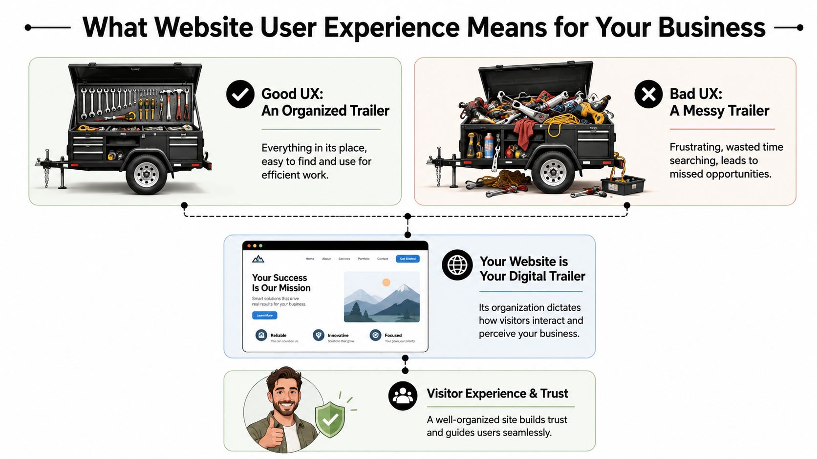
Contractors usually understand UX once you stop talking like a designer and start talking like a foreman. Think about a tool trailer. If every wrench, fitting, and cutoff wheel has a place, the crew moves faster. If everything is piled in the corner, people waste time, get irritated, and sometimes use the wrong thing.
Your website works the same way.
The tool trailer test
A visitor shows up with a job to do. They aren't there to admire your website. They want to know one of a few things fast.
Maybe they need a vac truck. Maybe they need welding support. Maybe they want to know if you work in Duchesne County, Uintah County, or beyond. Maybe they're a CDL driver looking for a better employer.
If the menu is confusing, the pages are scattered, or the contact options are buried, the site feels like a messy trailer. People don't say, “This site has poor information architecture.” They say, “I can't find anything,” and they leave.
That's why website user experience design matters. It organizes your digital space around what the visitor needs to accomplish, not around how your company happens to be structured internally.
Three pillars that matter
Most of UX for a contractor website comes down to three simple tests.
Short forms, click-to-call, readable text, mobile-friendly layouts
Trust
Does this company look legitimate and capable?
Professional design, current photos, clear service area, consistent branding
The first pillar is navigation and layout. A strong site doesn't make people dig through vague labels like “Solutions” or “Resources” when what they need is “Services,” “Careers,” or “Request a Quote.”
The second is ease of use. A form that asks for too much too early kills momentum. A phone number that isn't clickable on mobile wastes an easy opportunity. Tiny text, weak contrast, and crowded pages make the site harder to use than it needs to be.
The third is trust. People judge your operation partly by how your website feels. If it looks outdated, broken, or unfinished, they start wondering what else is disorganized.
A polished website doesn't replace good field performance. It does help a buyer believe you'll deliver it.
The practical takeaway is simple. Review your site the way a stranger would. Don't ask whether it has all the information. Ask whether the right person can find and use that information without effort.
If the answer is no, that's a UX problem, not just a design problem.
How Good UX Drives Leads Recruitment and Credibility
A contractor doesn't invest in a website for compliments. The site needs to produce phone calls, quote requests, and applicants. That's where UX stops being abstract and starts looking like a business decision.
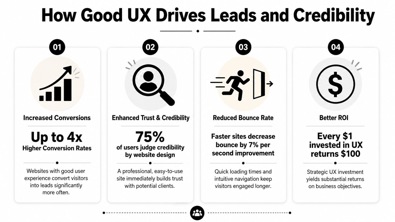
The upside can be substantial. According to DesignRush's roundup of UX statistics, every dollar invested in UX can generate up to $100 in return, which is often described as about 9,900% ROI. The same source also notes that frictionless UX design can increase conversion rates by as much as 400%. For a contractor or oilfield service company, that means the structure of the site can directly affect how many visitors become leads or applicants.
More leads with less friction
A good contractor website doesn't just say “contact us.” It clears a path.
If someone lands on your service page, they should see what you do, where you work, and what to do next. On many underperforming sites, the visitor has to hunt for all three. That's where leads disappear. Not because demand is weak, but because the path is clumsy.
A few things usually work well:
Visible calls to action: “Request a Quote” in the main menu works better than hiding the contact path in the footer.
Short forms: Ask only for what you need to start the conversation.
Service-specific pages: A page about excavation should lead naturally to an excavation estimate request.
Trust cues near the form: Reviews, safety credentials, and service area details reduce hesitation.
If you want a simple way to present credibility elements cleanly, a trust badge generator tool can help package reviews or proof points into something more usable than random screenshots.
For companies focused on lead flow, this is the same logic behind a better website conversion rate strategy. Reduce friction, and more of the traffic you already have turns into real opportunities.
Better recruiting starts with usability
Recruiting is where a lot of contractor sites inadvertently lose good people. The company says it's hiring, but the process sends applicants through a maze. Sometimes it's a PDF. Sometimes it's a desktop-only form. Sometimes the careers page is buried under “About.”
That setup filters out the wrong people. Not the unqualified ones. The busy ones.
A welder on break or a driver between loads won't jump through hoops to express interest. They'll move on to the company with the easier process. Good UX supports hiring by making the careers path obvious, mobile-friendly, and short enough to finish in a real-world setting.
If applying for a job feels like office paperwork, field talent won't finish it.
Credibility gets decided fast
Many local businesses underestimate how much website quality affects perception. A smaller company can look dependable and established online. A capable company can also look disorganized if the site is slow, sparse, or outdated.
Credibility comes from details people notice without thinking about them:
Current project photos
Readable service descriptions
Consistent branding
Clear company contact details
A site that feels maintained rather than abandoned
For industrial buyers, that first impression matters because the consequences are more significant. They're not ordering a T-shirt. They're evaluating whether you seem reliable enough to handle a serious job.
Good UX tells them yes before the first phone call.
Practical UX Upgrades for Your Contractor Website
Most contractor websites don't need a fancy reinvention first. They need practical cleanup. Fix the places where users get stuck, and the site usually starts pulling more weight right away.
One useful way to think about it is task completion. CareerFoundry's overview of UX design notes that well-structured site hierarchies and optimized task flows can improve task completion rates by 20–40%. On a contractor site, that often means more visitors finishing a quote request or job application instead of dropping off halfway through.
Fix the high-friction spots first
Start with the pages tied directly to money and hiring. Don't begin with your history page or a logo refresh.
Make the phone number tap-to-call: On mobile, this should work from the header on every page.
Put “Request a Quote” in the main navigation: Not buried under a submenu.
Create a real careers page: Don't force users to download a document to apply.
Show service areas clearly: If you serve Vernal, Roosevelt, Duchesne, and surrounding areas, say so plainly.
Use plain labels: “Hydrovac Services” beats vague menu text like “Capabilities.”
A lot of this is easier to manage when the site is built on a flexible platform. A well-structured WordPress website for business makes it easier to update service pages, hiring content, and forms without rebuilding the whole site every time something changes.
Build around the jobs people need done
Internal org charts make terrible website navigation. Customers don't care which department owns a service. They care whether you can solve the problem they have today.
That means pages should map to user tasks, such as:
Visitor need
Best page or feature
Get pricing or availability
Quote form with a clear next step
Check service fit
Individual service pages with examples
Confirm service area
Service area page or map
Apply for work
Mobile-friendly careers page
Verify credibility
Projects, certifications, reviews, equipment info
When this is done well, the site feels obvious. That's a compliment. Obvious is good. Obvious gets the job done.
Here's a practical walkthrough that shows the difference between cluttered interfaces and cleaner decision paths:
Use video and visuals to remove doubt
Contractor websites often lean too hard on text or, just as often, on giant photo galleries with no context. The better approach is to use visuals as proof.
Show trucks, crews, fabrication work, equipment, site conditions, and finished results. Add short captions so the visitor knows what they're seeing. A photo of a rig-up yard means more when it's tied to a service, project type, or capability.
A few upgrades usually pay off quickly:
Replace generic stock images with real field photos.
Use headings that answer questions people have.
Keep forms short and place them near relevant content.
Add FAQs for common concerns like service area, turnaround, or equipment types.
Trim dead pages that don't help a visitor take action.
The best contractor websites feel less like advertisements and more like a well-run office counter. Clear signs, direct answers, and no wasted motion.
That's the standard to aim for.
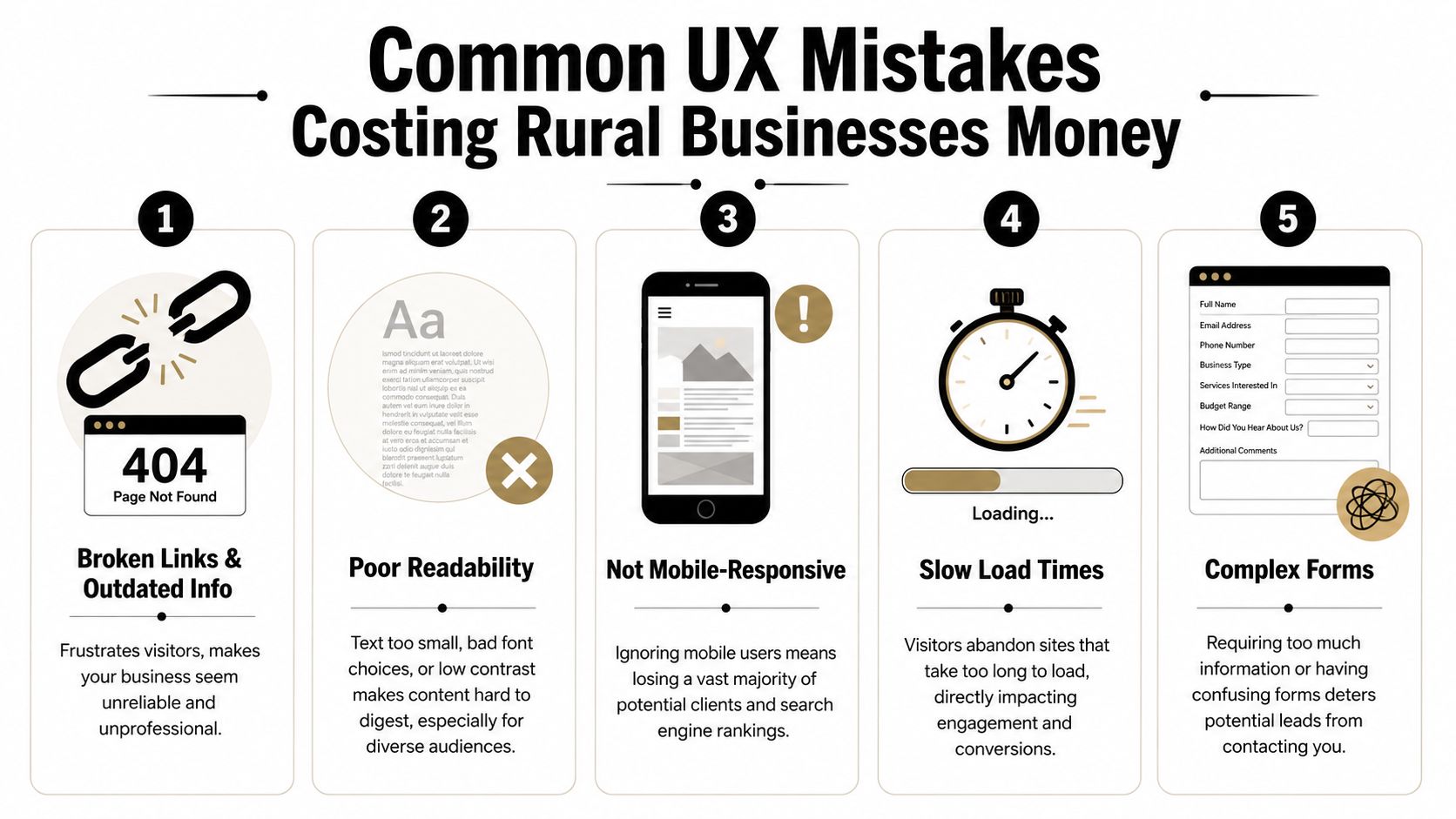
Common UX Mistakes Costing Rural Businesses Money
Some website problems are annoying. Others directly cost you leads and applicants. Rural businesses often deal with both at the same time.
The hard truth is that many local contractor sites still make basic mistakes that turn away good traffic. Not because the owners don't care, but because the site was built once, then left alone while the business kept evolving.
The expensive mistakes I see most often
The first is hidden contact information. If a user has to scroll, search, or switch pages just to find a phone number, the site is slowing down a ready-to-buy visitor.
The second is oversized image files. Contractors want to show off jobs, which makes sense. But if those photos are uploaded straight from a phone or camera with no compression, the site gets heavy fast. On a weak mobile connection, that hurts.
The third is document-first thinking. If your service details, job application, or equipment list live inside downloadable files instead of usable web pages, you're adding friction for no reason.
The fourth is unclear language. Local businesses sometimes write for insiders only. That works if the reader already knows your world. It fails when a property owner, office manager, or project coordinator needs plain-English confirmation that you do the work they need.
A quick diagnostic list helps:
Buried contact paths: Visitors shouldn't have to hunt for a call or quote option.
Outdated information: Old crew photos, expired job posts, and stale service pages make the business look inactive.
Tiny text and weak contrast: Hard-to-read sites lose people fast.
Forms that ask too much: Long forms feel like work, especially on mobile.
Broken mobile layouts: If the site pinches, overlaps, or cuts off content, users won't fight through it.
Why rural conditions make bad UX worse
Rural users don't always browse on ideal connections. They may be on the road, on-site, or using older devices. That changes what “good enough” means.
According to the Wikipedia overview of user experience design, sites that exceed Google's Core Web Vitals thresholds for speed and stability can see conversion rates 10–30% higher than slower, poorly optimized sites. For Uinta Basin businesses, that matters because many visitors are using mobile devices in less-than-perfect network conditions.
Challenging environments expose weak websites. A slow-loading gallery, shifting layout, or heavy script might be tolerable on office fiber. It becomes a problem in the field.
Slow websites don't just test patience. They make the company look less professional than it is.
If your website only works well under perfect conditions, it isn't working well.
Your Prioritized UX Action Plan
Most owners don't need another vague reminder to “improve the website.” They need a sequence. What should get fixed first, what can wait, and what deserves a bigger rethink later.
The best UX plans start with friction removal, then move into structure, then into refinement. That keeps the work practical and tied to business results instead of endless tinkering.
This week
Handle the obvious issues first. These are the fixes that stop immediate leakage.
Test your site on your own phone: Not in the office, but the way a customer would use it.
Check every main contact path: Phone number, quote form, contact page, and careers page should all work cleanly.
Move key actions higher: Put quote requests and job opportunities where they're visible without hunting.
Remove dead weight: Broken pages, outdated PDFs, and old announcements should go.
Review readability: If the text is hard to read, increase contrast and size.
A good companion for this step is a structured WCAG AAA checklist. Even if you don't pursue every accessibility standard at once, it gives you a practical way to catch readability and usability issues that affect real visitors.
The next 90 days
Once the urgent problems are fixed, clean up the foundation.
Build clearer service pages. Simplify the main menu. Create a dedicated careers section. Add real project photos with context. Make sure each important page points to one next action instead of several competing ones.
This is also the right time to rethink navigation depth. Critical pages should be easy to reach. Visitors shouldn't need to bounce through multiple layers just to find employment info, equipment details, or service-area coverage.
You'll usually get the best results by focusing on these business paths:
Priority
What to improve
Why it matters
High
Quote flow
Direct impact on leads
High
Careers flow
Direct impact on recruiting
Medium
Service page clarity
Helps qualify the right inquiries
Medium
Mobile usability
Supports field and rural users
Ongoing
Photo and content updates
Keeps credibility current
Longer-term improvements
After the basics are solid, you can add more advanced UX improvements. That might include better FAQ content, tighter local SEO alignment, stronger review presentation, or smarter automation around lead intake.
It may also include AI-assisted interactions. Used carefully, they can help answer common questions or guide users to the right page. But the experience has to stay clear and trustworthy. The Moqups article on hidden work in UX/UI design notes that as AI-driven interactions become more common, UX has to preserve transparency and trust. For a service business, that means users should understand what the tool is doing and still have a clear path to a real human when needed.
Don't bolt on an AI chat widget just because everyone else is doing it. If it blocks the contact form, gives muddy answers, or feels like a gimmick, it hurts more than it helps.
The long-term goal is simple. Build a site that works under real conditions, supports the way your customers and applicants behave, and keeps earning its place in the business.
If your website isn't bringing in enough leads, helping you recruit, or reflecting the quality of your company, Northpoint Web can help. We build practical websites for contractors, oilfield service companies, trucking businesses, and other growing companies in the Uinta Basin that need their site to do more than sit online.
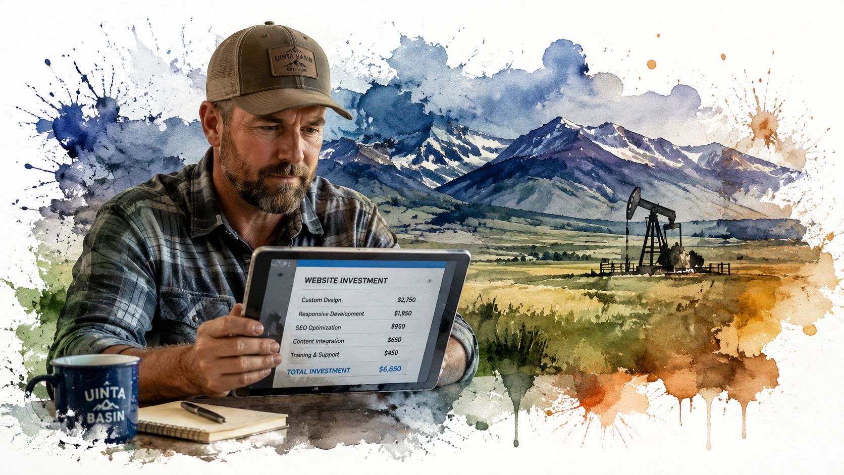
A DIY website can cost under $50 per month, while a professional site from a freelancer or agency usually lands somewhere from $3,000 to over $10,000. That spread is normal. Website price depends entirely on how you build it and what you need it to do.
If you're a contractor in Vernal, a trucking company in Roosevelt, or an oilfield service outfit in Duchesne, you've probably already seen this. One quote looks cheap enough to ignore. Another looks like someone priced you a new piece of equipment. Both might be honest. They just aren't talking about the same thing.
A website is a lot like a truck. A basic pickup gets you down the road. A fully outfitted work truck with toolboxes, racks, upgraded suspension, and a diesel motor costs a whole lot more because it does a whole lot more. Same with websites. A simple online brochure is one thing. A site that brings in leads, filters bad prospects, and helps you recruit CDL drivers or operators is a different asset entirely.
That distinction matters more in rural Utah than most generic website articles admit. Around the Uinta Basin, labor is tight, trust matters, and buyers often check your website before they call. If your site can't help you win jobs or attract workers, the cheap option can turn into the expensive one fast.
How Much Does a Small Business Website Really Cost
A contractor in the Uinta Basin can get one quote for $800 and another for $8,000, and both can be honest numbers. They are pricing different tools for different jobs. A cheap site is like a basic trailer you pull to the job. A growth-focused site is more like a service truck stocked to keep work moving and bring in the next call.
That gap confuses a lot of owners. It should not. Website cost depends on what the site is expected to produce for the business.
A simple site can be inexpensive. A site built to bring in quote requests, show up in search, answer common questions, and help recruit operators or CDL drivers costs more because it does more work. If you want a clear picture of what goes into a serious build, review what's really included in a $7,500 website build.
The easiest way to understand pricing is to compare it to another marketing service owners already know. If you've ever looked at a real estate photo pricing guide, you know the price changes based on the job. A few basic listing photos cost less than a full package with drone shots, twilight images, and marketing extras. Website pricing works the same way. A home page and contact page are one level. Lead forms, hiring pages, local SEO setup, and custom service content are another.
What you're really buying
For a small business in rural Utah, a website usually needs to earn its keep in a few specific ways:
Build trust so a prospect picks up the phone instead of calling the next company
Generate leads from Google searches, map listings, and referrals
Help recruiting when skilled labor is hard to find and harder to keep
Save office time by answering basic questions before someone calls
That last point gets ignored in generic website guides. Around here, labor is tight. If you're an excavation company, HVAC shop, diesel outfit, or oilfield service business, your site is not just a brochure. It can help you win work and fill open positions. Those two outcomes matter more than having fancy design features nobody asked for.
Here is the rule I give local owners. If the website only needs to show you exist, keep it lean. If it needs to help grow revenue or attract good people, pay for a professional build that is set up to do that job well.
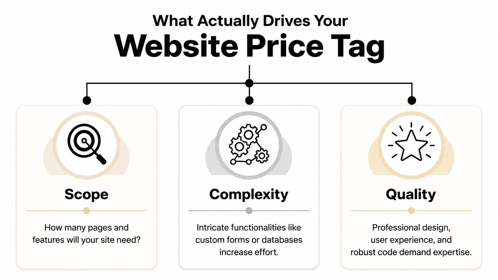
What Actually Drives Your Website Price Tag
The number of pages matters, but it usually isn't the main driver. Functionality complexity is where price starts to move.
Industry guidance shows a basic DIY WordPress build can start near $100 to $400 upfront with $10 to $75 per month in hosting and tools, while a custom small-business site commonly rises to $2,000 to $8,000 with a freelancer or $10,000 to $35,000+ with an agency when it includes custom design, SEO setup, integrations, or e-commerce features, as outlined in Elementor's website cost guide.
Imagine building a workshop. Square footage affects cost, sure. But the wiring, concrete work, specialty tools, and finishes are what really separate a basic shed from a building that supports serious work.
Scope is the size of the job
Scope is the footprint.
If you need a home page, about page, service pages, gallery, contact page, and maybe a careers page, that takes more planning and content than a one-page site. More pages usually mean more writing, more layout work, and more decisions.
But don't get stuck counting pages like they're the whole story. A seven-page site can still be simple. Another seven-page site can be a headache if every page has custom sections, forms, filters, or special content needs.
Complexity is where cost jumps
This is the big one.
Add a quote request system that routes leads by service type. Add hiring forms for CDL drivers. Add booking, CRM integration, e-commerce, shipping logic, or custom location pages. Every feature adds setup, testing, and future maintenance.
A lot of business owners don't see that part at first. They compare a cheap site to a growth-focused site and think the only difference is design. It isn't. The difference is what happens behind the scenes. If you want a plain-English breakdown of that middle tier, this explanation of what's really included in a $7,500 website build is worth reading.
Here's a simple way to judge complexity:
Low complexity means brochure pages, basic contact forms, standard templates
Medium complexity means lead funnels, service-area pages, stronger SEO setup, better forms
High complexity means custom applications, recruiting workflows, online payments, portals, or deep integrations
The video below gives a solid overview of how these moving parts affect budget.
Quality decides whether the site works or just exists
Two shops can both say they build websites. That doesn't mean they build the same thing.
Quality shows up in the writing, layout, mobile performance, photo selection, calls to action, code quality, and how easy the site is to update later. It also shows up in the strategy. A decent builder can make a website look acceptable. A strategist builds it so a contractor gets better calls and fewer tire-kickers.
A cheap site often lowers launch cost, not ownership cost. If it breaks, looks dated, or fails to convert, you pay for it later.
That's why small business website cost should be judged like any other capital expense. Don't ask only what it costs to buy. Ask what it costs to own, use, and rely on.
Choosing Your Path DIY vs Freelancer vs Agency
A website builder, a freelancer, and an agency can all put a site online. That does not mean they solve the same business problem.
For a contractor in Roosevelt or an oilfield service company in Vernal, the question is simple. Do you need a site that just proves you exist, or a site that helps you win bids, get quote requests, and recruit people who can pass a drug test and show up on Monday? Website pricing works the same way as buying equipment. A basic tool is cheaper. The right tool earns its keep.
When DIY makes sense
DIY works for a new business that needs a clean placeholder fast.
If you are just getting started, a platform like Wix or Squarespace can handle the basics. You can list services, show your phone number, add a form, and stop losing work to competitors who at least have something online.
That said, DIY usually tops out early.
Once you need better service-area pages, stronger local search visibility, hiring pages, or clearer calls to action, the cracks show. You end up wrestling with templates instead of running your business. For a serious contractor, that is like trying to trench with a shovel because the shovel was cheaper than a machine.
When a freelancer is the practical middle ground
A good freelancer is often the right fit for a small business that has outgrown DIY but does not need a full outside team.
This route can work well for local service companies with a defined scope and decent source material. If you already know your services, have solid photos, and can give feedback quickly, a freelancer can build a strong site without a lot of overhead.
The tradeoff is depth and capacity. One person may be handling design, copy, SEO setup, edits, and support. If that person is good, great. If that person disappears during hunting season, gets booked out, or is weak in one area, your project slows down or comes out uneven.
When an agency is the right tool
Agency work fits businesses that expect the website to produce results, not just sit there.
If the site needs to support lead generation, recruiting, content planning, search structure, maintenance, and ongoing improvement, an agency is usually the better choice. That matters in the Uinta Basin, where many companies are fighting two battles at once. They need more qualified inquiries, and they need more skilled labor. Generic website advice misses that. Around here, the hiring side often matters just as much as the sales side.
If you are still sorting out platform options before choosing a provider, this guide to small business website platforms will help you compare the tradeoffs.
Website Build Options Compared
Factor
DIY (Wix, Squarespace)
Freelancer
Agency (Northpoint Web)
Upfront cost
Lowest
Middle
Higher
Monthly cost
Predictable subscription
Varies by hosting and support setup
Usually paired with ongoing support
Best for
Basic credibility
Solid custom site with moderate needs
Lead generation, recruiting, long-term growth
Owner involvement
High
Medium
Medium, but more guided
Flexibility
Limited
Good
Highest
Support after launch
Usually self-managed
Depends on the freelancer
Usually structured
Recruiting and SEO readiness
Basic
Possible if scoped well
Better fit for businesses that need strategy and execution
If your website needs to help hire operators, drivers, techs, or office staff, DIY is usually the wrong choice. It lowers launch cost, but it often costs more in missed calls, weak applicants, and rebuilds later.
My recommendation is straightforward. Use DIY if cash is tight and you need to get online this month. Hire a freelancer if the project is clear and your needs are moderate. Hire an agency if the website affects revenue, staffing, or both. A $50 tool should not be carrying a $500,000 part of your business.
Real Website Costs for Uinta Basin Businesses
Generic website advice usually stops at pages and design. Around here, that misses the point. For a lot of Uinta Basin businesses, the website isn't just a brochure. It's part sales tool, part recruiting tool, part credibility check.
A local business owner doesn't just need "a website." He needs a site that helps him solve the problem right in front of him.
Excavation contractor in Duchesne
This owner needs more than a gallery of dirt work and pipe installs.
He needs project photos, service pages, trust signals, a clean quote request form, and a recruiting page that doesn't look like an afterthought. If he needs operators, laborers, or CDL drivers, the hiring side can't be buried in a generic careers tab with one sentence and a bad application form.
Recent analysis focused on rural energy markets says a standard $5,000 brochure site often fails to attract qualified tradespeople because it lacks recruiting features such as job-board integrations and employee testimonial structures. The same analysis says recruitment costs for skilled trades in rural U.S. energy sectors exceed $4,000 per hire, and the added recruiting premium for the right website functionality is typically 15% to 25% of the total build cost in these markets, according to this Uinta Basin-focused website cost discussion.
That should change how you budget. If one good hire matters, the site needs to support hiring from day one.
Oilfield service company in Roosevelt
This company usually cares about trust, capability, and professionalism.
The site should show service lines clearly, explain the company's operating standards, make it easy for buyers to understand what crews and equipment are available, and give larger clients confidence that they're dealing with a legitimate operation. Safety, responsiveness, and clean presentation matter here because procurement teams and field managers are judging your company before they ever call.
For this kind of business, the website earns its keep by helping win better conversations. It also supports recruiting when the labor market tightens. A weak site makes a serious company look smaller than it is.
This one is different. The main question isn't hiring. It's control.
A rental owner may want a site that shows the property well, answers guest questions, builds trust, and encourages direct booking inquiries instead of depending entirely on third-party platforms. That pushes the budget toward better photography, polished layout, stronger mobile experience, and cleaner calls to action.
The lesson across all three examples is the same. The right website budget comes from the business problem. Not from a random average on the internet.
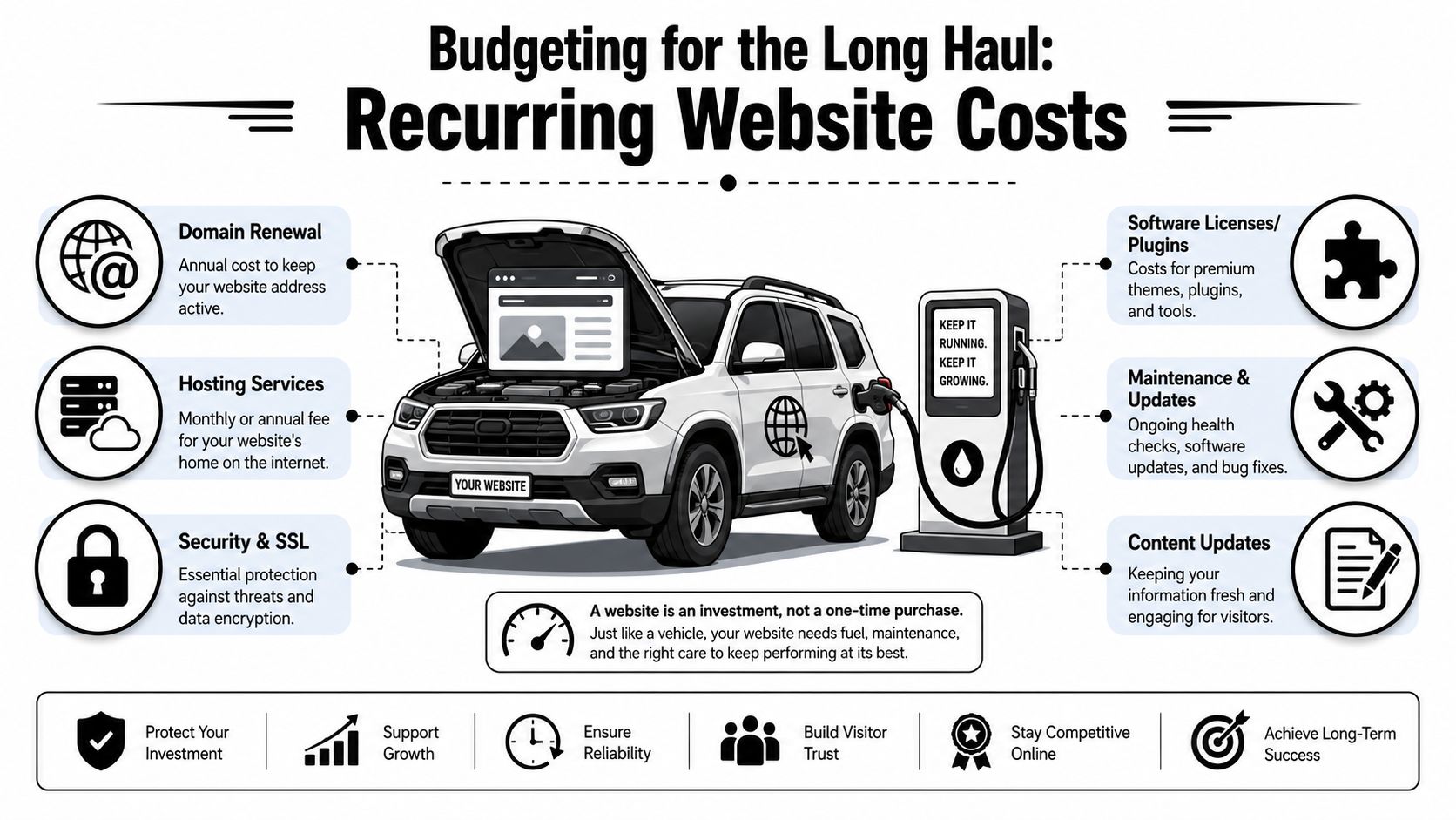
Budgeting for the Long Haul Recurring Website Costs
A website isn't a one-time print job. It's more like a truck in your fleet. Once you buy it, you still have fuel, tires, insurance, service, and the occasional repair. Ignore those costs and the thing stops doing its job.
Independent industry guides put standard small-business builds at roughly $1,500 to $15,000 for a 5 to 8 page site, while recurring expenses commonly add $500 to $2,400 per year for hosting, domain, maintenance, backups, and security updates. For service businesses, maintenance retainers of $100 to $500 per month are common, based on this small business website cost guide.
The first-year budget is what catches people
A lot of owners only budget for the build.
Then the domain renews. Hosting renews. Plugins need licenses. WordPress needs updates. Forms break. A staff member wants new service pages. A phone number changes. Suddenly the website didn't cost what the invoice said. It cost the invoice plus the upkeep.
Your real small business website cost is build price plus the cost to keep it secure, current, and useful.
That's why I tell people to budget in two buckets from the start:
Build cost for design, content, setup, and launch
Ownership cost for hosting, maintenance, security, backups, and edits
What ongoing website costs usually include
Most recurring website budgets include a mix of the following:
Hosting that keeps the site online and loading reliably
Domain renewal so you keep ownership of your web address
Security and backups in case the site gets hit or something breaks
Plugin and software licensing for forms, SEO tools, booking tools, and premium features
Maintenance labor for updates, testing, fixes, and small content changes
Reputation work can also become part of ongoing digital costs, especially if reviews or search trust are affecting leads. If that issue is on your radar, this overview of pay-for-results reputation management services is a useful companion read because reputation and website conversion usually work together.
The bottom line is simple. If the website matters to your business, maintenance is not optional. You don't park a truck all winter, skip oil changes, and expect it to haul without problems. Same deal here.
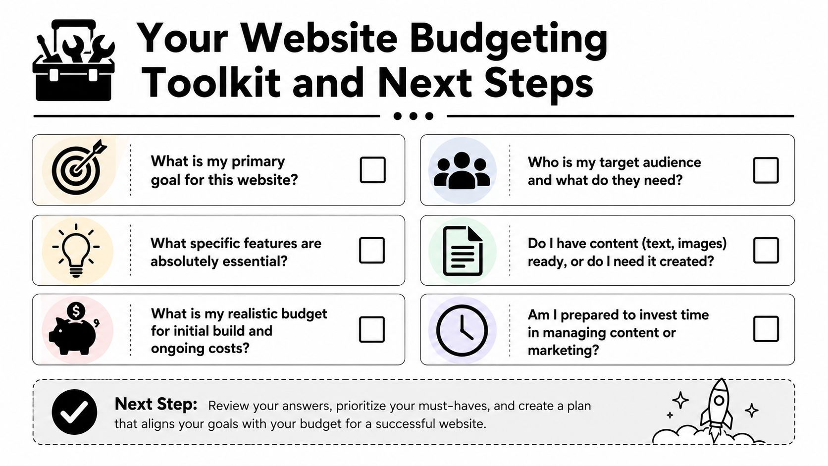
Your Website Budgeting Toolkit and Next Steps
If you want accurate quotes, don't start by asking, "What does a website cost?" Start by answering the questions that define the job.
Six questions to answer before you ask for quotes
Write these down before you call anyone.
What is the website supposed to do? If the answer is "just have something online," your budget can stay lean. If the answer is "bring in leads, support sales, and help recruit," expect a more serious build.
Who needs to use it? Homeowners, commercial buyers, truck drivers, job applicants, vacation guests, and municipal contacts all need different information. One site can't speak clearly to everyone unless it's planned well.
What features are required from day one? Quote forms, hiring forms, job pages, service-area pages, galleries, booking requests, CRM connections, and review integration all change scope.
Do you already have content and photos? Good websites need good raw material. If you don't have quality jobsite photos, team photos, service descriptions, or hiring copy, somebody has to create them.
Who will handle updates after launch? Some owners want control. Others never want to log in. Be honest. That answer affects platform choice and support needs.
What's your real budget for build and ownership? Not your wish budget. Your actual budget. If you only plan for launch and ignore recurring costs, you're setting the project up wrong.
"The cheapest website is usually the one that only has to exist. The minute it needs to perform, strategy matters."
Three practical budget levels
I like to frame website budgeting around function, not vanity.
Stronger service pages, conversion-focused structure, better messaging, room for SEO and lead capture
Established service business that wants more calls
Recruiting and Growth Engine
Hiring pages, applicant flow, stronger trust content, service clarity, recruitment support, maintenance plan
Contractors, oilfield services, trucking, and industrial firms trying to grow crews
You don't need to name your project this way when you get quotes. But you should know which category you're shopping for. A lot of bad website decisions happen because owners ask for a business card site when what they need is a lead and recruiting system.
Common questions from local business owners
Can I update the site myself? Usually, yes. But there's a big difference between changing text on a page and managing plugins, forms, security, and layout problems. Know which kind of update you're talking about.
Should I start small and add later? Usually yes, if the foundation is right. Starting lean is smart. Starting cheap on the wrong platform is not.
Do I need ongoing SEO right away? Not every business needs a heavy SEO push on day one. But every business does need clear service pages, solid messaging, clean structure, and a site that doesn't look abandoned.
Should I choose based on lowest bid? No. Choose based on whether the bid matches the business outcome you need. Lowest bid is only a win if the site does the job.
What should I bring to the first conversation? Your services, service areas, photos, logo, competitor examples, and a clear answer about whether hiring is part of the website's job.
If you're a local contractor or industrial business owner, the right move is to treat your website like any other business asset. Buy the right tool for the work. Don't overbuild. Don't underbuy. And don't confuse a cheap launch with a smart investment.
If you want help sorting out what your website should cost for your business, Northpoint Web works with contractors, oilfield service companies, trucking businesses, and other rural Utah companies that need websites built for leads, recruiting, and day-to-day credibility. A straight conversation about your goals, your market, and your realistic budget will save you a lot of wasted time.
Your website probably says the same thing as every other contractor or oilfield company in your market. “Quality work.” “Reliable service.” “Experienced team.” That copy doesn't help you win jobs, and it definitely doesn't help you hire welders, drivers, operators, or field crews.
Most owners know their website feels weak. They just can't tell whether the problem is design, writing, or both. In my experience, the writing is usually the bigger issue. If your headline doesn't say what you do, who you do it for, and why someone should trust you, the rest of the page won't save it.
Good website copy isn't fancy. It's clear, specific, and built to get action. If you want to learn how to write website copy that brings in leads and helps recruit skilled people, start treating your website like a sales tool and a hiring tool at the same time.
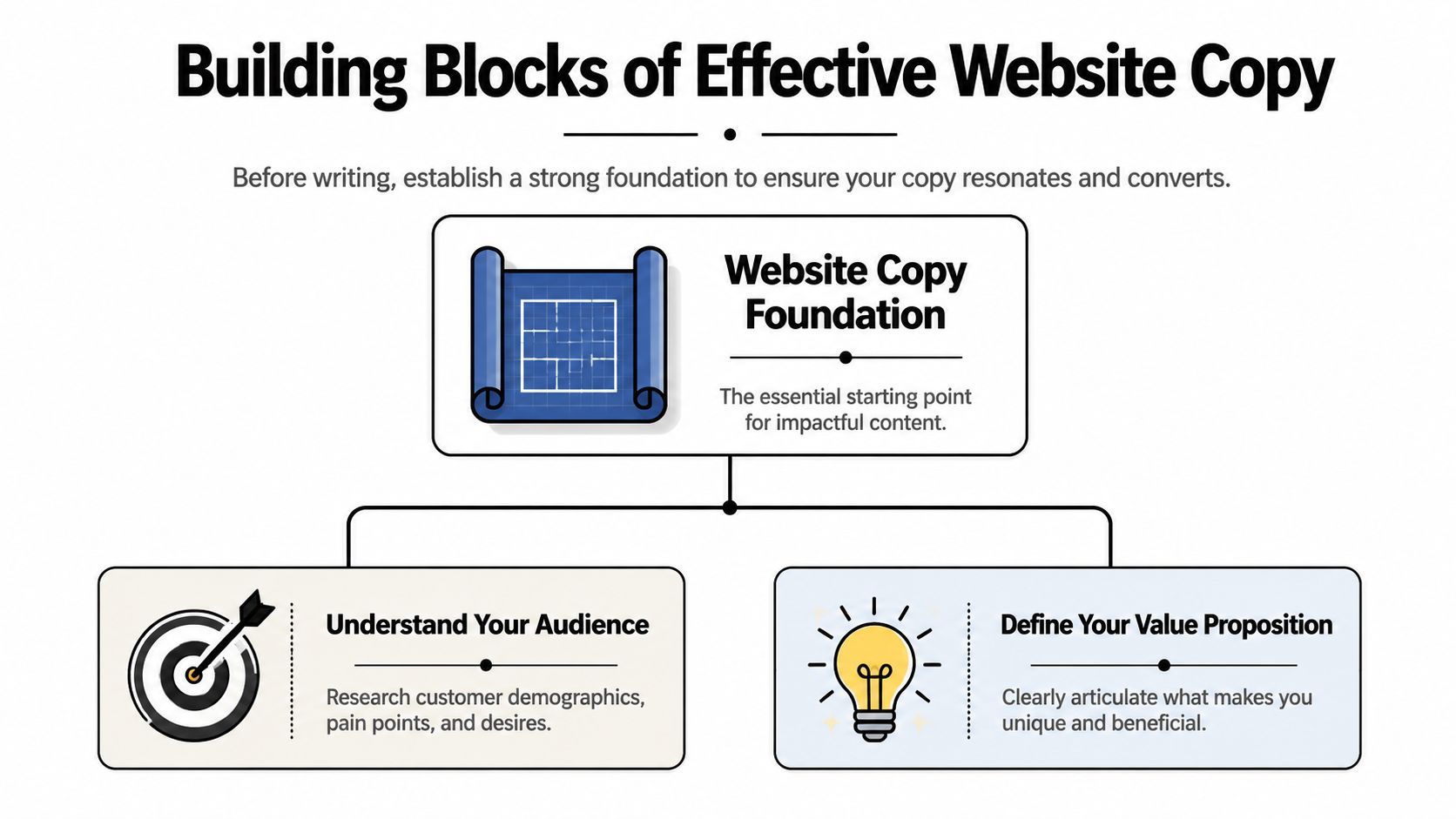
Good copy starts before the writing starts. Most bad websites don't fail because the owner picked the wrong adjective. They fail because nobody decided who the site is for and what the message needs to be.
Web visitors usually scan first and read later, and only about 10% of visitors read body copy after seeing a headline, which is why you need short paragraphs, short sentences, and important information at the top, as noted in Squarespace's website copy guidance. If your site makes people hunt for basic facts, they won't do it.
Start with the two audiences that matter
Most contractor websites are written for one audience only. That's a mistake.
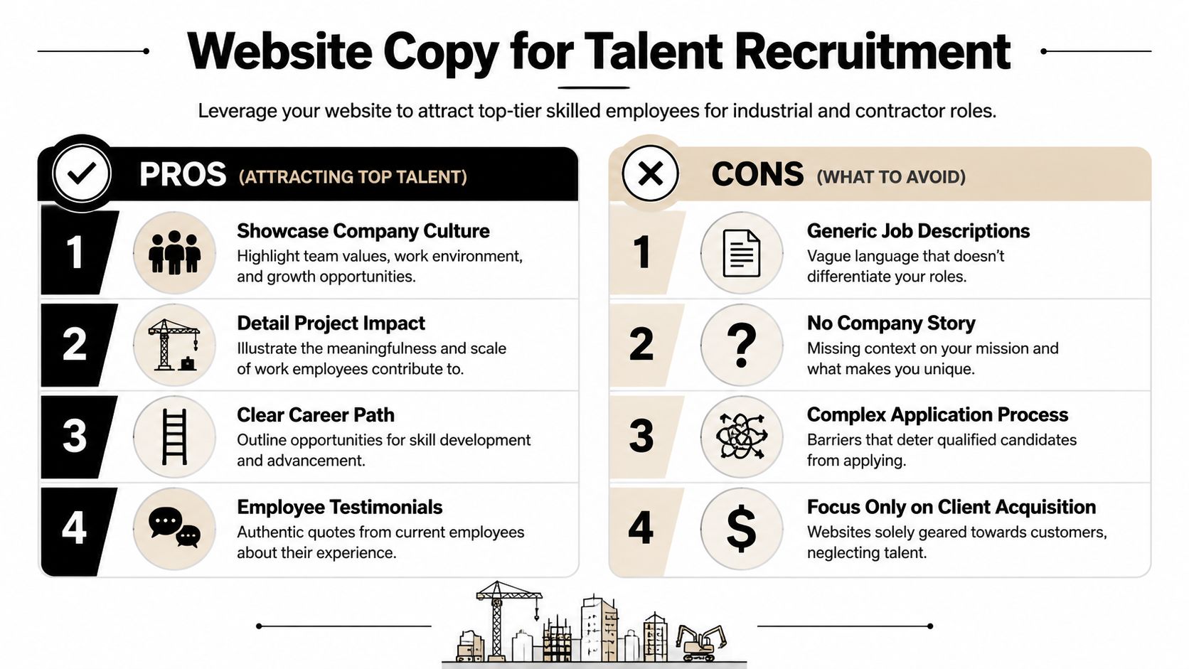
You usually have two real audiences:
Customers who need a job done and want to know if you're qualified.
Potential hires who want to know if your company is worth their time.
Those audiences care about different things. A plant manager might care about response time, service area, equipment, and whether your crew can handle shutdown work. A CDL driver might care about schedule, type of work, equipment quality, stability, and whether your company treats people right.
Write those questions down before you touch the homepage.
Practical rule: If a page doesn't answer a real visitor question, cut it or rewrite it.
A lot of owners also confuse copywriting with general content creation. They're not the same job. If you want a clean explanation, this guide helps compare content writing and copywriting goals. Your service pages and homepage need to persuade and direct action, not just fill space.
Lock in your main message
Your site needs one central promise. Not five. One.
That message should answer three things fast:
What do you do
Who do you do it for
Why should someone choose you
A weak message sounds like this: “We provide complete solutions with a commitment to excellence.”
A useful message sounds like this: “Hydrovac, excavation, and roustabout support for oilfield and industrial sites in Eastern Utah.”
That second line works because it tells people what business you're in. No decoding required.
Build the structure before the sentences
If you want to know how to write website copy that performs, stop thinking page by page first. Think question by question. Your site structure should follow the order a customer or applicant naturally thinks.
For a service buyer, that usually looks like:
What do you do?
Can you handle my type of project?
Why should I trust you?
What do I do next?
For a job seeker, it looks more like:
What kind of company is this?
What work will I be doing?
Why would I want to work here?
How do I apply?
Put the most important answer first. Don't warm up with background. Don't bury the point halfway down the page.
That foundation saves you from writing fluffy copy later. Clarity at the start fixes a lot.
Craft Your Core Message and Proof Points
Generic copy dies on contact. Buyers ignore it. Applicants ignore it. Search engines don't get much value from it either.
If your website says you deliver “top-quality service,” you haven't said anything useful. People expect you to say that. The question is whether you can prove it.
Stop writing claims you can't prove
Specific, measurable language increases credibility. Articulate Marketing advises using quantifiable facts and says a line like “over 500 projects in the Uinta Basin” is more believable than vague experience claims in its article on copy tips for website conversions.
That principle matters even more in industrial and field-service work. Your customers are hiring for risk. Your job is to reduce uncertainty.
So stop using throwaway phrases like:
High quality work
Dependable team
Customer-focused service
Industry-leading solutions
Those lines are empty unless you attach proof.
Build a proof library before you draft
Before you write pages, gather every fact that strengthens trust. I call this your proof library. It gives you raw material for copy that sounds real.
Collect things like:
Years in business
Service area details
Types of equipment or crews
Certifications and safety qualifications
Project types completed
Response times
Crew availability
Recruiting advantages, such as steady work, variety of projects, or in-house advancement
If your team struggles to write clearly, it helps to tighten the process before polishing the wording. This short piece on an authoritative content workflow is useful because stronger copy usually starts with stronger sentence construction.
Here's a simple test. If a statement could appear on any competitor website, it's too vague. If only your company could say it that way, you're getting closer.
“We support oilfield and industrial projects with field-ready crews, clear communication, and service pages built around specific scopes of work.”
Weak copy:
“We care about our employees.”
Better copy:
“Our careers page should show what kind of work you'll do, what the schedule looks like, and why people stay.”
Use this video if you want a practical reset on writing stronger messaging for the web:
The best proof points are the ones a buyer or applicant can use to make a decision quickly.
Your copy should prove competence, not announce it. That's the whole game.
A Page-by-Page Copywriting Blueprint
Most websites fail because every page tries to do everything. Don't do that. Give each page one main job, then write the copy in the order people need it.
NN/g recommends an inverted-pyramid structure, with the summary at the top, and guidance for mobile scanners says the key benefit should appear in the first 3–4 words of a paragraph. It also helps to make every section answer what problem is solved, what result is delivered, and what the next step is, as explained by Nielsen Norman Group on writing for domain experts.
Homepage
The homepage is your front gate. Its job isn't to explain everything. Its job is to orient the visitor and push them to the right next step.
A strong homepage usually follows this order:
Headline with a clear offer Say what you do and who you serve.
Short supporting line Add location, scope, or differentiator.
Primary calls to action One for customers, one for hiring if recruiting matters.
Service overview Give a fast scan of main offerings.
Proof section Add facts, qualifications, project types, or trust markers.
Industry or market fit Show the types of clients or jobs you handle.
Final call to action Repeat the next step.
Your homepage doesn't need more cleverness. It needs better routing.
Service pages
A service page should sell one service, not your entire company. If you offer hydrovac, excavation, welding, trucking, roustabout work, and reclamation, each major service needs its own page.
A useful service page flow looks like this:
Clear headline naming the service
Short opening that states the outcome
The problems this service solves
Where or for whom you provide it
Why your company is a solid choice
Proof and specifics
A direct call to request a quote or site visit
Don't write “Our team offers complete excavation solutions.” Write the page around actual jobs, situations, and buyer concerns.
About page
Most About pages are self-indulgent. The visitor doesn't care about your company history unless it helps them trust you.
Use the About page to answer:
Who leads the company?
What kind of work are you known for?
What standards do you work by?
Why do customers and employees stay with you?
If hiring matters, this page can also support recruitment. Applicants want signals about stability, leadership, and work environment.
Contact page
Your Contact page should remove friction. That's it.
Don't make people guess what happens next. Tell them what to send, who should reach out, and what kinds of inquiries you want. If you're hiring, give applicants a direct path too.
Here's a simple planning table you can use before drafting.
Page Type
Primary Goal
Recommended Word Count
Homepage
Explain what you do and route visitors to the right next step
Short to moderate
Service Page
Show fit for one service and generate inquiries
Moderate
About Page
Build trust with company background and credibility
Moderate
Contact Page
Make it easy to inquire or apply
Short
Careers Page
Attract applicants and answer employment questions
Moderate to detailed
If you're writing page by page, keep asking one question: what does this page need the visitor to do next? That answer should shape the copy.
Writing to Recruit The Best Talent
A lot of contractor websites are built like online brochures for customers. That leaves a major gap.
If you're trying to hire drivers, welders, laborers, operators, mechanics, or field hands, your website also needs to sell the job. Most generic advice on how to write website copy barely touches this. That's a blind spot.
Twilio's guidance points out that most website copy advice focuses on customer conversion and overlooks recruitment, even though companies in construction, transportation, and oilfield services need pages that answer “Why should I work here?” with a different employer-brand message in its article on writing website copy that converts.
Your website has two jobs
You need customer-facing copy and applicant-facing copy. They overlap, but they aren't the same.
Customer copy says:
We can do the work
We understand the job
You can trust us
Recruiting copy says:
This is the kind of work you'll do
This is the kind of team you'll work with
This is why good people stay here
If your careers page is just a list of openings with no context, you're making applicants do too much work. Good people won't chase vague opportunities.
For companies thinking about a better platform for this kind of recruiting-focused site, a solid WordPress website for business gives you room to build service pages, hiring pages, and application flows without boxing your business into a template.
What skilled applicants actually want to know
The best applicants aren't looking for corporate slogans. They want practical answers.
Write to the questions they already have:
What kind of projects will I be on?
Is this local work, travel work, or both?
What equipment or trucks am I working with?
Is the work steady?
What's the culture really like?
Is there room to grow?
How do I apply without jumping through hoops?
If your recruiting copy sounds like HR boilerplate, field people will tune it out.
You also need to stop hiding behind clichés like “we're like family.” That phrase means nothing on a website. Say what the work environment is like. Tight crews. Straight communication. Fast-moving jobs. Long-term opportunity. Hands-on leadership. Those details are better.
How to write a careers page that pulls its weight
A strong careers page usually includes:
A direct opening statement about the kind of people you hire
A short company overview written for applicants, not customers
Real job categories with plain-language descriptions
Reasons to work there, stated clearly
Application instructions that feel simple
Don't only post jobs. Sell the workplace.
If your company has a reputation for stable work, local roots, interesting projects, or solid leadership, say that. If your crews work on meaningful projects and use serious equipment, say that too. Recruiting copy should help the right people picture themselves on the job.
That's how a website becomes a hiring asset instead of a dead page with an “Apply Now” button.
Integrating SEO and Powerful Calls to Action
Strong writing that nobody finds won't help you. Strong writing with no direction won't help much either. You need search visibility and clear next steps working together.
A lot of contractors either overdo SEO and sound robotic, or ignore it completely and wonder why their site doesn't show up. The fix is simple. Use the terms real buyers and applicants already use, then connect those terms to action.
Use search terms the way real buyers use them
Think in plain search language:
Hydrovac services in the Uinta Basin
Oilfield welding contractor
Excavation company near Vernal
CDL driver jobs in Eastern Utah
Heavy equipment operator jobs
Those phrases belong in page titles, headlines, subheads, service descriptions, and image context where they fit naturally. Don't jam the same term into every paragraph. Write like a person, not a keyword spreadsheet.
If you want a broader view of what supports visibility for field-service businesses, these contractor marketing strategies are a useful companion to copy planning.
For companies that depend on local visibility, local SEO for contractors matters because service-area pages, Google visibility, and location-specific copy all support the same goal. They help the right people find you before they compare you.
Write calls to action that match intent
“Contact Us” is weak because it asks for action without context. Better calls to action tell the visitor what happens next.
For customer pages, use CTAs like:
Request a quote
Schedule a site visit
Talk to our team
Get project pricing
For hiring pages, use:
See open positions
Apply for field work
Talk to us about driving jobs
Start your application
Every important page should have a next step that matches the visitor's reason for being there.
Your homepage should probably have more than one CTA if you're balancing leads and recruitment. One path for customers. One path for applicants. Don't force both groups through the same message.
When SEO and calls to action line up, your website stops acting like a brochure. It starts acting like a filter, a sales rep, and a recruiting coordinator.
Launching Testing and Refining Your Copy
A website isn't finished when the copy goes live. It's finished when the copy starts producing better conversations, better leads, and better applicants. Until then, it's a draft in public.
Mailchimp recommends an evidence-based loop of research, draft, test, and refine, and it specifically points to A/B testing and user feedback as ways to improve copy based on behavior instead of guesswork in its guide to website copywriting and testing.
Treat copy like a working asset
Most owners update copy only when they redesign the site. That's too slow.
Pay attention to what happens after launch:
What questions do leads still ask on the phone?
Which pages seem to lead to inquiries?
Are applicants referencing the careers page?
Are the wrong people filling out forms?
Those signals tell you where the copy is missing the mark.
Simple ways to improve without overcomplicating it
You don't need a complicated testing setup to make useful changes. Start small.
Try this:
Rewrite the homepage headline if people still don't immediately understand what you do.
Change CTA wording if forms are getting low engagement.
Ask new customers and hires what they looked at on the site before reaching out.
Tighten weak sections where your team keeps explaining the same thing offline.
If you want a practical framework for turning more website visits into action, this guide on how to improve conversion rate is worth reviewing alongside your copy.
Good copy isn't the copy you like best. It's the copy that gets the right people to act.
Keep editing. Keep listening. That's how to write website copy that works in the field, not just on a screen.
If your website needs to pull more weight, Northpoint Web helps contractors, oilfield service companies, trucking firms, and industrial businesses build websites that generate leads, attract employees, and compete better online. If you need a site that speaks clearly to customers and recruits skilled workers at the same time, they're built for that job.
A trucking website has to do more than prove your company exists. It needs to help shippers understand your capabilities, help drivers evaluate the opportunity, and make the next step obvious on any device.
This guide explains how to make a trucking website with clearer audience paths, stronger trust signals, useful recruiting content, and a practical structure for turning visits into quote requests, calls, or applications.
This guide explains how to make a trucking website with clearer audience paths, stronger trust signals, useful recruiting content, and a practical structure for turning visits into quote requests, calls, or applications.
That usually happens because the site was built like a brochure instead of a working sales and recruiting tool. In regions like the Uinta Basin, that mistake gets expensive fast. A small to mid-sized carrier doesn't have room for dead weight marketing. Every page needs to either help a shipper trust you, help a driver see a future with you, or move someone toward a call, quote request, or application.
Most general advice misses the hard part. A trucking company website has to serve two different audiences with different questions, different urgency, and different decision criteria. If you mix them together carelessly, both sides get a worse experience.
Why Your Old Trucking Website Is Costing You Money
An old trucking site usually doesn't fail because it's ugly. It fails because it makes people work too hard.
A shipper lands on the homepage and can't tell what lanes you run, what freight you handle, or how to request a quote without digging through a cluttered menu. A driver lands on that same homepage and sees generic company talk, no clear hiring path, and no fast answer to the questions they care about. Pay structure, equipment, home time, and how to apply.
That's the true cost. Not the design itself. The lost call, the abandoned form, the qualified applicant who moves on to a competitor with a cleaner process.
Practical rule: If a shipper or driver has to guess where to click next, the website is underperforming.
Most trucking company website design problems come from the same assumption. Owners think the website's job is to prove the business exists. That was enough years ago. It isn't enough now.
Your website needs to do two separate kinds of work:
Sell capability to shippers. Show service area, freight types, equipment, safety, responsiveness, and a simple quote path.
Sell the opportunity to drivers. Show what it's like to work there, what trucks they'll run, what kind of work they'll do, and how to apply without hassle.
Remove friction. Make the next step obvious on every key page.
There's another issue many companies overlook. Accessibility and usability affect whether people can use your site in the first place. If you want a practical primer on why that matters, ADA Compliance Pros on web accessibility is worth reading. It connects compliance to real-world usability, which is exactly how business owners should think about it.
A working site isn't a vanity project. It's part dispatcher, part salesman, part recruiter.
The Blueprint Before You Build
The worst time to decide what your website should do is after the homepage mockup is already on the screen. Good trucking company website design starts with structure, not colors.
Start with the two jobs your site has to do
Most carriers don't need a complicated digital strategy. They need a clear one.
Industry roundups have explicitly recommended separate pathways for shippers and drivers rather than forcing both audiences through the same funnel, because mixing them too early can hurt lead quality and applicant flow, as noted by The Whit Group's trucking website design roundup.
That means your first planning decision is priority.
If freight sales are the immediate pressure, your homepage should lead with service credibility and quoting. If hiring is the bigger pain point, the homepage can still support shippers, but the recruiting path needs to be visible immediately. Not buried in a footer link called Careers.
A practical homepage layout for small and mid-sized carriers usually looks like this:
Visitor type
What they need first
Best first action
Shipper
Service area, freight type, reliability signals
Request a quote
Driver
Job type, equipment, work expectations
Apply now
Broker or partner
Fast company verification and contact info
Call or contact operations
Build the page structure before the design
Navigation should reflect how people think, not how the owner talks about the business in the yard.
A clean structure often includes:
Home for high-level trust and routing
Services for freight capabilities and lanes
Equipment or Fleet for operational proof
About or Safety for credibility
Careers for recruiting content
Contact for fast outreach
Keep the top navigation tight. Too many tabs usually signal poor planning, not more information.
One of the best ways to avoid bloated menus is to sketch the site hierarchy first. Even a one-page outline in Google Docs or a whiteboard session can save a lot of redesign later. If you're comparing frameworks for lead flow and page intent, LeadBlaze's lead generation website guide gives a useful marketing-first perspective. For companies that need a simpler business site foundation before industry customization, this overview of small business web design is also a practical reference.
The homepage should route visitors. It shouldn't answer every question for every audience.
Set one primary action for each audience
Too many trucking websites throw five calls to action on the same screen. Call us. Email us. Request a quote. Apply now. Get started. Learn more. That isn't strategy. That's indecision.
Pick the main action for each path and support it consistently.
For shippers, that usually means a short quote form, direct phone access, and service pages tied to specific hauling capabilities. For drivers, it means a dedicated recruiting page with a real application flow and plain language about the job.
Before design starts, write down these three things:
Primary business goal More freight leads, more driver applications, or both with a clear ranking.
Primary visitor questions Shippers ask whether you can handle the job. Drivers ask whether the job is worth taking.
Proof points you can show Fleet photos, service descriptions, certifications, testimonials, equipment details, dispatch availability.
If those aren't settled, the design phase usually turns into expensive guesswork.
Designing for Trust and Action on Any Device
A trucking website doesn't get much time to make its case. Visitors decide quickly whether the company looks established, responsive, and worth contacting.
Mobile-first is the baseline
This isn't optional. 60.67% of website traffic arrives from mobile devices, according to Wix's guide to making a trucking website. If your site doesn't work smoothly on a phone, a lot of your audience is gone before they read a line of copy.
That matters more in trucking than in a lot of industries. Drivers are browsing on breaks. Dispatchers are checking vendors between tasks. Shippers and brokers may be searching while traveling or after hours. They want a fast answer, not a desktop-only experience squeezed onto a small screen.
If you want a strong technical companion on the search side of mobile performance, this agency playbook for mobile SEO covers the practical side well.
Trust signals that actually matter
Shippers don't trust a carrier because the site uses a trendy font. They trust what they can verify quickly.
The strongest trust-building elements are usually simple:
Real fleet photography rather than generic stock trucks
Visible operating details such as service types, coverage areas, and equipment categories
Safety and compliance information presented clearly
Testimonials that sound specific, not anonymous and vague
Direct contact paths that don't make someone hunt for a phone number
For many companies, conversion goes up when the design removes friction instead of trying to impress. This guide on how to improve conversion rate lines up with that approach. Make the path clearer, and more people take it.
A shipper looking at three carriers online will often choose the company that feels easiest to trust and easiest to reach.
What hurts conversions
The most common design mistakes are easy to recognize once you've seen a few of them.
What works
What fails
Clear headline with service focus
Generic slogan with no operational detail
Phone number and CTA near the top
Contact info hidden in the footer
Short forms
Long forms that ask too much too early
Fast-loading media
Heavy hero videos and oversized images
Separate shipper and driver paths
One mixed message for everybody
Good design in this industry is practical. It says, "We know what business we're in, and we know what you need next."
Must-Have Pages for Your Trucking Website
A trucking website earns its keep page by page. Every major page should answer a real business question, not just fill out a navigation menu.
The scale of the industry is one reason this matters. Trucks moved roughly 72.7% of the nation's freight by weight in 2024, according to the American Trucking Associations economics and industry data. A carrier's website isn't competing in a tiny niche. It's competing in a major freight market where buyers compare operational credibility quickly.
The pages that win shipper trust
The Services page should do more than say "we haul freight." It should spell out what kind of work you want.
If you haul flatbed, heavy haul, oilfield support, aggregate, regional freight, or specialized loads, say it plainly. Mention the industries you serve, the kind of jobs you're set up for, and the areas you regularly cover. This helps the right prospects qualify themselves before they call.
The Fleet or Equipment page is where many companies get lazy. They post one sentence and a truck photo. That's not enough. List the equipment categories you run and show the assets clearly. Shippers want to know if you have the tools and capacity for the job.
The Safety or About page should support confidence. Keep it factual. Include company background, operating standards, and the kind of details that signal professionalism and consistency.
The best service pages sound like they were written by someone who understands dispatch, equipment, and customer expectations. Because they should be.
Here's a quick content checklist for shipper-focused pages:
Service detail with freight type and job fit
Coverage clarity so visitors know where you operate
Equipment proof with real photos and categories
Quote CTA on every key page
Trust content such as testimonials, credentials, or operational standards
A short visual explainer can also help business owners think through site structure and content balance:
The recruiting pages drivers actually use
A proper Careers section deserves its own hub, not a single paragraph on the About page.
Drivers want direct answers. What equipment will they drive? What kind of routes are involved? Is the work local, regional, oilfield, seasonal, or over-the-road? What does the company expect, and how hard is it to apply?
A recruiting section usually needs:
Job-specific pages for different roles if you hire for more than one
An application form that works on mobile
Straightforward job copy without corporate fluff
Photos of actual trucks and working conditions
Contact options for people who want to ask before applying
The support pages most companies underbuild
The Contact page should be easy. A simple form, clickable phone number, service email, and clear location information are enough for most carriers.
Testimonials also deserve more attention than they usually get. If you've got strong customer feedback or driver feedback, don't hide it on one forgotten page. Place it where it supports the buying decision or hiring decision.
The homepage matters, but these support pages often do the actual closing work.
Getting Found by Local Shippers and Drivers
A solid site still won't help much if nobody local can find it. Trucking companies need visibility where intent is highest. Search results, map results, and branded searches tied to service areas.
Local visibility starts with intent
The strongest local search strategy usually separates shipper intent from driver intent.
A shipper may search for freight hauling, oilfield trucking, flatbed service, or transportation support tied to a city or region. A driver may search for CDL jobs, local driving work, heavy haul positions, or oilfield trucking jobs. Those are different searches, and they should land on different pages.
That means your site should have local and service-specific pages where appropriate, clean page titles, and copy that reflects what you do in the markets you serve. If your business depends on regional visibility, this article on local SEO for contractors is useful even outside construction because the same local intent principles apply.
On-site tools that help visitors convert
Search rankings matter, but on-site usability closes the gap between traffic and leads.
One industry analysis reports that adding an internal search function can increase conversions by as much as 1.8 times, according to Promodo's trucking website design analysis. For a trucking site, that can be especially useful when a visitor wants a specific service page, lane detail, or job opening without digging through the menu.
Useful conversion tools often include:
Internal search for users with a clear destination in mind
Sticky quote or apply buttons on mobile
Short forms matched to the page's purpose
Location cues throughout the site so visitors know they're in the right place
Reviews and Google Business Profile still do heavy lifting
For local carriers, reputation often shows up before the website does. A Google Business Profile with accurate business information, business category alignment, and consistent contact details helps people verify they're dealing with a legitimate operation.
Reviews matter for both audiences. Shippers look for professionalism and responsiveness. Drivers pay attention to how a company is described by people who have worked with or for it.
Keep the basics clean:
Business name, address, and phone consistency across your site and listings
Fresh photos that reflect your current operation
Review gathering as a regular process, not an afterthought
Landing pages that match what someone searched for
A local SEO plan works best when the website and the business listing reinforce each other instead of sending mixed signals.
Launching Your Site and Hiring a Pro
A website launch shouldn't feel like flipping a switch and hoping for the best. It should feel like putting a finished truck into service after you've checked the tires, lights, brakes, and paperwork.
The basics still matter. A successful website build starts with clear audience segmentation and intuitive navigation, and common pitfalls include overloaded menus, poor mobile usability, slow-loading media, and hard-to-find contact details, as noted in NuTech Digital's guide to building a transportation business website.
What to check before launch
Before the site goes live, verify the obvious things people often miss.
Forms work properly and send submissions to the right inbox
Phone numbers are clickable on mobile
Driver application flow is complete from first click to confirmation
Service pages are indexed and readable with no placeholder copy
Photos are compressed well enough that pages load quickly
Contact details appear in the header, footer, or both
Also decide what counts as a lead before launch. A quote request, a phone call, and a completed application shouldn't all get lumped together. Track them separately so you know what part of the site is doing its job.
What to ask before hiring a web partner
A generic designer can build a pretty homepage. That doesn't mean they understand carrier operations, recruiting pressure, or industrial buyers.
Ask practical questions:
Question
Why it matters
Have you built sites for trucking, industrial, or field service businesses?
Industry context changes structure and messaging
How do you handle separate shipper and driver paths?
This is the core strategic issue
Who writes the page copy?
Strong copy is usually the difference between a brochure and a lead tool
How will leads be tracked?
You need feedback after launch
What happens after launch?
Most sites need updates, support, and SEO follow-through
Hire the team that asks smart business questions before they talk about colors.
A simple brief you can send out
If you want better proposals, give designers a cleaner brief. Something like this is enough:
Company overview What you haul, where you operate, and what makes your operation different.
Primary goals More freight leads, better driver recruiting, or both in ranked order.
Target audiences Shippers, brokers, owner-operators, company drivers, or support hires.
Required pages Home, Services, Fleet, About, Safety, Careers, Contact, plus any location pages.
Assets available Logo, fleet photos, certifications, reviews, service lists, recruiting details.
Success metrics More quote requests, more qualified calls, more completed applications.
A good build process isn't mysterious. It just requires somebody to think through the business before the design files start moving.
If your trucking company needs a website that brings in freight leads, attracts qualified drivers, and reflects how your operation works, Northpoint Web builds practical websites for industrial and transportation businesses in the Uinta Basin and beyond. The focus is simple. Clear structure, better visibility, and a site that helps your company win work and hire faster.
Why your old trucking website may be costing you opportunities
An old trucking website usually does not fail simply because it looks dated. It fails when a shipper cannot quickly understand your lanes, freight capabilities, or quote process—or when a driver cannot find useful information about the job and how to apply.
Use a simple test: if a visitor has to guess where to click next, the site needs a clearer structure. The goal is not to add more pages for their own sake. The goal is to remove friction from the decisions that matter.
Start with the two jobs your trucking website must do
Before choosing colors, layouts, or WordPress features, decide what the website must accomplish for each audience.
Shippers: Find service areas, freight types, equipment, reliability signals, and a simple way to request a quote.
Drivers: Understand the job, equipment, work expectations, home-time information when available, and how to apply.
Partners and brokers: Verify the company quickly and find a direct contact path.
If freight leads are the immediate priority, make the shipper path prominent. If recruiting is the larger challenge, make the careers path easy to find without hiding the shipper experience.
Build the page structure before the design
A practical structure for many small and mid-sized carriers includes Home, Services, Equipment or Fleet, About or Safety, Careers, and Contact. The homepage should route visitors to the right path instead of trying to answer every question for every audience.
Keep the navigation focused and assign a primary action to each audience. For shippers, that may be requesting a quote or calling operations. For drivers, it may be starting an application. Supporting actions can exist, but they should not compete equally for attention.
Design for trust and action on every device
Mobile usability is a baseline requirement for trucking websites. Drivers may browse during breaks, while shippers and dispatchers may search between tasks or outside normal office hours. Important information and actions should be easy to find without excessive scrolling, zooming, or navigation.
Use evidence visitors can evaluate quickly: real fleet photography, specific service descriptions, coverage areas, equipment categories, safety information, direct contact details, and specific testimonials when available. A clean, fast path is generally more persuasive than decorative design that makes people work to find answers.
A trucking website has two jobs—and most sites handle neither well
Your website needs to help shippers decide whether to contact you and help drivers decide whether to apply. When both audiences are sent through the same vague homepage, important questions stay unanswered and qualified visitors leave.
Build separate paths for shippers and drivers
A useful trucking website makes the next step obvious for each audience. Shippers should quickly find service areas, freight capabilities, equipment information, and a quote path. Drivers should find job expectations, equipment, work details, and a straightforward application path.
Turn the website into a working sales and recruiting tool
Help shippers understand whether your company can handle their freight.
Give drivers a clear reason to continue to the recruiting process.
Reduce the effort required to call, request a quote, or apply.
Make important information usable on phones and other devices.
Use evidence visitors can verify quickly
Trust comes from specific operating information, real fleet photography, clear service descriptions, safety and compliance details, direct contact options, and specific testimonials when a company has them. Avoid filling the page with generic claims that visitors cannot verify.
A useful trucking website does not need to be complicated
Most small and mid-sized carriers do not need a large digital system to get started. They need a clear structure, one primary action for each audience, focused content, and a process for keeping important information current. Planning the site hierarchy before design helps control unnecessary pages and redesign work.
Ready to turn the guide into a trucking website plan?
If your current site makes shippers or drivers guess what to do next, use this guide as a starting point for a redesign conversation. Northpoint can help you clarify the page structure, audience paths, and conversion goals before the design work begins.
Plan a better trucking company website
If your website is not clearly serving shippers and drivers, start with the structure before the visual redesign. Contact Northpoint to discuss the audiences, pages, and primary actions your trucking website needs.
Why your old trucking website may be costing you opportunities
An old trucking website usually does not fail simply because it looks dated. It fails when a shipper cannot quickly understand your lanes, freight capabilities, or quote process—or when a driver cannot find useful information about the job and how to apply.
Use a simple test: if a visitor has to guess where to click next, the site needs a clearer structure. The goal is not to add more pages for their own sake. The goal is to remove friction from the decisions that matter.
Start with the two jobs your trucking website must do
Before choosing colors, layouts, or WordPress features, decide what the website must accomplish for each audience.
Shippers: Find service areas, freight types, equipment, reliability signals, and a simple way to request a quote.
Drivers: Understand the job, equipment, work expectations, home-time information when available, and how to apply.
Partners and brokers: Verify the company quickly and find a direct contact path.
If freight leads are the immediate priority, make the shipper path prominent. If recruiting is the larger challenge, make the careers path easy to find without hiding the shipper experience.
Build the page structure before the design
A practical structure for many small and mid-sized carriers includes Home, Services, Equipment or Fleet, About or Safety, Careers, and Contact. The homepage should route visitors to the right path instead of trying to answer every question for every audience.
Keep the navigation focused and assign a primary action to each audience. For shippers, that may be requesting a quote or calling operations. For drivers, it may be starting an application. Supporting actions can exist, but they should not compete equally for attention.
Design for trust and action on every device
Mobile usability is a baseline requirement for trucking websites. Drivers may browse during breaks, while shippers and dispatchers may search between tasks or outside normal office hours. Important information and actions should be easy to find without excessive scrolling, zooming, or navigation.
Use evidence visitors can evaluate quickly: real fleet photography, specific service descriptions, coverage areas, equipment categories, safety information, direct contact details, and specific testimonials when available. A clean, fast path is generally more persuasive than decorative design that makes people work to find answers.
If you're a contractor in the Uinta Basin, you've probably felt this already. One week the phone stays busy, the crew is moving, and bids are going out. The next week you're chasing estimates, trying to fill the schedule, and still short a CDL driver, operator, or welder. That's where digital marketing stops being a side project and starts acting like part of the business itself.
Most contractor marketing advice is written for metro markets with giant budgets and cookie-cutter service areas. That isn't how rural Utah works. Around here, your website has to help you win jobs in Vernal, Roosevelt, Duchesne, and the outlying service areas. It also needs to help you recruit the kind of people you can't afford to lose. Good digital marketing for contractors does both. It brings in project leads and it gives serious applicants a reason to call, apply, and stick around.
A lot of contractors still treat their website like a digital business card. Company name, phone number, a few photos, maybe a contact form buried at the bottom. That setup used to be enough when most work came from referrals alone. It isn't enough now.
About 97% of consumers start their search online when they need a contractor, which is why search visibility, local SEO, and a mobile-friendly website are now core infrastructure, not optional extras, according to Blue Corona's contractor marketing guidance. If your competitor has a better site, they often get the first look, even if your field work is stronger.
Your site is your working hub
A contractor website should do more than explain who you are. It should answer the questions buyers and applicants already have before they call.
That means the home page needs to point people somewhere useful fast. A residential customer might need "Get an Estimate." An oilfield service buyer may want "Request a Quote." A welder or equipment operator looking for work needs "Apply Now" without digging through five pages.
Practical rule: If someone can't tell what you do, where you work, and how to contact or apply within a few seconds on a phone, the site is losing business.
For contractors, mobile performance matters because people are checking you from a truck, a job trailer, a lunch break, or a kitchen table at night. The site has to load cleanly, use HTTPS, and make navigation obvious. Those aren't fancy upgrades. They're basic operating requirements.
A strong build usually includes:
Service-specific pages: Don't hide everything under "Services." Create pages for actual work, such as hydrovac, excavation, welding, roustabout services, or commercial concrete.
Location relevance: Mention the markets you really serve instead of pretending you cover half the state.
Clear contact paths: Phone tap, simple form, quote request, and directions should all be easy to find.
Careers access: Put hiring front and center if labor is a bottleneck.
Project proof: Real job photos, equipment photos, and scope details build confidence quickly.
What the site needs to do on day one
The best contractor sites are built around decisions. Every page should help someone take the next step.
Consider the following:
Visitor type
What they want
What your page should offer
Property owner or manager
Confidence and a fast quote path
Service page, gallery, estimate CTA
Industrial buyer
Capability and response speed
Scope-specific page, certifications or experience, quote CTA
Job seeker
Payoff, culture, and easy application
Careers page, role details, apply CTA
Most weak sites fail because they try to sound professional instead of being useful. They use generic lines like "quality service" and "trusted team" but never show the work, the equipment, the service area, or the process.
If you're rebuilding on WordPress, a practical starting point is a WordPress website for business that gives you control over service pages, hiring pages, and local search content without locking you into a proprietary platform.
A contractor website should work like a dispatcher that never sleeps. It should route customers to the right service and route applicants to the right job.
Dominate Local Search With Google and SEO
Most contractors don't need to rank everywhere. They need to show up where they can perform the work. That's why local search matters more than broad visibility.
A practical workflow for digital marketing for contractors is to start with the website, then layer in Google Business Profile optimization and geo-targeted ads. That same guidance also warns against broad geographic targeting and poor lead-source tracking in 800.com's contractor marketing guide. That's exactly where many rural contractors burn time and ad spend.
The local search checklist that matters
If you serve Vernal, Roosevelt, Duchesne, or surrounding rural areas, Google needs clear signals about what you do and where you do it. Local SEO isn't magic. It's consistency.
Start with this checklist:
Claim and finish your Google Business Profile Fill out business categories, hours, services, phone number, and website. Half-complete profiles don't compete well.
Keep NAP consistent Your business name, address, and phone need to match across directories and your website. Small mismatches create confusion.
Upload real photos Use actual crew, equipment, trucks, yard, and jobsite photos. Generic stock imagery weakens trust.
Ask for reviews steadily Don't wait until the end of the year and ask everyone at once. Make it part of closeout.
Create location-aware service pages If you do excavation, hydrovac, welding, or trucking, build pages around those services and the places you really serve.
For teams that want extra help spotting on-page opportunities and content gaps, tools like AI SEO software can help organize the work without turning SEO into a full-time side job.
A more detailed local strategy for contractors is covered in this guide to local SEO for contractors.
Here's a useful walkthrough if you want to see local search basics in action:
What local contractors usually get wrong
The most common mistake is trying to target too much territory with vague pages. A contractor in Duchesne County doesn't need to act like a statewide operation unless the business actually runs that way.
Another issue is weak proof. If your Google profile says you do industrial welding, pipeline support, or excavation, but the profile has no recent photos and the website has one generic "Services" page, Google has less to work with and buyers have less reason to call.
Your local search presence should look like a real operating company, not a placeholder listing someone set up and forgot.
Google Business Profile posts can also pull extra weight. Use them to highlight completed jobs, seasonal availability, equipment additions, or current openings. That's one place where lead generation and recruiting can live side by side without feeling forced.
Create Content That Attracts Both Customers and Crew
Most contractor content misses the obvious opportunity. It talks only to buyers. That's a mistake in any market where labor is tight.
Industry guidance has started to catch up here. Construction and contractor companies are using digital marketing not just to generate leads, but also to “generate interest from future employees” and strengthen employer brand, as noted in Phaser Marketing's construction digital marketing article. For rural and industrial contractors, that isn't a side benefit. It's one of the main reasons to publish content at all.
One piece of content can do two jobs
A solid project spotlight should help a prospect trust your company and help a potential hire picture themselves working there.
Say you post a hydrovac job recap. A customer sees response capability, equipment quality, and professionalism. A CDL driver or operator sees late-model gear, organized crews, and whether your company looks serious or sloppy. Same content. Two audiences.
That kind of dual-use content has a better return than generic blogging because it reflects actual field work. You don't need marketing fluff. You need proof.
A project spotlight works best when it includes:
The type of work: What was done and why the client needed it.
The environment: Remote site, industrial facility, municipal area, residential neighborhood.
The process: Equipment used, scheduling realities, safety considerations, and execution.
The people: Crew photos, role highlights, or a short note about the team on site.
The outcome: Not inflated claims. Just a clear explanation of what was completed.
Content ideas that fit contractor reality
A lot of contractors freeze up because they think content means writing long blog posts every week. It doesn't. Start with formats you can realistically maintain.
Here are a few that work well:
Content type
What customers see
What applicants see
Project spotlight
Capability and quality
Equipment, crew standards, work environment
Before and after gallery
Visible results
Pride in workmanship
Safety post
Professionalism and process
Culture and expectations
Day-in-the-life video
Real operations
What the job is actually like
Hiring page update
Company growth
Open roles and easier next steps
A simple content calendar helps, especially if you're trying to keep social channels active without scrambling every week. If you need a framework, this guide on how to craft an effective social media strategy is useful because it pushes you toward repeatable themes instead of random posting.
The best contractor content usually starts in the field. Take the photo, jot down what happened, and turn it into a page, post, or hiring update before the job fades from memory.
One more point matters here. Careers content shouldn't feel separate from brand content. If your company talks about quality, safety, and reliability to customers, those same values should show up in job descriptions, recruiting pages, and crew updates. People notice when the public message and the hiring message don't match.
Run Smart Paid Ads for Immediate Local Leads
A contractor in the Basin can burn through a month of ad spend in a week if the setup is sloppy. I see it all the time. Ads run across too much territory, clicks come in from places the crew will not drive to, and the phone calls that do convert are a poor fit. Paid ads can still work fast, but only when the campaign is built around your actual service area, your real margins, and whether you need customers, employees, or both.
According to WordStream's Google Ads benchmarks for search advertising, home improvement campaigns tend to run at higher cost per click than many other local categories. That matters in rural and industrial markets, where every wasted click hits harder because search volume is smaller and the wrong lead can tie up your estimator for half a day.
Tight targeting beats broad reach
For contractors, paid search usually outperforms broad awareness ads because the buyer is already looking for a service. In the Uinta Basin, that often means splitting campaigns by town, service line, and intent. Roosevelt trenching traffic should not be mixed with Vernal shop fabrication traffic. Emergency repair traffic should not land on a page built for planned project bids.
A paid setup that holds up usually includes:
Narrow geography: Target only the towns, counties, and drive radius you will serve profitably.
Service-specific landing pages: Send excavation clicks to excavation pages, welding clicks to welding pages, and recruiting clicks to hiring pages.
Separate lead paths: Keep customer quote requests and job applications on different pages, forms, and follow-up sequences.
Careful remarketing: Reconnect with people who visited a service page, quote page, or careers page but did not take the next step.
That separation matters more in smaller markets. A single website often has to do two jobs at once. It needs to bring in work and help fill openings for operators, welders, laborers, or CDL drivers. Generic campaigns blur those goals together and usually hurt both.
If you want a stronger system behind the ads, this guide to lead generation for contractors does a good job showing how traffic, landing pages, and conversion paths fit together.
Where paid ads usually leak money
The first leak is geography. Contractors widen the map because more coverage sounds like more opportunity. What they get instead is calls from outside the service area, lower close rates, and crews stretched across too much ground.
The second leak is message match. If the ad offers hydrovac, directional boring, roofing repair, or tenant improvement, the landing page should continue that exact offer with a clear next step. Sending every click to the homepage is expensive guesswork.
The third leak is treating recruiting as an afterthought. In industrial and rural markets, hiring pressure can be just as urgent as lead pressure. Paid social and search can support that, but only with dedicated job pages, clear qualification language, pay or schedule details when appropriate, and an easy application process. Tools like Formzz forms, chat & AI can help reduce drop-off once someone decides to apply or request a quote.
Paid ads should direct the right person to the right page, with one clear action to take.
Smaller contractors do not need giant campaigns. They need clean campaign structure, honest targeting, landing pages tied to real services, and separate ad paths for customers and crew. That is what gets immediate leads without filling your inbox with junk.
Track Your Results and Automate Follow-Up Like a Pro
A contractor in the Basin can spend good money getting the phone to ring, then lose the job because nobody called back until the next morning. The same thing happens on the hiring side. A mechanic, operator, or laborer fills out an application during lunch, hears nothing, and takes a job with the company that replied first.
That is why tracking and follow-up matter so much in rural and industrial markets. You are not just trying to get more leads. You are trying to protect the leads and applicants you already paid to get.
Market Veep's construction marketing strategy guide makes a solid point here. Contractor marketing works better when you run it like an acquisition system with clear goals, channel tracking, and defined KPIs. I agree with that. If you cannot tell where good jobs and good applicants came from, you are guessing.
The numbers that actually matter
Skip the bloated dashboard. A short weekly scorecard is enough for a lot of contractors.
Track these:
Lead source: Which channel brought the call, form fill, or message?
Booked estimate rate: How many inquiries turned into actual appointments?
Qualified lead rate: Which sources produce real jobs in your service area, not bad-fit calls?
Cost per lead: What did each paid lead cost?
Close rate by source: Do Google leads close better than Local Services Ads, Facebook, or referrals?
Applicant source quality: Which channels bring people who answer the phone, show up, and fit the work?
That last one deserves its own line item. In the Uinta Basin, staffing pressure can hit just as hard as sales pressure. If the field is short on CDL drivers, welders, roofers, or operators, recruiting data belongs on the same report as lead data.
Track the handoff, not just the click
A lot of reporting stops at form submissions. That misses the part where money is made or lost.
Track what happens after the inquiry comes in. How fast did someone respond? Was the lead booked, quoted, won, or marked unqualified? Did an applicant finish the application, answer the callback, and make it to an interview? Those steps show where the bottleneck is.
HubSpot's guide to marketing automation timelines makes the broader point that systems need time, clean setup, and regular review before you judge performance: HubSpot's marketing automation strategy guide. That fits contractor marketing too. Check results every month, make adjustments quarterly, and do not rebuild the whole machine every two weeks because one campaign had a slow spell.
Automation should cover the first five minutes
Fast follow-up wins work. It also wins hires.
A simple CRM or intake system should catch every form, call, quote request, and job application in one place. Then use automation for the first response so nobody sits in limbo after hours or while the office is busy.
Useful automations include:
Trigger
Automation
Why it helps
Quote form submitted
Instant email or text acknowledgement
Confirms receipt and sets expectation for next contact
Careers form submitted
Immediate applicant response
Keeps qualified people from drifting to another employer
Missed call
Automatic text follow-up
Recovers leads and applicants who called after hours
New lead assigned
Internal notification to the right person
Speeds up response and creates accountability
Estimate scheduled
Reminder text or email
Reduces no-shows
Interview scheduled
Confirmation and reminder message
Improves applicant attendance
For smaller teams, tools that combine forms, chat, and automation can cut a lot of manual back-and-forth. This overview of Formzz forms, chat & AI shows how a small business can automate intake and follow-up without piecing together a big enterprise setup.
Fast follow-up protects conversion rate on both sides of the business, jobs and recruiting.
The trade-off is simple. More automation gives you speed and consistency, but it still needs a human handoff with good judgment. Auto-replies should confirm, route, and set expectations. They should not replace the estimator who knows the territory or the office manager who can tell whether an applicant is serious.
Done right, tracking shows where leads and applicants come from, and automation keeps them warm long enough for your team to do the part that closes.
Your Digital Playbook for the Uinta Basin
Digital marketing for contractors works best when you stop thinking of it as advertising and start treating it like business infrastructure. Around here, that means something pretty practical. Your online presence should help the company get found, get trusted, get contacted, and get staffed.
The contractor who wins online in a rural market usually isn't the one with the flashiest branding. It's the one with the clearest service pages, the strongest local signals, the best proof of work, and the fastest follow-up. That business shows up when someone searches. It looks credible on a phone. It has a hiring path that doesn't waste applicants. And it doesn't make people guess what happens next.
A practical order of operations
If the current setup feels scattered, use this order.
Fix the website first Build pages for actual services, real locations, and real actions. Add estimate and apply paths that are easy to use on mobile.
Tighten local visibility Finish the Google Business Profile, clean up business information across the web, and publish location-aware service pages.
Create field-based content Use projects, equipment, crew updates, safety moments, and hiring posts as the foundation. Don't wait for perfect polished campaigns.
Add paid ads where urgency exists Use paid search for immediate service demand and targeted recruiting pushes when hiring pressure spikes.
Track and automate Measure lead sources and applicant sources. Respond quickly. Adjust based on what produces real work and qualified people.
This approach works because it lines up with how contractors operate. Build the asset first. Improve visibility second. Add fuel where needed. Then measure hard.
What consistency looks like in the real world
Consistency doesn't mean posting every day or buying every tool on the market. It means the basics are handled month after month.
That includes keeping service pages current, adding new project photos, asking for reviews, checking where leads came from, and cleaning up the response process. It also means looking at recruiting with the same seriousness as lead generation. If you need operators, CDL drivers, welders, or laborers, your digital presence should make that obvious and make applying easy.
A strong contractor marketing system also respects the trade-offs. SEO builds long-term visibility, but it takes patience. Paid ads move faster, but they need tight control. Content builds trust, but only if it reflects real work. Automation saves time, but only if the underlying process makes sense.
The good news is that none of this requires a giant-city agency mindset. It requires clear priorities, a working website, local discipline, and follow-through. Contractors in the Uinta Basin already know how to build durable systems in the field. The same logic applies online.
If you handle those pieces well, your website stops being something you have because every business is supposed to have one. It becomes an operating asset that helps bring in jobs, support recruiting, and make the company easier to trust.
If you're ready to turn your website into a tool that brings in leads and helps recruit better employees, Northpoint Web works with contractors and industrial businesses in the Uinta Basin to build practical websites, stronger local search visibility, and digital systems that support real business growth.
Your website might look sharp. The logo is clean, the photos are decent, and somebody already paid to “get it online.” But if you're a contractor in Duchesne, a trucking company near Roosevelt, or an oilfield service outfit around Vernal, the key question is simple. Is it bringing in calls, quote requests, and job applicants?
That's where most advice on how to get website traffic falls apart. A lot of it is written for bloggers, software startups, or online stores chasing broad audience growth. That's not your game. If you run an excavation company, welding shop, roustabout crew, or local service business, you don't need random visitors from all over the map. You need the right people finding the right pages at the right time.
Current guidance has started to say this more clearly. More traffic does not always mean more leads. For contractors and rural businesses, the better question is which pages bring qualified inquiries or job applicants, not just how to get more visits, as noted in this website visibility analysis.
That changes everything. It changes what pages you build, what keywords you target, what ads you run, and how you judge whether the site is working. It also changes how social media fits into the picture. If you want a practical example of using social channels to drive actual inquiries instead of empty engagement, PostClaw's social media lead strategy is worth reviewing.
A contractor can waste a lot of money chasing “traffic” that never turns into anything. I've seen sites pull attention to the wrong pages, rank for vague terms, and attract people who were never going to call in the first place. The owner gets a report showing activity, but the office still isn't getting better leads.
That usually happens when the site is built around volume instead of intent. A page trying to rank for everything at once ends up weak. A homepage stuffed with every service, every city, and every keyword becomes unclear to both Google and the customer.
The traffic that matters is specific
If someone searches for a broad term, they may just be researching. If they search for a tightly defined service in your area, they're much closer to action. For a rural Utah business, that could mean phrases tied to a service, a place, or a hiring need.
Examples of stronger intent look like this:
Service plus location: excavation contractor Vernal, welding shop Roosevelt, hydrovac services Uinta Basin
Problem plus location: emergency pipe repair Duchesne County, site prep contractor near Vernal
Job-related searches: CDL driver jobs Vernal, heavy equipment operator jobs Duchesne
Practical rule: If a page can't reasonably lead to a call, a quote request, or an application, it probably shouldn't be your main traffic priority.
What usually doesn't work
Broad tactics sound good because they're easy to sell. They also miss the mark for most local industrial businesses.
A few examples:
Generic blogging: Writing random articles that have nothing to do with your services, service area, or hiring goals.
Homepage overload: Trying to make one page rank for every service and every city.
Vanity social posting: Posting for reach without a clear path back to a service page, job page, or contact form.
Untargeted ads: Paying for attention from people outside your market or outside your actual customer base.
The businesses that get traction online usually do something simpler. They build a small set of pages with clear purpose, tighten up local relevance, and track whether those pages lead to real business outcomes.
Master Your Backyard with Local SEO
If you want to know how to get website traffic for a contractor or service company, start close to home. Local search is usually the shortest path to qualified traffic because the person searching already has a place and a need in mind.
Search visibility is a major driver of website traffic, and traffic tools can reveal estimated organic and paid traffic, top keywords, and geography. That matters because traffic growth often comes from improving keyword coverage, page-level relevance, and geographic targeting, as explained in Matomo's guide to checking website traffic.
Start with your service area and business profile
A lot of local companies leave easy wins on the table because their business profile is half-complete or inconsistent.
Here's the local checklist I'd handle first:
Claim and complete your Google Business Profile: Fill out the business category, services, phone, website, hours, and service areas. Don't leave obvious blanks.
Use real photos: Add photos of trucks, crews, equipment, shop space, finished work, and field conditions. Local buyers want proof you're real.
Describe what you do: Keep the wording grounded in your core services. Don't drift into buzzwords.
Keep your contact details consistent: Your business name, phone, and address details should match across your website and directory listings.
Ask for reviews after real work is completed: The best time is when the customer is satisfied and the job is still fresh in their mind.
You don't need to get fancy. You need to be complete, accurate, and believable.
Build local proof on your website
Your business profile can help people discover you. Your website has to close the gap between interest and action.
That means building location relevance into the site itself:
Create individual service pages: One page for excavation, one for welding, one for trucking, one for hydrovac, and so on.
Create city or area pages where it makes sense: Not thin copies. Real pages tied to work you do in Roosevelt, Vernal, Duchesne, or nearby service areas.
Show local evidence: Job photos, project writeups, service areas, equipment details, and local contact information.
Write copy people in your market would recognize: Mention the type of work, terrain, weather, schedules, and equipment realities your customers deal with.
A dedicated page for “excavation contractor in Vernal” is usually more useful than a generic page trying to target all of Eastern Utah at once. The same goes for recruiting. A careers page that speaks to local workers will do more than a vague “join our team” page.
If you want a contractor-specific breakdown of that process, local SEO for contractors is a useful reference.
Local SEO works best when your business profile, review profile, and service pages all point to the same truth about who you serve and what you do.
Create Content That Wins Jobs and Attracts Talent
Most rural businesses don't need “more content” in the abstract. They need the right pages. The kind that answer buyer questions, prove capability, and make it easy for a qualified applicant to say, “That's the company I want to work for.”
A practical SEO workflow starts with keyword research, then maps one primary keyword per page, places that keyword in the title, subheadings, body copy, URL, and image ALT text, and measures performance so the page can be refined over time, according to Shergroup's traffic growth workflow.
Build pages for buyers, not browsers
Think about three common local businesses.
A welding and fabrication shop shouldn't rely on one generic services page. It should have separate pages for structural welding, field welding, repair work, and fabrication. Each page should show what the shop handles, what industries it serves, and photos tied to that service.
An excavation company should publish project pages, not just a homepage gallery. A project page can show the scope, site conditions, equipment used, and outcome. That helps two different audiences at once. Buyers see proof of experience. Google sees a page with clear topical relevance.
A trucking company should avoid vague copy like “we deliver with excellence.” A stronger page talks about the type of hauling, routes, equipment, and industries served. If the company wants work from oilfield operators or construction firms, the site should say that plainly.
Useful page types include:
Service pages: Built around one service and one clear search intent.
Project pages: Short portfolio-style pages with photos and a straightforward description of the work.
Industry pages: If you serve different markets, create pages for them only when the messaging changes.
FAQ pages: Answer common pre-sale questions that stall calls and quote requests.
If you need ideas beyond standard blog posts, this roundup of essential content types for marketers can help you think in formats instead of just “articles.”
Use your website to recruit
For a lot of contractors and industrial companies, hiring is just as urgent as sales. Yet many websites bury careers in the footer and throw applicants into a dead-end form.
That's a mistake.
A recruiting page should work like a service page. It needs a clear target and clear language. If you need CDL drivers, roustabouts, mechanics, or equipment operators, give those roles their own pages or at least their own sections with real detail.
A stronger careers section includes:
Job-specific titles: CDL Driver, Welder, Heavy Equipment Operator, Shop Mechanic
Location context: Let applicants know where the work is based and what territory the company serves
Work reality: Schedule expectations, field conditions, travel expectations, and the type of projects they'd work on
Application path: A simple form, a phone number, and a clear next step
A careers page that speaks plainly about the work will attract fewer casual applicants and more people who actually fit the job.
Images matter here too. Name them clearly and descriptively before uploading. If you want a practical reference on that point, naming pictures for SEO lays it out in plain terms.
Quick Website Fixes That Boost Traffic
Some traffic problems have nothing to do with content. The site may be hard to use, difficult to explore, or measured badly enough that nobody can tell what's working.
Fix the stuff that makes people leave
Start with the basics a business owner can inspect.
Mobile speed: In rural areas, a slow phone connection is normal. If your pages drag because of oversized images, clunky scripts, or heavy design effects, people leave.
Navigation: Your top menu should make sense at a glance. Services, service area, projects, careers, about, contact. That's enough for most companies.
Page layout: Put the phone number, service area, and next step where people can find them without hunting.
Local business details: Make sure the site clearly shows who you are, where you operate, and how to reach you.
Clean up your measurement before you judge results
A lot of owners think a page is performing because analytics show traffic. However, half the visits came from staff, the web agency, or people inside the business checking the site.
Technical traffic analysis should exclude internal visits before judging performance, because staff and agency traffic can distort page-level metrics. One recommended workflow is to exclude office and remote-team traffic, then use user-flow reporting to identify traffic drivers and drop-off points, as explained in Humblytics' traffic analysis guide.
That matters because a clean view changes your decisions. If a service page attracts outside visitors and moves them toward contact, keep improving it. If people land on a page and disappear, that's usually a content, design, or navigation problem.
A few questions to ask your web provider:
Are internal visits excluded from reporting?
Which pages bring visitors into the site first?
Where do users drop off before contacting us?
Which pages support leads or applications, and which pages just soak up attention?
You don't need to become a developer. You do need enough clarity to ask better questions.
Smart Spending with Paid Ads and Partnerships
Organic traffic builds over time. Sometimes you need to move faster. That's where paid traffic and partnerships come in, but only if you stay disciplined.
Throwing money at broad campaigns is how small businesses burn through budget. A contractor usually gets better results by narrowing the audience, narrowing the message, and sending visitors to a page built for one action.
Use paid traffic where intent is already strong
Recruiting is one of the clearest examples. A local company can run social ads focused on job openings, local geography, and the kind of work offered. That's a lot more useful than boosting random brand posts.
Google ads can also make sense when they align with high-intent searches and dedicated landing pages. The same goes for Local Service Ads where they fit the business model and service category. The key is simple. Don't pay to send people to a generic homepage.
A better paid setup looks like this:
One campaign per service or hiring goal
One landing page per campaign
Local targeting aligned to your actual service area
Clear conversion action such as call, form fill, or application
Many ad campaigns go sideways when people watch clicks and impressions, then never connect those visits to leads or applicants.
Google Analytics 4 is a foundational tool because it shows whether visitors came from search, social, email, direct, or referrals. The U.S. Chamber of Commerce notes that a practical dashboard should track traffic source, top pages, and a business outcome such as leads or sign-ups, because traffic alone doesn't show whether the site is producing results, as outlined in their GA4 tracking guide for business owners.
That's the part to pay attention to. If social sends applicants, keep it. If referrals from local supplier websites send quote requests, build more of those relationships. If an ad campaign sends low-quality traffic, cut it fast.
Partnership traffic is often overlooked, especially in rural markets. Suppliers, trade associations, chambers, complementary subcontractors, and local organizations can all send relevant visitors. A simple website mention, referral page, or partner listing can drive more useful traffic than a broad awareness campaign.
This short video gives a helpful overview of thinking about traffic channels in a more practical way.
Bottom line: Pay for traffic when the audience, message, and landing page are tightly matched. Don't pay just to feel like marketing is happening.
Your 90-Day Website Traffic Action Plan
A lot of rural businesses do not have a traffic problem first. They have a sequence problem.
A contractor in the Basin pays for ads, sends people to a weak homepage, gets a few visits, and hears no phone calls. An oilfield company posts occasional updates, sees some traffic, and still gets no serious bid requests or qualified applicants. The pattern is common. Traffic shows up before the website is ready to convert it into work.
That is why the first 90 days matter. For contractors, trucking companies, fabricators, and other rural businesses, the job is to build a site that matches how real customers and job seekers search. Then you put money behind the pages that already prove they can produce calls, quote requests, and applications.
Days 1 through 30
Start with clarity.
Your website should answer three questions fast. What do you do. Where do you work. What should the visitor do next. If those answers are buried, traffic will leak out before it turns into anything useful.
Focus on these tasks:
Audit your current website: Check navigation, service pages, contact paths, mobile usability, and whether the site clearly states your service area.
Review your Google Business Profile: Fill out missing fields, update photos, and make sure your services are described accurately.
List your core pages: One page per major service. If you do excavation, trucking, welding, and hydrovac, each needs its own page.
Identify target searches: Choose practical keyword themes based on what buyers or applicants would search.
Clean up analytics: Make sure internal traffic isn't muddying the picture.
The goal for month one is simple. A stranger should land on the site and know within a few seconds whether you handle the kind of work they need and whether you serve their area.
Days 31 through 60
Build the pages that carry the business.
A small business website does not need fifty blog posts to get traction. It needs a short list of pages tied to real services, real project types, and real hiring needs. That is the difference between traffic that looks nice in a report and traffic that turns into bid invites and applicants who can do the work.
Priority work for this phase:
Create or rewrite service pages: Give each main service its own page with plain language, local relevance, and a direct call to action.
Publish one or two project pages: Use real job photos and explain what was done.
Build a real careers section: Add role-specific details for the positions you need to fill.
Reach out for one local partnership opportunity: A supplier, trade group, chamber, or complementary business is enough to start.
Ask for reviews consistently: Not aggressively. Just steadily after completed work.
Each page should earn its spot. It should answer a buyer's question, support a sales conversation, build trust before a call, or help a solid applicant decide to apply.
Days 61 through 90
Now review results and make sharper decisions.
This is the point where some owners get impatient and try three new channels at once. Usually that spreads the budget thin and muddies the results. A better move is to review what is already gaining traction, fix weak pages, and test one paid campaign with a clear goal.
Do this next:
Review top pages: Which service pages draw attention? Which project pages hold it?
Check conversions, not just visits: Calls, form submissions, and applications matter more than raw sessions.
Improve weak pages: Tighten headlines, clarify copy, add better photos, or simplify the call to action.
Launch one targeted paid campaign: Pick a recruiting need or one service with strong local intent.
Keep building local proof: More reviews, more project examples, more evidence that you do what you say.
If you try to build everything at once, progress slows. If you build in the right order, each step supports the next one.
90-Day Traffic Generation Plan
Phase
Timeline
Key Actions
Goal
Foundation
Days 1-30
Audit site, clean navigation, improve business profile, define service pages, clean up analytics
Make the site clear, local, and measurable
Content and outreach
Days 31-60
Publish service pages, project pages, careers content, request reviews, start one partnership
Build pages that attract buyers and applicants
Analysis and amplification
Days 61-90
Review top pages, refine weak pages, track leads and applications, test one targeted ad campaign
Strengthen what works and expand carefully
If you want help implementing this kind of plan, Northpoint Web works with contractors, oilfield service companies, trucking businesses, and other rural Utah companies on websites, local SEO, and lead-focused digital marketing.
If your website looks fine but still is not helping the business, that can be fixed. Northpoint Web helps companies in the Uinta Basin build websites that support real outcomes, including qualified leads, project inquiries, and job applicants.
Necessary cookies enable essential site features like secure log-ins and consent preference adjustments. They do not store personal data.
None
Functional cookies support features like content sharing on social media, collecting feedback, and enabling third-party tools.
None
Analytical cookies track visitor interactions, providing insights on metrics like visitor count, bounce rate, and traffic sources.
None
Advertisement cookies deliver personalized ads based on your previous visits and analyze the effectiveness of ad campaigns.
None
Unclassified cookies are cookies that we are in the process of classifying, together with the providers of individual cookies.
None
Zippy Available
💬
Before we start…
This chat may be reviewed by our team, and relevant messages are sent to our configured AI provider. Please do not share passwords, payment details, or other sensitive information.