You're getting traffic. Maybe Google Business Profile is sending people over. Maybe you're paying for ads. Maybe your site is found via queries for excavation, trucking, welding, roustabout work, or CDL jobs in your area, with visitors landing on your site.
But the phone isn't ringing enough. Quote forms sit empty. Job applications start and then disappear.
That's where conversion rate optimization matters. In plain language, it means getting more leads and better applicants from the visitors you already have. Not by chasing vanity metrics, but by fixing the points where real people hesitate, get confused, or lose trust.
For contractors, oilfield service companies, and industrial businesses, this work looks different than it does for an online store. Your buyer isn't adding socks to a cart. They're deciding whether to trust you with a project, a bid, or a job application. That decision happens fast, and your website either helps it or hurts it.
Table of Contents
- Why Your Website Gets Clicks But Not Calls
- Find the Leaks in Your Sales Funnel First
- Build Landing Pages That Do the Selling For You
- Fix Technical Issues That Kill Conversions
- Earn Trust Before You Ask for the Job
- Your CRO Roadmap and When to Call a Pro
Why Your Website Gets Clicks But Not Calls
A lot of contractor websites fail for a simple reason. They answer the question, “What do you do?” but they never clearly answer, “What should I do next?”
A visitor lands on the homepage, skims a few service blurbs, sees a stock photo of a hard hat, then leaves. That isn't always a traffic problem. Often it's a conversion problem. The site got attention, but it didn't create enough clarity, confidence, or urgency for someone to call, request a quote, or apply for a job.
For local service businesses, how to improve conversion rate usually starts with reducing friction. If a first-time visitor has to hunt for your phone number, pinch and zoom on mobile, or fill out a long form just to ask a basic question, many won't bother. They'll call the next company on the list.
That's why direct actions matter. A visible phone number. A simple quote form. A clear job application path. Strong mobile calling behavior also matters, especially for field-based businesses where prospects often visit from a truck or a jobsite. If you want a useful reference on mobile phone conversion behavior, review these best practices for click to call and compare them against your current site setup.
Practical rule: If someone can't tell within a few seconds how to contact you or apply, the website is making them work too hard.
The good news is you usually don't need a complete rebuild to fix this. Most conversion gains come from making the next step obvious, matching the message to what the visitor wants, and removing the little obstacles that stop action. For a contractor, that means fewer generic pages and more pages built around real intent, such as getting an estimate, checking service areas, or applying for open positions.
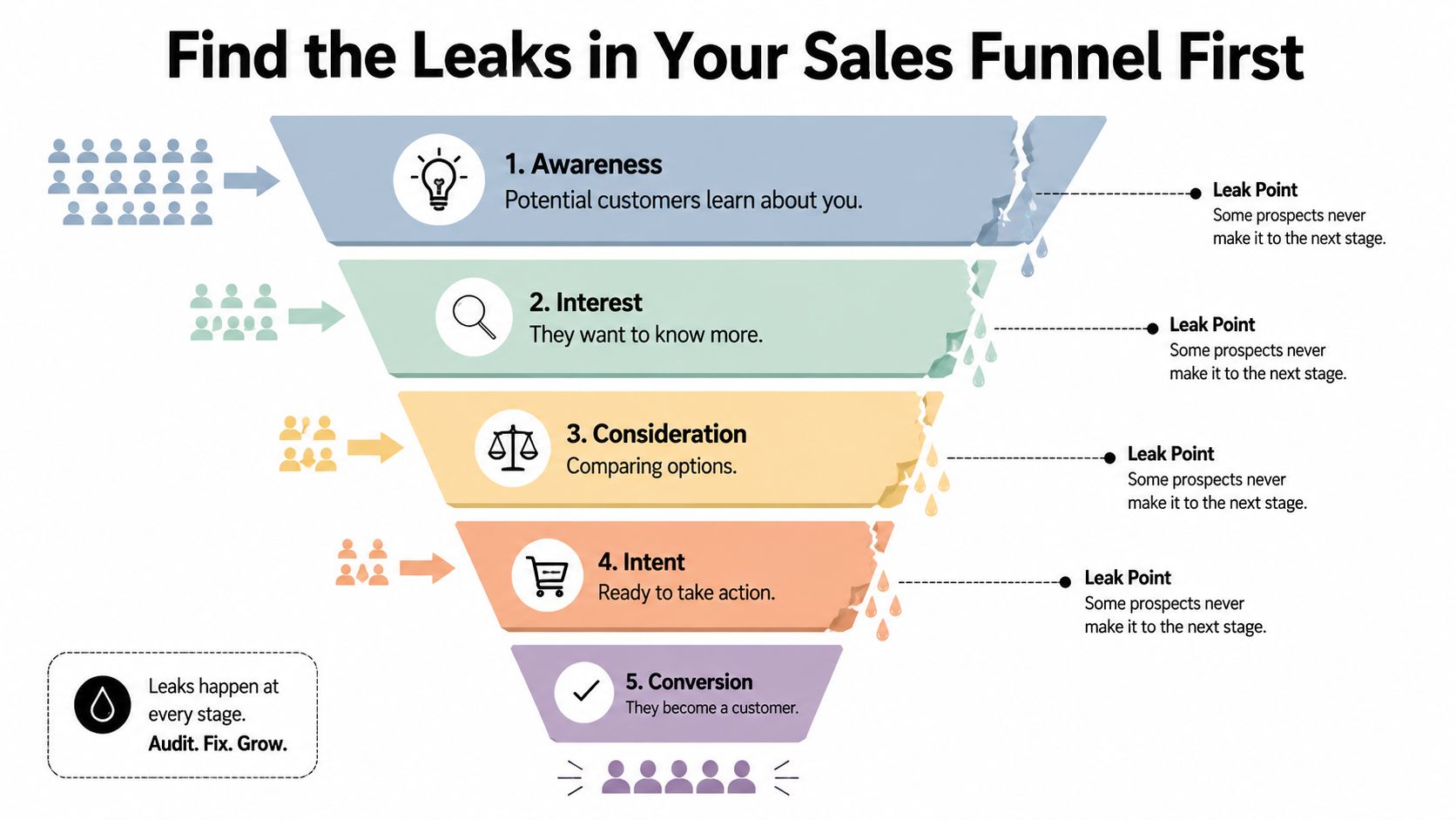
Find the Leaks in Your Sales Funnel First
Changing button colors before you know what's broken is like tearing into an engine because the truck “doesn't sound right.” Start with diagnosis.
Strong CRO guidance emphasizes tracking micro-conversions, funnel drop-off, and segment-level performance so you can see where users hesitate before the final action. For contractors and industrial firms, the primary issue is often form abandonment or applicant drop-off, not the homepage conversion rate. Session recordings and funnel analysis help identify the exact bottleneck before you change anything, as noted in this guidance on tracking micro-conversions and funnel drop-off.
Treat your site like a jobsite inspection
A website funnel for a service business usually looks something like this:
| Funnel step | What the visitor is trying to do | Common leak |
|---|---|---|
| Landing on the page | Check if you do the work they need | Message is too generic |
| Reading service details | Decide if you're relevant | Weak proof or unclear scope |
| Starting contact or application | Test how easy it is to act | Form feels long or confusing |
| Submitting | Finish the task | Errors, friction, or second thoughts |
If you use Google Analytics, start by looking at your highest-traffic pages and your main conversion pages. Don't just ask which pages get visits. Ask which pages lose people right before action.
Then add behavior tools. Heatmaps show where people click and how far they scroll. Session recordings show where they pause, backtrack, or quit. On a job application page, you might find applicants abandon when they hit a resume upload field on mobile. On a quote page, you might see prospects click your phone number image because they assume it should call, but it isn't tappable.
What to look for before you redesign anything
Use a short audit checklist:
- Track form starts: If people begin a quote request or application but don't finish, you likely have a friction problem, not a traffic problem.
- Watch mobile sessions: Field workers and local buyers often browse on phones. That's where the rough edges show up first.
- Review high-intent pages first: Service-area pages, quote pages, and hiring pages usually matter more than a blog post.
- Separate audiences: A company looking for hydrovac services and a driver looking for a CDL job behave differently. Don't blend them into one average.
Don't redesign blindly. Find the leak, form a clear hypothesis, then fix the highest-friction page first.
If you want a useful framework for mapping touchpoints before and after conversion, these strategies for customer journey optimization are worth reviewing. They help you think beyond the homepage and look at the full path from first click to final action.
Build Landing Pages That Do the Selling For You
Most contractor websites rely too heavily on one general “Services” page. That page might list excavation, site work, trucking, welding, hydrovac, reclamation, and fabrication all at once. It looks complete, but it usually doesn't convert well because it asks one page to speak to too many different intents.
A better approach is to build focused landing pages that match what the visitor wants right now.

Data backs this up. According to HubSpot-reported figures compiled by Matomo, personalized calls-to-action perform 202% better than basic CTAs. The same source reports a 55% increase in leads when landing pages grew from 10 to 15, and organizations with more than 40 landing pages increased conversion by over 500%. Those figures point to the same principle: relevant pages and lower-friction next steps outperform generic experiences, as summarized in Matomo's conversion rate optimisation statistics.
One page for everyone usually converts no one
A page titled “Our Services” is broad. A page titled “Hydrovac Services in Vernal” is specific. A page titled “CDL Driver Jobs in the Uinta Basin” speaks directly to one audience with one need.
That difference matters because intent matters.
If someone clicks an ad for excavation services and lands on a page that also talks about welding, trucking, and hiring, you've diluted the message. If a driver is looking for work and lands on a general company page with no clear hiring path, you've created confusion right at the moment of interest.
Here's the practical comparison:
- Generic page: Talks about the company in broad terms, offers several competing actions, and leaves the visitor to sort out whether they're in the right place.
- Targeted landing page: Matches the search or ad, names the service or position clearly, answers likely questions, and offers one obvious next step.
If you want to see how focused websites communicate clearly without overcomplicating the layout, these small business website examples are useful to study.
What a strong contractor landing page includes
A high-converting page for a local service or hiring campaign doesn't need clever copy. It needs the right parts in the right order.
- A headline that matches intent: “Excavation Contractor in Duchesne County” works better than a vague brand slogan.
- Short proof-driven copy: Explain what you do, where you work, and what kinds of jobs you handle.
- Specific CTA language: “Request a Quote” or “Apply for a Job” gives clearer direction than “Learn More.”
- Simple capture point: Keep the form concise, especially for first contact.
- Trust cues near action: Reviews, certifications, service area references, equipment photos, or project examples should sit near the CTA, not buried elsewhere.
One more thing matters. Don't send paid traffic, Google Business Profile clicks, and recruiting traffic to the same destination by default. Build separate pages for each major service line and each major hiring need.
A short walkthrough on page structure can help if you're evaluating your own layouts:
Fix Technical Issues That Kill Conversions
A sharp message won't save a clunky website. If the site loads slowly, breaks on mobile, or makes forms hard to complete, people leave before your sales pitch has a chance to work.
This matters even more for rural and industrial markets. A buyer might be checking your site from a truck between stops. An applicant might be on a phone during a lunch break. If the website struggles on that connection or that screen, the conversion dies there.
Guidance from Lucky Orange emphasizes page load speed, mobile responsiveness, simplified navigation, reduced form fields, guest checkout, trust signals, and A/B testing as standard conversion improvements. Their broader point is simple: reducing friction at the moment of decision is one of the most reliable ways to improve performance, especially on mobile, as explained in their article on proven methods to increase conversion rate.
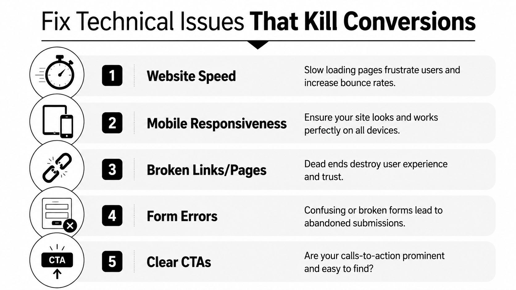
Speed and mobile usability decide whether people stay
The biggest technical mistakes are usually boring. Oversized images. Sliders nobody needs. Scripts piled on top of each other. Forms that look fine on desktop but become a thumb-tapping chore on a phone.
A slow site doesn't just feel unprofessional. It makes people question whether the company will be slow to respond too.
For service businesses, mobile usability should drive many of your decisions. Can someone call from the header without zooming in? Can they complete the form with one hand? Does the application page work cleanly on a phone screen? If not, you've built for the office, not the field.
A practical technical checklist
Run through this list with your site open on an actual phone, not just a desktop browser shrunk down:
- Check the homepage load: If the page feels heavy, strip out anything decorative that delays the first useful interaction.
- Test every CTA button: Quote buttons, phone links, and job-application links should work on the first tap.
- Trim forms aggressively: Ask only for what you need to start the conversation.
- Fix dead ends: Broken links, 404s, and missing thank-you pages make the whole business look sloppy.
- Review security basics: Visitors may not understand technical details, but they notice warning signs and trust cues. This overview of website security best practices is a good checkpoint.
A site doesn't need fancy effects to convert. It needs to load fast, work cleanly, and remove excuses to leave.
Earn Trust Before You Ask for the Job
For a contractor or industrial company, the conversion question usually isn't “Can this website impress me?” It's “Can this company do the work, show up, and communicate?”
That's why trust often matters more than design polish. Standard CRO advice isn't enough in trust-heavy B2B services and local hiring. Conversion improves when pages align messaging with user intent, answer common objections, and reduce uncertainty with clear proof and straightforward next steps, as described in Quantum Metric's guidance on improving conversion rates for trust-heavy journeys.

Trust is the real conversion trigger
If you're asking someone to request a quote for a major project, or asking a qualified driver or operator to apply, they need reassurance before they act.
A slick page without proof creates doubt. Real proof lowers it.
That proof can take different forms depending on the page:
- For service pages: Project photos, service area references, equipment images, certifications, and real client testimonials.
- For hiring pages: Pay transparency if you choose to share it, role expectations, equipment type, schedule clarity, and signs that a real person will respond.
- For company pages: A straightforward About page, local roots, team photos, and current information.
What to place near the point of action
A common mistake is hiding all credibility in a separate page nobody reads. Put trust elements close to the form, quote button, or apply button.
Use this placement logic:
| Page type | Trust element that helps most |
|---|---|
| Quote page | Reviews, service area, certifications, project photos |
| Hiring page | Clear role details, application expectations, current openings |
| Homepage | Core services, local proof, direct contact options |
| About page | Company story, team credibility, responsiveness |
If a visitor has to dig for proof that you're legitimate, many won't dig. They'll leave.
Keep this content current. Old team photos, outdated job listings, and stale project galleries create the wrong kind of impression. In local and industrial markets, people notice when a company looks inactive.
Your CRO Roadmap and When to Call a Pro
Most businesses don't need more random marketing activity. They need a better order of operations.
The strongest workflow starts with diagnosis, then testing. Guidance on structured CRO recommends using analytics first, then A/B testing versions of a single element like a headline or button. It also warns against testing too many variables at once or redesigning blindly without a clear hypothesis, as explained in this article on structured conversion improvement workflows.
A simple order of operations
If you want a practical sequence for how to improve conversion rate, use this one:
- Audit the funnel first. Look for drop-off on quote forms, job applications, and contact pages.
- Fix obvious friction. Broken links, poor mobile behavior, and cluttered forms come first.
- Build focused landing pages. Match page message to service intent or hiring intent.
- Add trust at decision points. Put proof where people hesitate.
- Test one change at a time. Try a new headline, CTA, or form layout, then measure what happened.
Keep the tests simple. “Request a Quote” versus “Get a Free Estimate” is a clean test. So is a shorter application form versus a longer one. A different hero image plus new headline plus new CTA plus new layout all at once tells you almost nothing.
If you're comparing software before building a workflow, this Estimatty blog on CRO tools is a decent starting point for seeing the kinds of platforms teams use for analysis and testing.
When DIY stops being efficient
There's a point where doing it yourself starts costing more than it saves.
That point usually shows up when one or more of these are true:
- You know there's a problem, but can't isolate it: Traffic comes in, but you don't know where leads or applicants are dropping off.
- Your site has grown messy over time: Too many pages, too many plugins, inconsistent CTAs, and no clear funnel.
- You need strategy and implementation together: Not just ideas, but someone to rebuild pages, configure tracking, and keep improving over time.
- Your website was designed to look good, not convert: That's more common than most owners realize. This article on why your website needs more than just a designer explains the difference well.
The goal isn't perfection. It's steady improvement. A contractor website that becomes easier to trust, easier to use, and easier to act on will usually outperform a prettier site that leaves visitors uncertain.
If your website gets traffic but doesn't generate enough calls, quote requests, or qualified applicants, Northpoint Web helps fix that. We build and optimize websites for contractors, oilfield companies, trucking businesses, and local service brands that need more than a good-looking homepage. If you want a site that works harder in the business world, Northpoint Web is worth a conversation.
Comments are closed